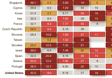
Presidents’ Day originally celebrated the birthday of George Washington, the first president of the United States. (Though, one could get crazy and say it was actually Samuel Huntington, but I fear I would digress.) Now technically the holiday still does celebrate Washington as the official name of the federal holiday is Washington’s Birthday, but by and large we group folks like Lincoln in there too.
Regardless of who exactly is remembered, we remember a United States of the 18th and 19th centuries. And thus it seems appropriate to share a piece from Charles Blow over at the New York Times.

The information graphic is a heat chart of various rankings and index numbers that compare the United States across various metrics to the rest of the world’s “advanced economies”, as decided by the IMF. I certainly have some issues with a few of the metrics, for example what exactly does Gallup mean by percentage of people thriving? And are the math and science scales out of 600 total points? I presume as much but cannot be certain. These could have briefly explained in the footer, or similar to how the food insecurity metric is handled—though I suspect that would be too much from an aesthetic standpoint. The use of drop shadows, from a design perspective, I disagree with; the dark crimson should surely be enough distinction to stand alone. And for completeness, I would have included what appears to be the beigish middle ground between the best and the worst in the scale at the top of the piece.
As to the story the piece supports, I leave that for the audience to decide. Is the United States of the President Obama/Bush as great as that of President Washington/Adams?
Leave a Reply
You must be logged in to post a comment.