Tag: infographic
-
Not the Momma
Well, we made it to the weekend once again. Sometimes—often if I’m being honest—I will sit and watch birds hop around on my balcony, chirping to each other for a minute or two before they fly off to destinations unknown. And in the back of my mind I am always thinking, that little guy is…
-
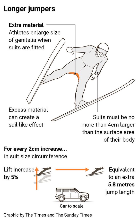
A Matter of Millimetres
Well we have made it to the weekend. And so it is the time to look at the area of men’s genitalia. This week on baseball Twitter the following graphic made the rounds. The graphic itself claims to be from the Times—the original, not the New York version for my American audience—though I have been…
-

Aches, Fevers, and Chills, Oh My!
Last week I suffered from the aforetitled and wondered what just might be ailing me. My sore throat woke me up in the middle of the night with intense, sharp pain and reminded me of stories I had read earlier this flu season about “razor blade” sore throat associated with the latest COVID strain, Nimbus.…
-
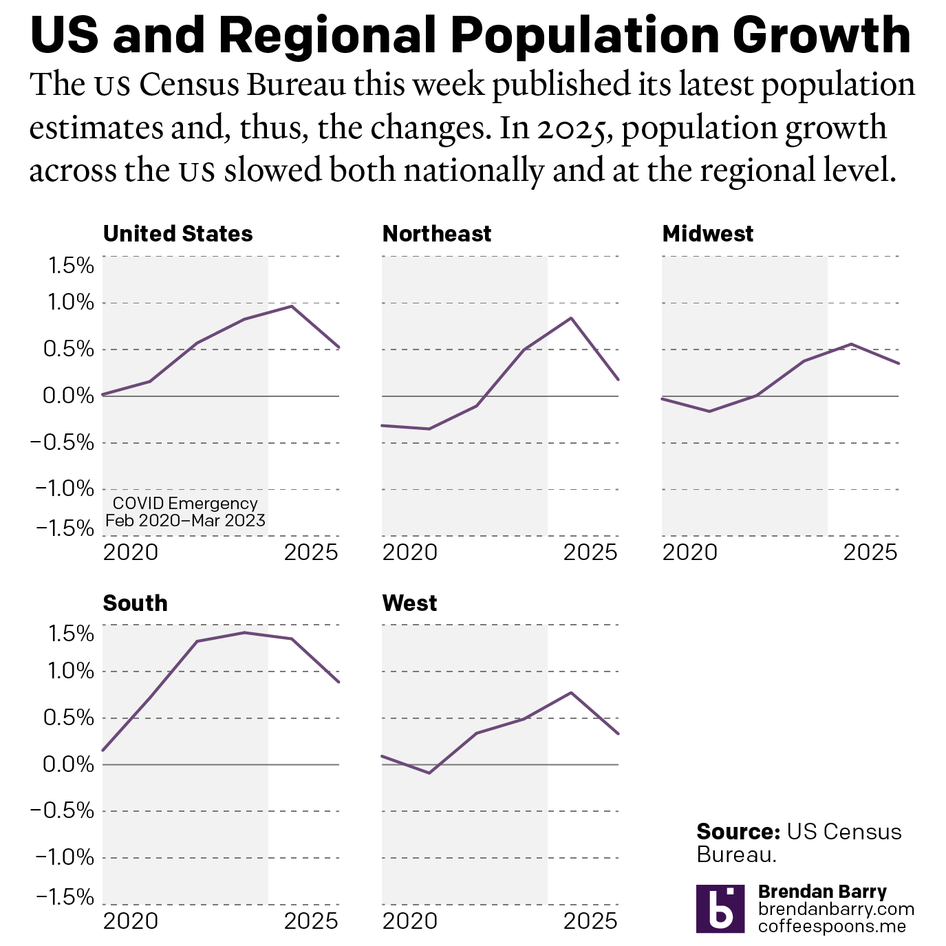
The Slowing of the Growth
This week the US Census Bureau released their population estimates for the most recent year and that includes the rate changes for the US, the Census Bureau defined regions, and the 50 states and Puerto Rico. I spent this morning digging into some of the data and whilst I will try to later to get…
-

The Philadelphia Beat is Pretty Big
Early last week I read an article in the Philadelphia Inquirer about where the city’s police officers live, an important issue given the city’s loose requirement they reside within the city limits. Whilst most do, especially in the far Northeast, the Northwest, and South Philadelphia, a significant number live outside the city. (The city of…
-
Space Is Cool
Well we made it to Friday. One of my longtime goals is to see the aurora borealis, or Northern Lights. My plan for the winter of 2020 was to travel to Norway, maybe visit a friend, and then head north to Tromsø and take in the Polar Night and, fingers crossed, catch the show. Then…
-
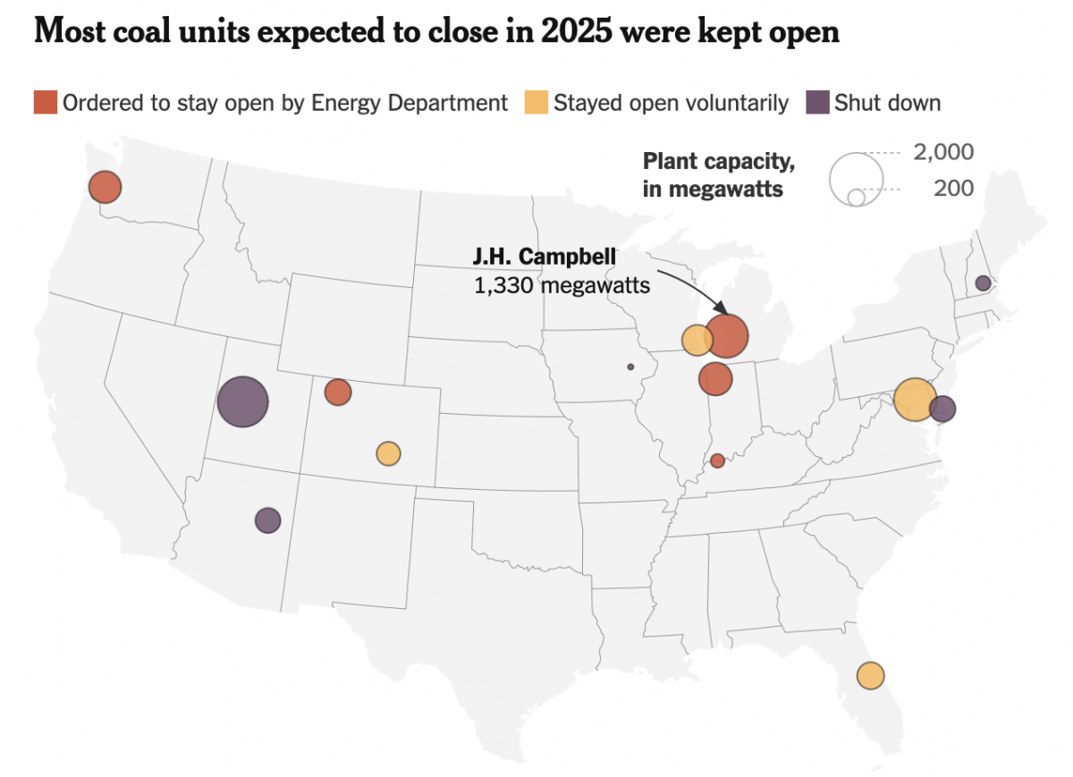
The Phoenix Rises from the Charcoal
To be clear, climate change is real. We know humanity drives the bulk of it via emissions of carbon and other greenhouse gasses, e.g. methane. Electricity generation plays a significant role in the total output, though not all means of generating power are equal. Wind, solar, hydro, and nuclear, for example, produce no carbon emissions.…
-
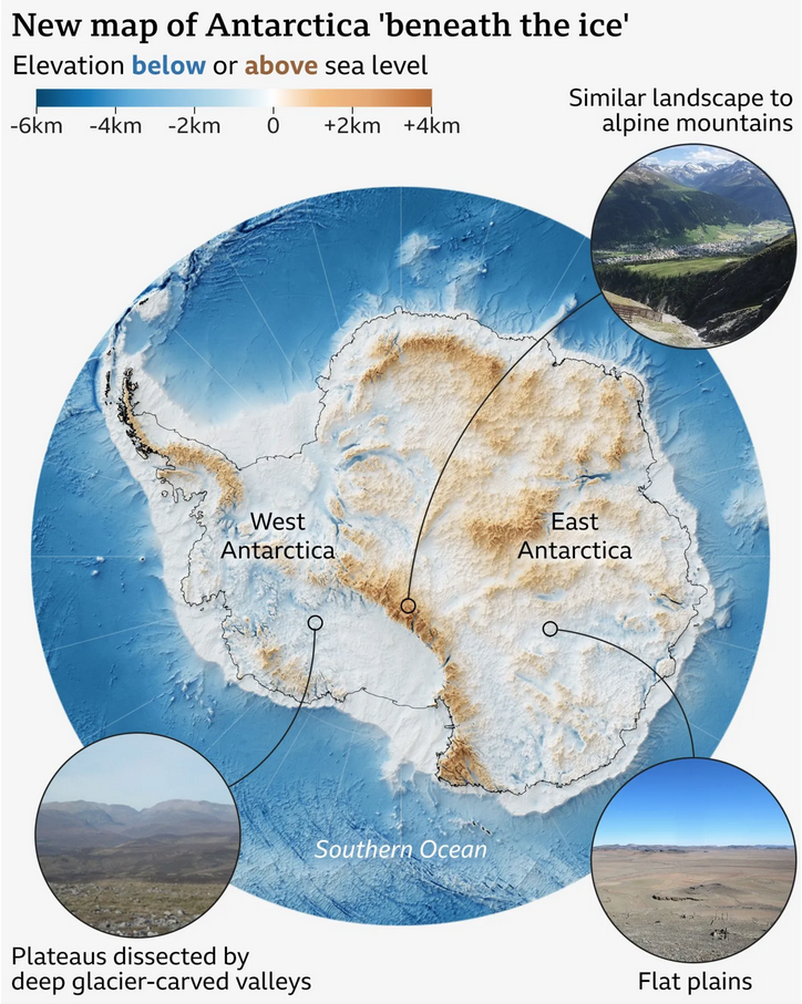
A View Beneath the Ice
I love maps. And above the ocean’s surface, we generally have accurate maps for Earth’s surface with only two notable exceptions. One is Greenland and its melting ice sheet is, in part, contributes to the emerging conflict between the United States and Denmark over the island’s future. The other? Antarctica. Parts of the East Antarctic…
-
The Sun’s Over the Yardarm
After all, matey, ’tis Friday. For those unfamiliar with the expression, what is a yardarm you ask? On traditional sailing vessels the tall thing holding the sail is the mast. Back in the day it was often crafted from a tall tree—see the critical timber industry of New England and the white pines provided to…
-
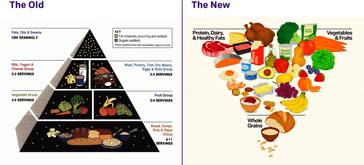
Turning the Pyramid Upside Down
Literally. Last week amongst all the things, the administration released new dietary guidelines, including a brand new food pyramid. The guidelines needed some tweaking as dietary and nutritional science evolves. The administration made a big deal about replacing the old pyramid with the new pyramid, and you can see the comparison here. I am not…