Tag: infographic
-
Flow Diagram from Hell
Well, not hell, but xkcd. The last several months I have had to use a number of websites where the user experience broke down and I was forced to switch to using a phone. Only to have the phone try and direct me back to the website. Nightmarish stuff, people. So Happy Friday! Credit for…
-
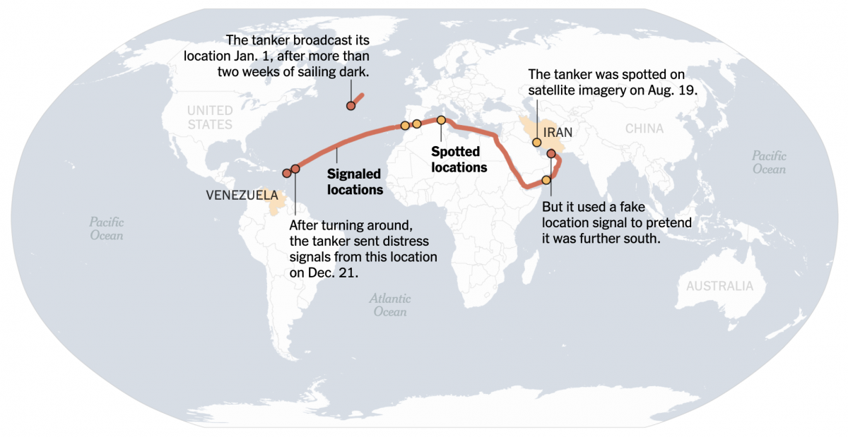
When the Ship Hits the Fan
On Friday I flagged this article from the New York Times for the first post in the new year here on Coffeespoons. The article discussed a Venezuelan oil tanker fleeing US Coast Guard and US Navy forces attempting to interdict the vessel as she steams into the North Atlantic. Whilst the article led with a…
-
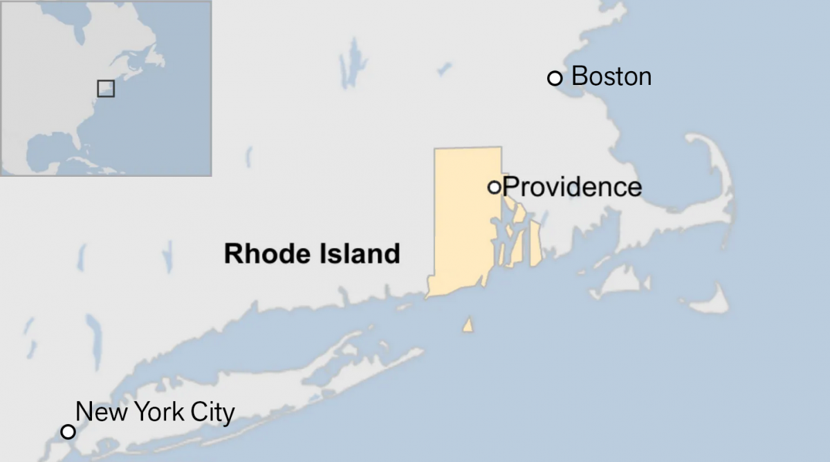
Off on the Road to Rhode Island
Yesterday I read an article from the BBC about this weekend’s shooting at Brown University, one of the nation’s top universities. The graphic in question had nothing to do with killings or violence, but rather located Rhode Island for readers. And the graphic has been gnawing at me for the better part of a day.…
-
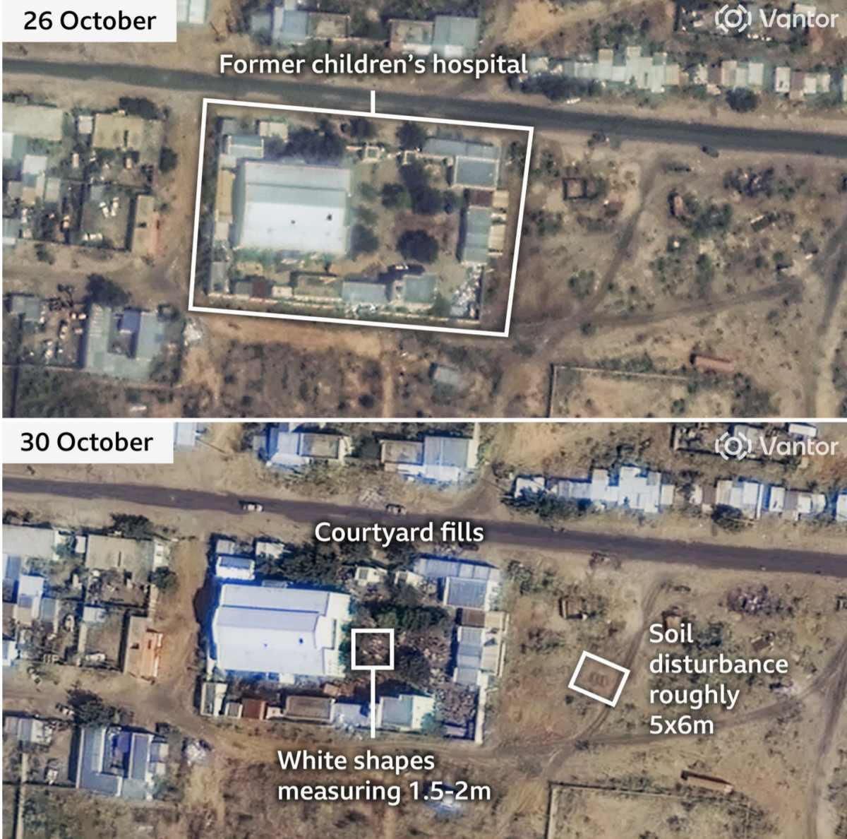
When the Walls Fell
Back in September I wrote about the siege of el-Fasher in Sudan, wherein the town and its government defenders faced the paramilitary rebel forces, the Rapid Support Force (RSF). At the time the RSF besiegers were constructing a wall to encircle the town and cut residents and defending forces off from resupply and reinforcements. At…
-
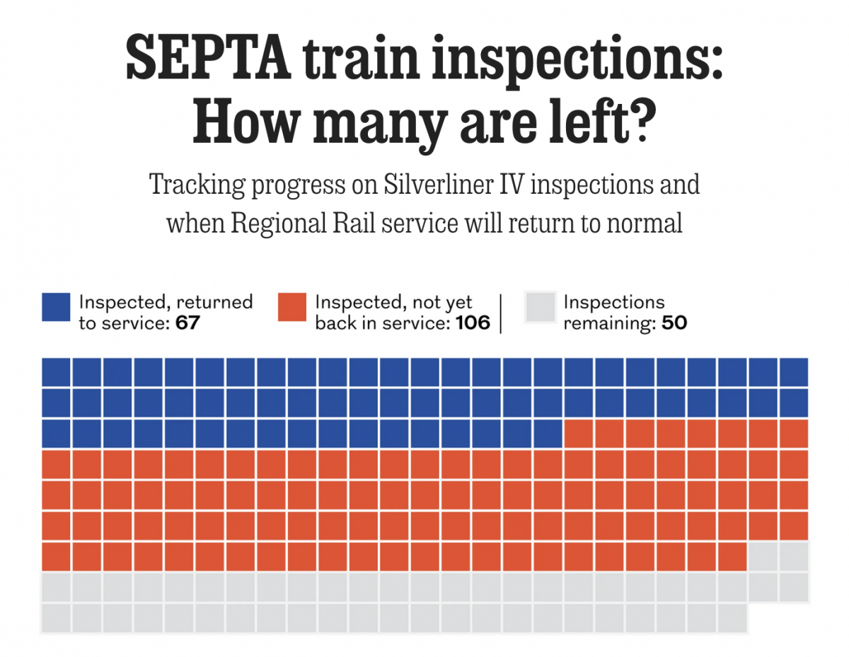
Tarnished Linings
Last month the National Transportation Safety Board (NTSB) ordered Philadelphia’s public transit system, SEPTA, to inspect the backbone of its commuter rail service, Regional Rail: all 225 Silverliner IV railcars. The Silverliner IV fleet, aged over 50 years, suffered a series of fires this summer and the NTSB investigators wanted them inspected by the end…
-

Philadelphia Blue Jays
Last weekend one of my good mates and I went out watch Game 7 of the World Series, wherein the Los Angeles Dodgers defeated the Toronto Blue Jays for Major League Baseball’s championship. Whilst we watched, I pointed out that the Jays’ pitcher at the moment hailed from a suburb of Philadelphia. He was well…
-
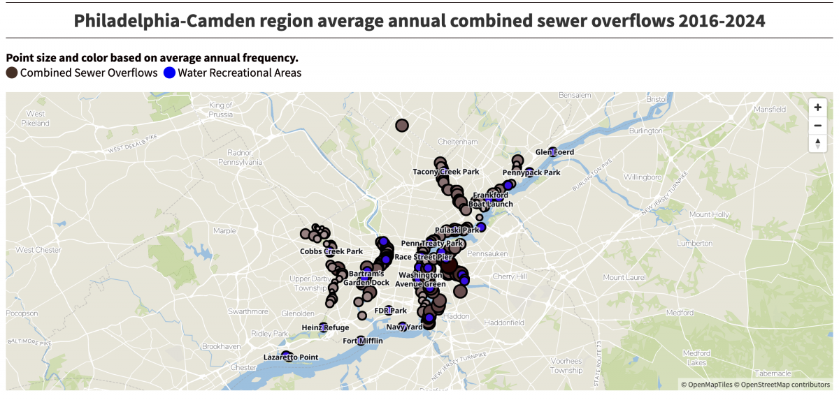
Boy, Does That Stink
(Editor’s note, i.e. my post-publish edit: The subject matter, not the work.) Last week the Philadelphia Inquirer published an article about the volume of sewage discharged into the region’s waterways over nearly a decade. It cited a report from Penn Environment, which claimed 12.7 billion tons of sewage enter the Delaware River’s watershed. I clicked…
-
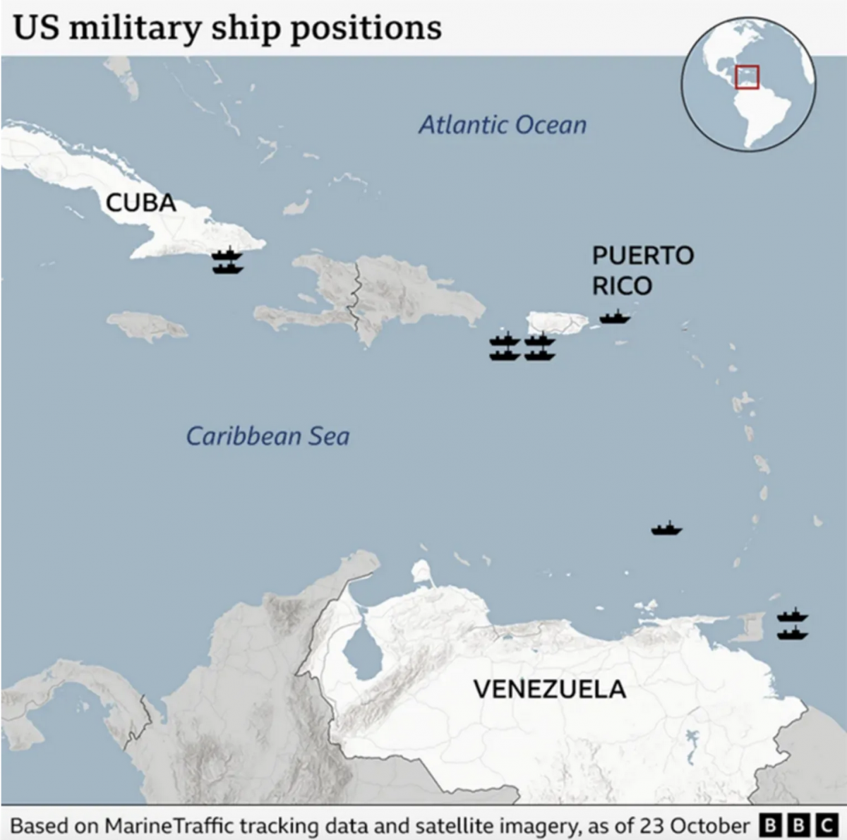
Where’s the Tin Can?
After a few weeks away for some much needed R&R, I returned to Philadelphia and began catching up on the news I missed over the last few weeks. (I generally try to make a point and stay away from news, social media, e-mail, &c.) One story I see still active is the US threatening Venezuela.…
-
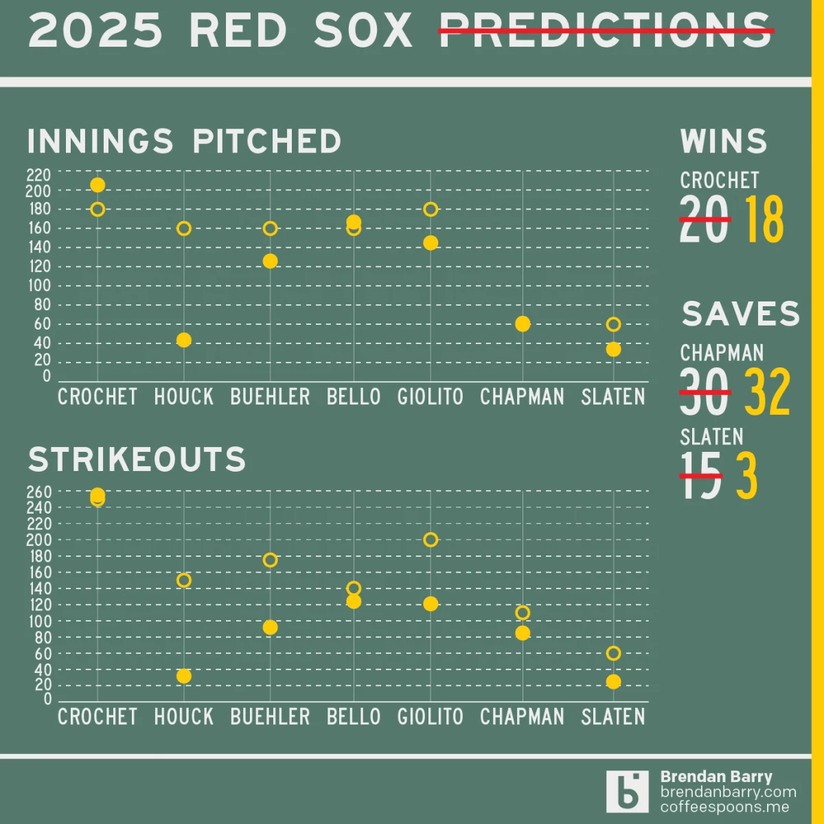
Revisiting My 2025 Red Sox Predictions
Back in March I posted my predictions for the 2025 Boston Red Sox on my social media feeds. I chose not to post it here, because the images had no real data visualisation and the only real information graphic was my prediction of the playoffs via a bracket. I did, however, write about how the…
-
Pick Your Pizza
As many longtime readers know, I lived in Chicago for eight years. I probably had Chicago-style pizza fewer than eight times in my life. I grew up in the Philadelphia suburbs and for the last nine years I have lived in central Philadelphia, where pizza is very much a different thing. And in my life…