Today is a Happy Happy Joy Joy Story

For the past two posts I focused on the sinking of the RMS Titanic, an historical event that has always been of some interest to me, but is not always the most uplifting of subjects. When in high-school, I once had an English teacher who took to heart our complaints that our literature selection was rather dark and depressing. So after finishing yet another such story, he had us turn to a specific page in our reader. The title of that day’s story was To the Gas Chambers, Ladies and Gentlemen; it was a story about the Holocaust.

Here is today’s uplifting story. What would happen if a dirty bomb was detonated in lower Manhattan. Courtesy of the National Post.
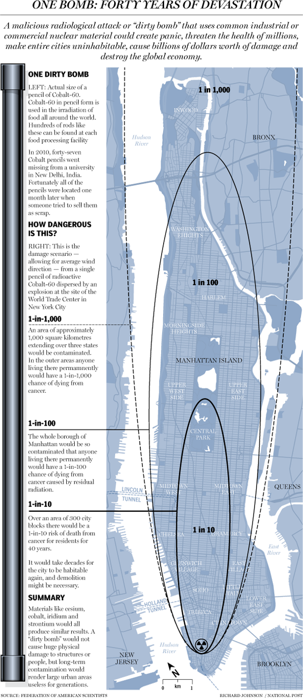
A dirty bomb in New York

Credit for the piece goes to Richard Johnson.

Setting the Stage for the Sinking of RMS Titanic

Saturday will be the 100th anniversary of the sinking of the RMS Titanic. She struck an iceberg just before midnight—at the time the crew thought merely as a glancing blow—and within three hours she would be headed towards the seabed. By the time the survivors were all picked up, over 1500 people would die in what is perhaps the most (in)famous sinking in human history.

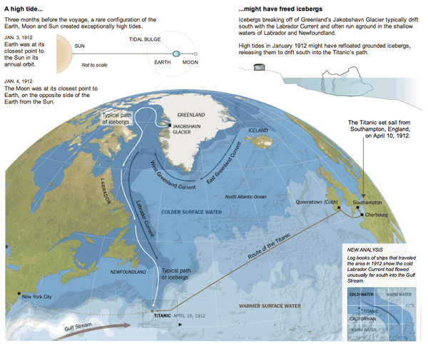
But, what about the iceberg? There are of course the reports that a ship scouring the sea for survivors after the sinking found the killer berg. But how did it get there? The New York Times put together an infographic exploring the science behind how the RMS Titanic might have ended up colliding with what originally was part of (probably) a Greenlandic glacier.

The Titanic Iceberg
The Titanic Iceberg

Also in the piece are explanations of how it is possible that the SS Californian did not come to the rescue of the stricken RMS Titanic.

Credit for the piece goes to Mika Gröndahl and Joe Burgess.

Santorum Quits. Goodbye…and Thanks for all the Varicose Veins.

So Rick Santorum is now out of the race. Mitt Romney is basically now set to run against the President. But why should Santorum go out without an infographic looking back at the Republican primary race. (Since neither Newt nor Ron come even close to running the same race as Rick.)

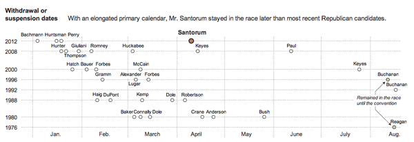
The New York Times put out an infographic looking at Rick Santorum’s campaign. And as one can see, he did do well in the evangelical and Christian conservative heartland of the United States. It just was not quite enough to beat Romney’s supporters.

County leaders in Republican primary states

But, Santorum did manage to last longer in the race than many others have in recent years. So who knows, depending on how the election in November turns out, we may just see more of Rick in the future.

A timeline of withdrawal

I’m On a Quest

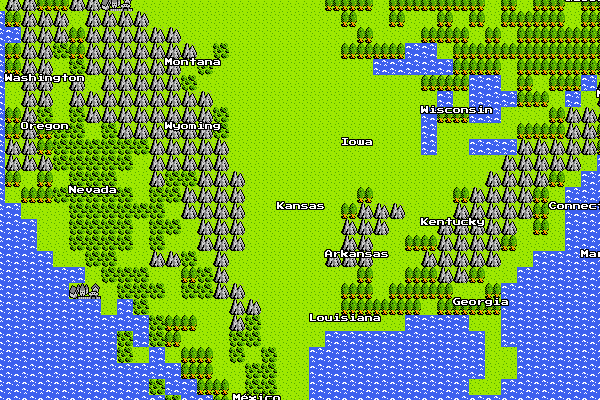
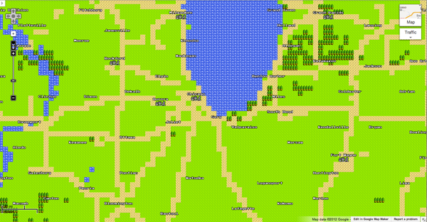
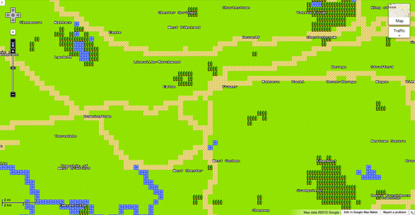
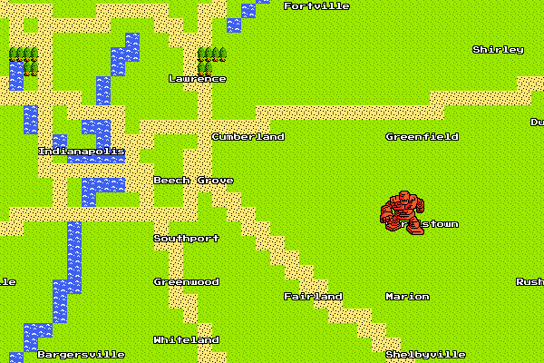
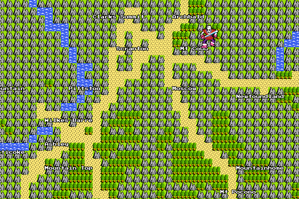
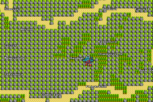
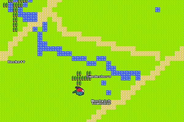
For those that may have missed it, earlier this week Google released its newest addition to its Google Maps product offering: the 8-bit Quest map. Never before has the world been seen in such high-resolution. And if you look close enough, you might even be able to spy some interesting features.

America…if only Vespucci had a map like this
The Chicago metropolitan area
My old stomping grounds
Monsters in the southeast suburbs, another reason not to visit Indianapolis…
Scranton–Wilkes-Barre is also under monster threat…
Wolfman…I'll be near him when on holiday next weekend…maybe I'll okay…
And if you know where Swedesboro is you get bonus points…

Happy Monster Hunting Quest.

Chocolate All Over the World

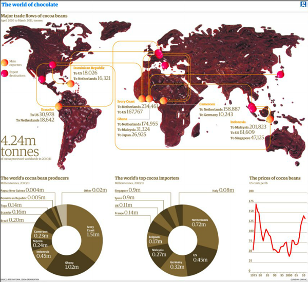
There are a few things in this world that I really dislike. Two of them are coffee and chocolate. So this map from the Guardian, a map made of real melted chocolate, is not quite to my liking.

Chocolate map
Chocolate map

While I can appreciate the concept behind it—regardless of the chocolate-ness—I am left to wonder if from a data visualisation point a world map might not have been the best choice. Only fourteen countries are shown, if I count melted chocolate correctly.

I am just thankful that at the bottom of the piece I am not looking at chocolate doughnuts.

Credit for the piece goes to Jenny Ridley.

A Warm Winter in Canada

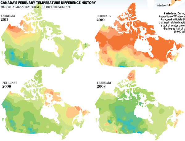
For many, this past winter was not so wintery, warmer than average temperatures and less than average snowfall. The National Post looked at Canada’s winter experience and found it to be the third-warmest in history. The story was covered in a large infographic piece that uses small multiples to look at previous Februaries across Canada and then bar charts to look at March temperatures specifically.

Previous February temperature differences

Credit for the piece goes to Tristin Hopper, Jonathon Rivait, and Richard Johnson.

Rising Seas

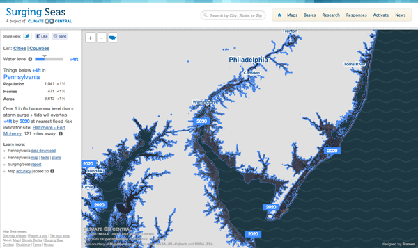
Via the Guardian, Stamen Design has teamed up with Climate Central to create an interactive piece that maps the potential effects of rising sea levels. The user has control over the amount of the rise—this graphic says four feet—after which the coastline recedes to reveal the devastation. This is complemented by statistics of the land, including the population potentially affected along with the number of homes and total acres. In this case you see South Jersey, which is where I spent my summers. As you can see, the coastal beach towns I called home would be underwater. (And the little blue specks inland in Pennsylvania near my hometown, those are quarries; nobody lives there. No need to worry.)

Changing coastline
Changing coastline

The problem, of course, is that a large percent of the Earth’s population lives near the ocean. There are not, after all, many people living in the interiors of the continents. So receding coasts may very well be a problem in the coming years.

Cholera

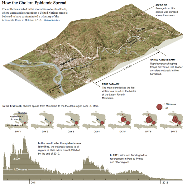
Cholera. It’s more than just a disease on the Oregon Trail. It exists in the 21st century, though typically we do not experience it in the industrialised Western world. Where one does see it crop up are in places with poor sanitation, which is usually in the developing world. But, if one were to take a developing country and then in a few seconds wreck the national infrastructure in a devastating earthquake, one could see the creation of the right conditions for an outbreak.

Sadly, that is exactly what happened—and to a lesser degree is still happening—in Haiti. The New York Times wrote about the problem in an article in the Sunday edition. The article was accompanied by an infographic that mapped the spread of the outbreak geographically and then its intensity over time.

Cholera outbreak
Cholera outbreak

Credit for the piece goes to Joe Burgess and Lisa Waananen.

The First Rule Is You Don’t Talk About It

There are two things one is not supposed to discuss in mixed company, and let us face it, the internet is some rather mixed company. One of those things, politics, I frequently mention and bring up on this blog. The other, religion, I do not.

Until now. (I think.)

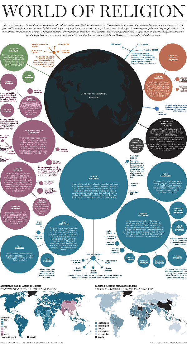
From the National Post comes this work on the size and distribution of the world’s religions.

World religions
World religions

Credit for the work goes to Richard Johnson.
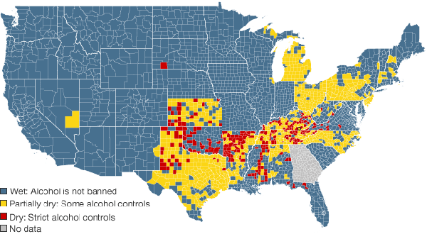
21st Century Prohibition

This map comes from the BBC, which investigates prohibition in the 21st century at the local level, as the national policy ended in the early decades of the 20th century.

Dry vs Wet Counties
Dry vs Wet Counties

Credit for the map goes to John Walton, Harjit Kaura, and Nadzeya Batson.