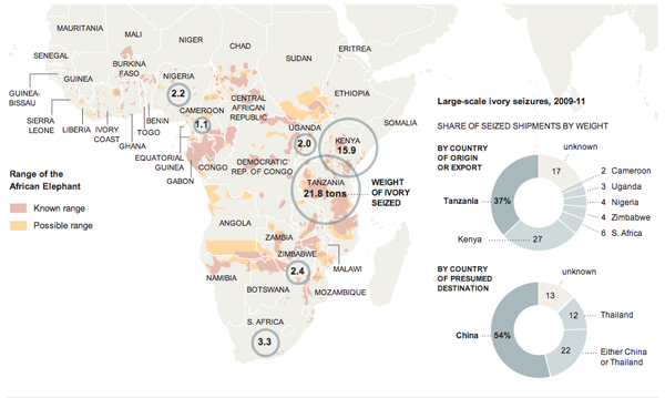
This graphic from the New York Times looks at the illegal ivory trade out of Africa and into, primarily, the markets of Asia. I think the map works fairly well in showing why certain countries are centres for the illicit industry. But the two donut charts integrated into the graphic as part of the Indian Ocean are a bit weaker.

My main problem is that the shares are a bit difficult to distinguish as arcs, especially when looking at the export countries. But the second chart with the import markets does work a little bit better. In this case there are really only three markets: China, Thailand, and Others. But the chart contains the ambiguous China or Thailand. So in theory, that demarcation could fall anywhere between China and Thailand—a point harder made if comparing simply by bars. This means that the chart really is looking at China vs Thailand that combine to 87% vs. Others. The trick is finding the break between China and Thailand. Is this chart perfect? No, but in this case I think it an acceptable use of the donut—though I likely would have treated it a little bit differently to emphasise that point.
Leave a Reply
You must be logged in to post a comment.