Tag: maps
-
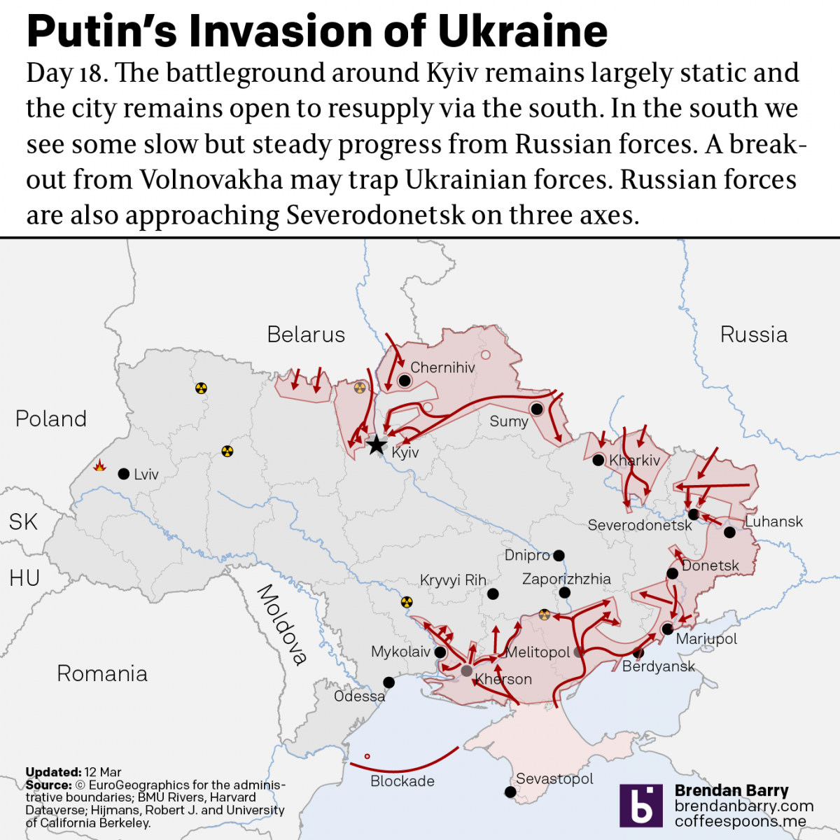
What Is Putin Trying to Accomplish Now in Ukraine?
So first, these maps are from last night and by the time this posts, most of the daytime in Ukraine will have happened and things on the ground could have changed dramatically. But let’s start the week out with where things are at in Ukraine. In short, on most fronts not a lot has changed…
-
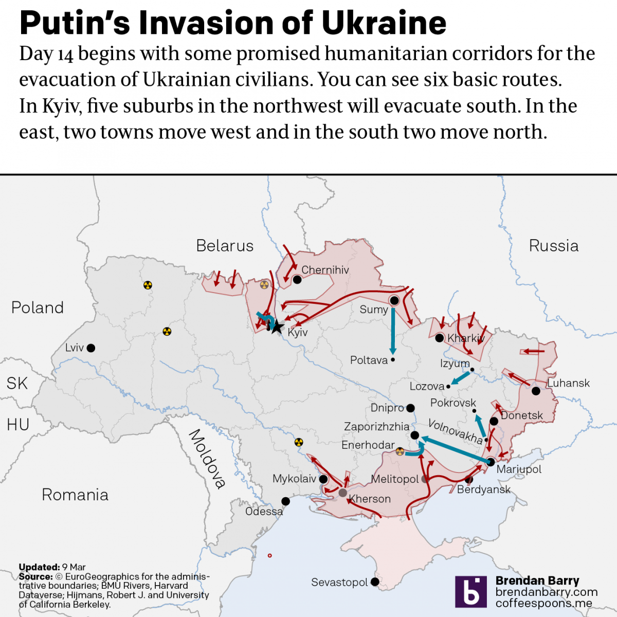
Evacuation Corridors
I’ve been posting a lot of map updates to my personal social media accounts instead of to the blog here. In part that’s because at the end of the night, it’s the wee hours in Ukraine and I can post something that will hold up fairly well for a few hours. But right now in…
-
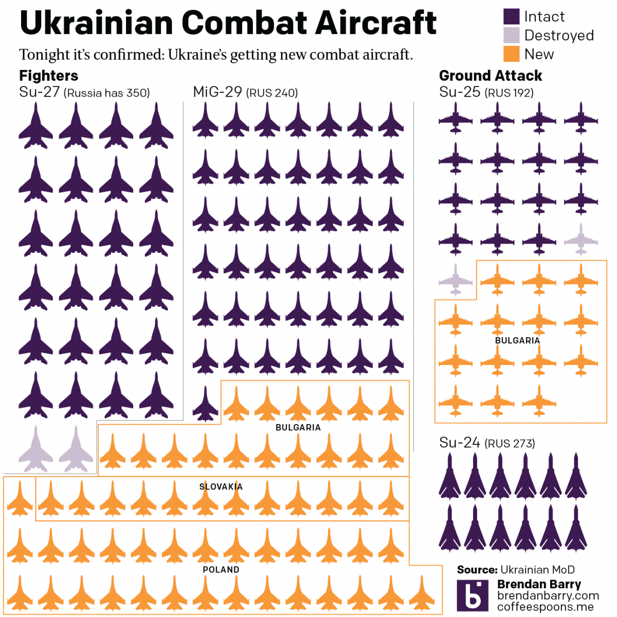
Bolstering the Ukrainian Air Force
Undeniably, Russia outnumbers and outguns the Ukraine on the ground, on the sea, and in the air. The latter matters because Ukraine’s air attacks have devastated Russian convoys. But beyond drones, Ukraine could use additional combat aircraft: both ground attack aircraft and fighter jets to try and defend Ukrainian airspace. The problem is that Ukrainians…
-
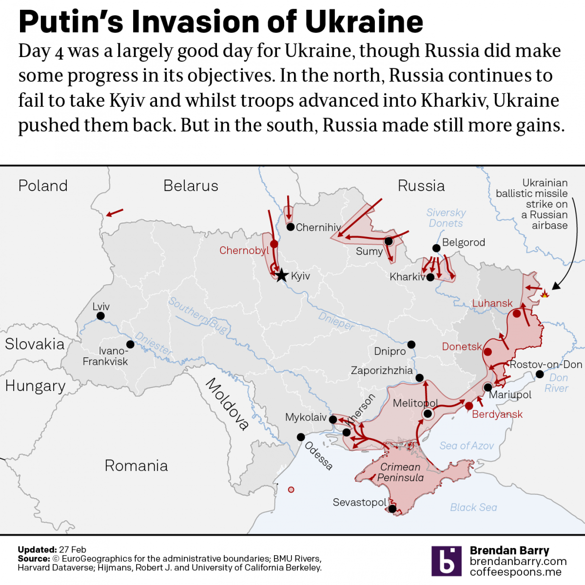
Putin’s War in Ukraine
Last week I wrote about what I considered Russia’s most likely plans of attack in a war with Ukraine. For the next day I had a post planned about what we could perhaps glean from Russian troop movements in days prior. But, the day I posted the first piece, late that night (US time), Russian…
-
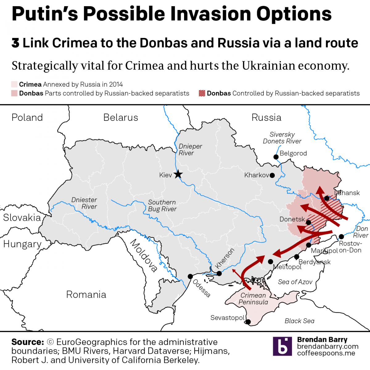
Some Possible Shapes a Russian Invasion of Ukraine Could Take
I’ve been trying to figure out how to start several days’ worth of coverage about Ukraine and Russia’s “further invasion”. For those that haven’t followed me here at Coffeespoons for very long, eight long years ago, in addition to covering other media outlets’ work, I did quite a lot of research, designed several pieces trying…
-
There Goes the Shore
The National Oceanic and Atmospheric Administration (NOAA) released its 2022 report, Sea Level Rise Technical Report, that details projected changes to sea level over the next 30 years. Spoiler alert: it’s not good news for the coasts. In essence the sea level rise we’ve seen over the past 100 years, about a foot on average,…
-
Colours for Maps
Today we have an interesting little post, a choropleth map in a BBC article examining the changes occurring in the voting systems throughout the United States. Broadly speaking, we see two trends in the American political system when it comes to voting: make it easier because democracy; make it more restrictive because voter fraud/illegitimacy. The…
-
Dots Beat Bars
Today is just a quick little follow-up to my post from Monday. There I talked about how a Boston Globe piece using three-dimensional columns to show snowfall amounts in last weekend’s blizzard failed to clearly communicate the data. Then I showed a map from the National Weather Service (NWS) that showed the snowfall ranges over…
-
Obfuscating Bars
On Friday, I mentioned in brief that the East Coast was preparing for a storm. One of the cities the storm impacted was Boston and naturally the Boston Globe covered the story. One aspect the paper covered? The snowfall amounts. They did so like this: This graphic fails to communicate the breadth and literal depth…