The Sorting Hat

Well the election is finally over. And since last week I used my Friday post to talk about something serious, I apologise for backtracking just a wee bit to go back to the election.

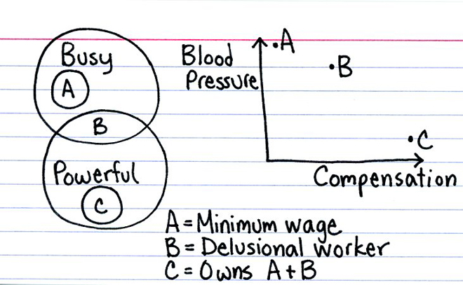
This summer I had a discussion with one of the designers I worked with at the time, Ciana Frenze. We were sitting out in the Art Institute garden with a few other designers where she was explaining Harry Potter’s sorting hat to me—I know nothing about Harry Potter. I never thought that knowing the defining characteristics of the various houses would come in handy, especially given my interest in politics and data. But today’s piece fits rather well.
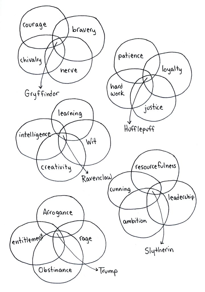
Fits right in there
Fits right in there

Credit for the piece goes to Jessica Hagy.

New Job Trepidation

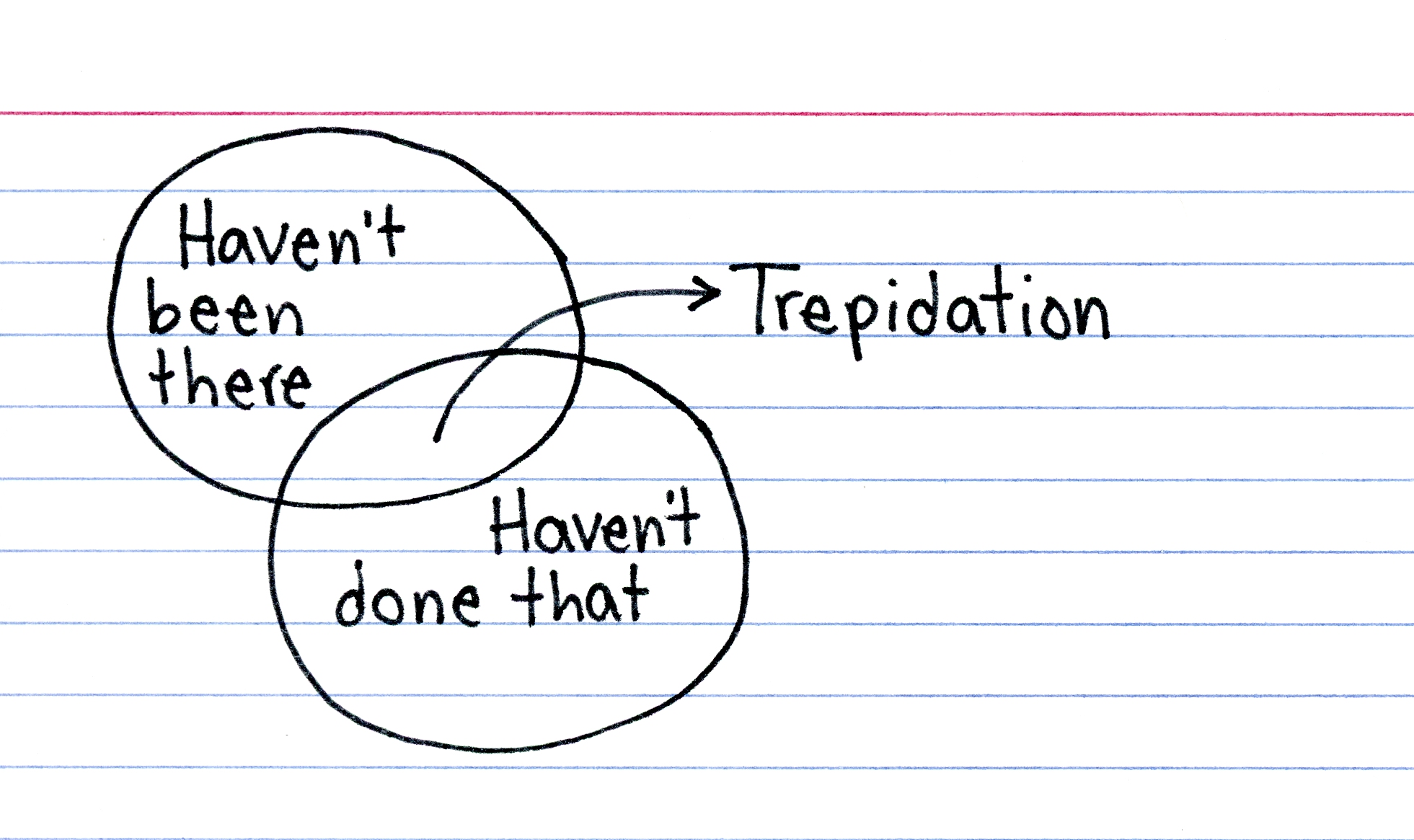
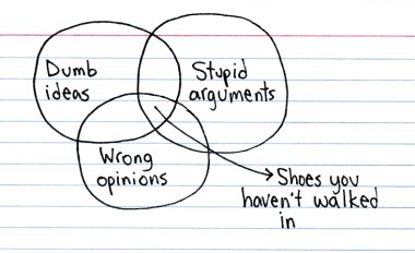
Some of my co-workers are taking me out for a few drinks as I started a new job at my company last month. It’s a lot of work and a lot of learning things I know little about. So this piece from This Is Indexed seems appropriate for this Friday.

My new job is somewhere in the sliver

Credit for the piece goes to Jessica Hagy.
Venn Diagrams

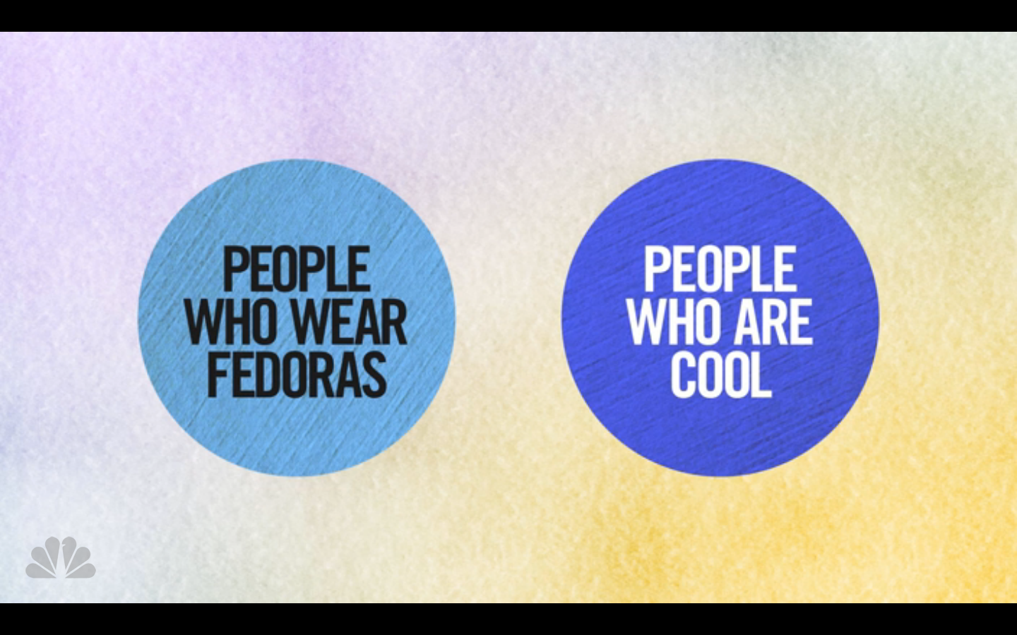
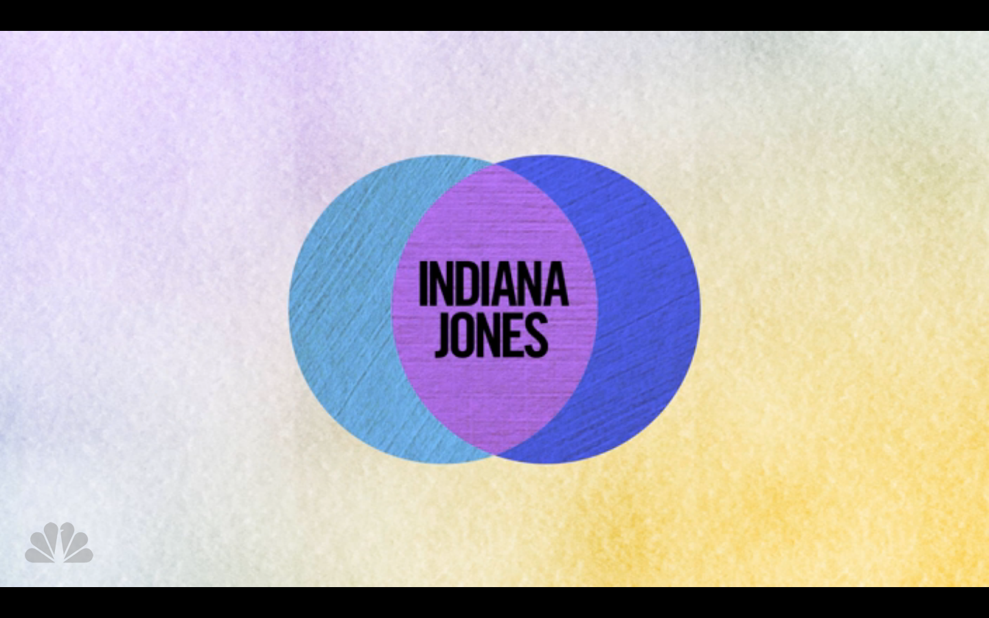
Seth Meyers debuted his new show last month. And in the debut he used Venn diagrams to tell jokes. And while I was going to poke fun at Arizona, the opportunity for the joke disappeared a few weeks ago. So instead, I will take the time to show another.

The setup:

Who could this be?
Who could this be?

The punchline:

Not me.
Not me.

Credit for the piece goes to Seth Meyers.

The Future of Data Visualisation

Happy Friday, everyone. According to xkcd, I am failing the future test. That is to say, by 2019, I will be unable to communicate data through infographics or create data visualisations.

The future of data visualisation

Credit for the piece goes to Randall Munroe.

Nice Work, Bro

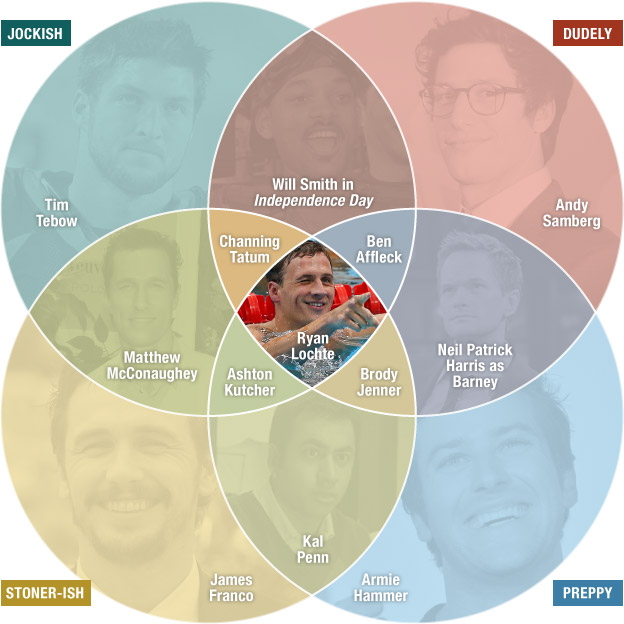
Bro. You have surely heard the term exchanged by young men to each other as a sign of friendship, greeting, &c. If you are like me, you are probably confused as to just what constitutes a bro. Thankfully the folks over an NPR analysed broness and compiled their findings into a Venn diagram that maps out the different types of bros. You should definitely head over to the piece and read up on the methodology, it’s worth the read. (And check out the video that epitomises the essence of bro-ness if for nothing else than a Philly news crew’s reaction to an interview with said essence.)

Bro-ness
Bro-ness

Credit for the piece goes to Alyson Hurt.

Venn Diagrams. Let’s Go Back to Grade School.

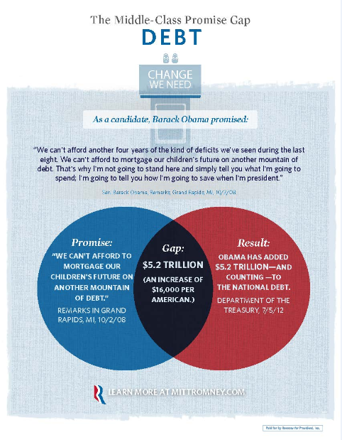
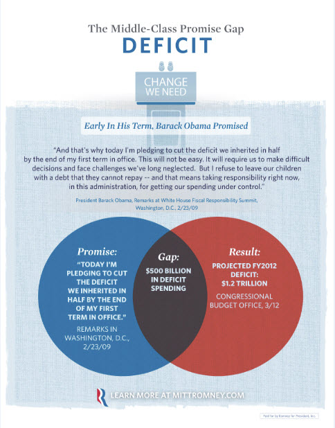
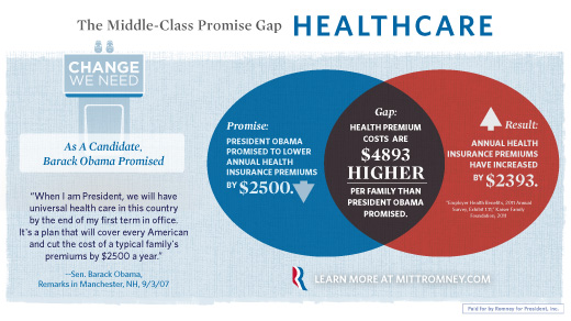
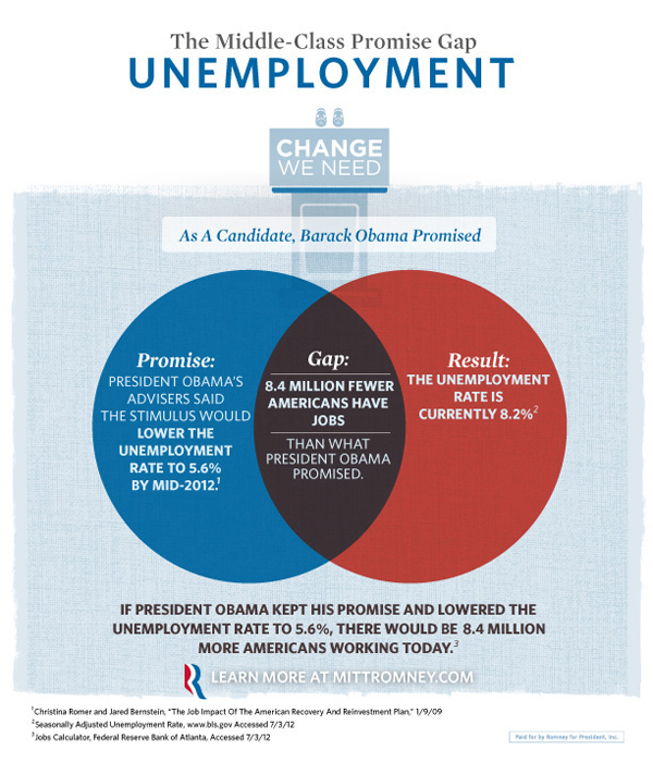
Last week Mitt Romney’s campaign released a series of infographic adverts. They were Venn Diagrams with messages attacking President Obama by highlighting what the Romney campaign called gaps between what the president has said he would do and what he has in fact done.

Debt Gap
Debt Gap
Deficit Gap
Deficit Gap
Healthcare Gap
Healthcare Gap
Unemployment Gap
Unemployment Gap

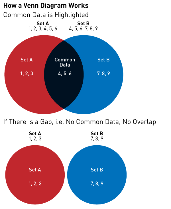
The problem with these is that they are all wrong. Do not misunderstand me, the Romney campaign certainly has valid points in these statements. And to use an infographic to communicate their points is a valid approach. But whoever designed these adverts clearly did not know how a Venn Diagram works.

Here is a brief refresher course for those interested.

How Venn Diagrams Work

Unfortunately, the Romney campaign’s message is being lost in a failed medium. It’s like watching a clown give a doctoral thesis in rocket science. He sure might be making a good point. But it’s a clown. People laugh at clowns. People won’t take the clown seriously. The Romney campaign is making good points, but that message is being lost because the campaign cannot master one of the simplest types of charts.

Credit for the originals go to the Romney campaign. The bit on How Venn Diagrams Work is mine.