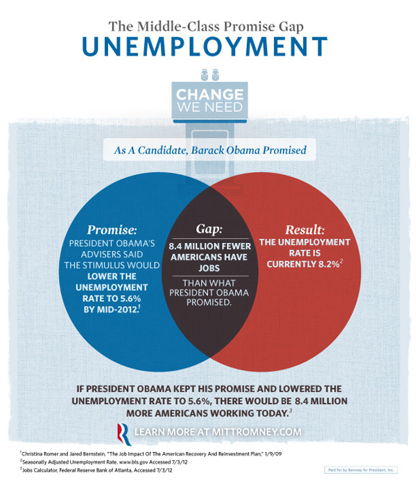
Last week Mitt Romney’s campaign released a series of infographic adverts. They were Venn Diagrams with messages attacking President Obama by highlighting what the Romney campaign called gaps between what the president has said he would do and what he has in fact done.


The problem with these is that they are all wrong. Do not misunderstand me, the Romney campaign certainly has valid points in these statements. And to use an infographic to communicate their points is a valid approach. But whoever designed these adverts clearly did not know how a Venn Diagram works.
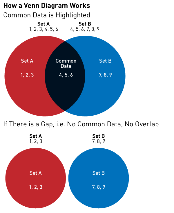
Here is a brief refresher course for those interested.

Unfortunately, the Romney campaign’s message is being lost in a failed medium. It’s like watching a clown give a doctoral thesis in rocket science. He sure might be making a good point. But it’s a clown. People laugh at clowns. People won’t take the clown seriously. The Romney campaign is making good points, but that message is being lost because the campaign cannot master one of the simplest types of charts.
Credit for the originals go to the Romney campaign. The bit on How Venn Diagrams Work is mine.
Leave a Reply
You must be logged in to post a comment.