National Heights

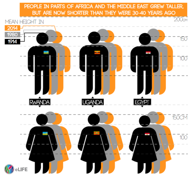
And by this title I am not referencing McKinleys, K2s, or Everests. No, the BBC published this piece on the changing average heights of citizens of various countries. This was the graphic they used from the report’s author.
National heights of people

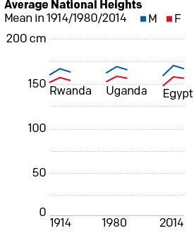
Personally speaking, I do not care for the graphic. It is unclear and puts undue emphasis on the 1914 figure by placing the illustration in the foreground as well as in the darkest colour. I took a thirty-minute stab at re-designing the graphic and have this to offer.
A comparison of the six heights

While I admit that it is far from the sexiest graphic, I think it does a better job of showing the growth than decline of national heights by each sex in each of these three select countries. Plus, we have the advantage of not needing to account for the flag emblems. Note how the black bars of Egypt disappear into the black illustration of the person.

Credit for the piece goes to the eLife graphics department.

Bye Bye, Yahoo

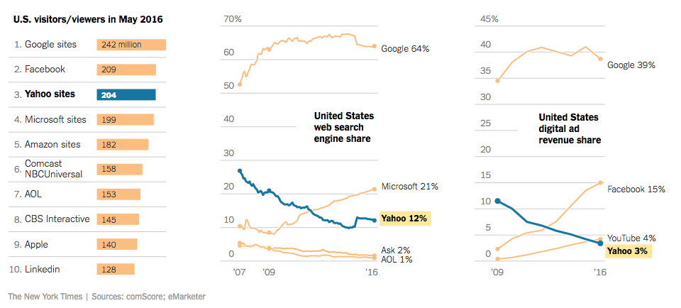
Happy Monday, all. Some big news stories going on today, but I wanted to take a look at this piece from the New York Times. They report on the sale of Yahoo to Verizon for almost $5 billion via a piece that takes short written analysis and blends it with clear and concise charting. The effect is a quickly digestible, but data-driven content piece.

The shares are falling, the shares are falling

Credit for the piece goes to Karl Russell.

Expensive Wines

Another Monday, another week, another post. But this week we will try to get by without any more Brexit coverage. So what better way to cure a hangover than with more booze? So let’s start with some fancy wine.

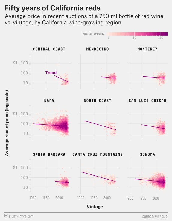
I meant to post this piece a little while back, but yeah that unmentionable thing occurred. Now we have the time to digest as we sip and not slam our beverage of choice—the Sun’s over the yardarm somewhere I figure. FiveThirtyEight took a look at expensive wines. It compares the pricing at various vintages for France, California, and other wine-producing regions. On the balance, a very smart piece with some great graphics.

But since I had to pick just one, since this isn’t a full-on critique, I opted for this set of small multiples. It compares the price vs. vintage for a number of California red wines. (One of which I had this weekend.)

California reds
California reds

Credit for the piece goes to Oliver Roeder.

Fact Checking Trump’s Small Multiples

Today marks the end of primary season for the US presidential election. By all accounts, at night’s end Hillary Clinton will be the Democratic nominee, but Bernie Sanders, while unlikely to win, could make California interesting tonight. And then there is Donald Trump. He is the Republican Party’s presumptive nominee and man, can that guy tweet.

Thursday he retweeted a set of small multiple charts arguing that President Obama’s legacy is an absolute disaster.

Trump's retweeted charts
Trump’s retweeted charts

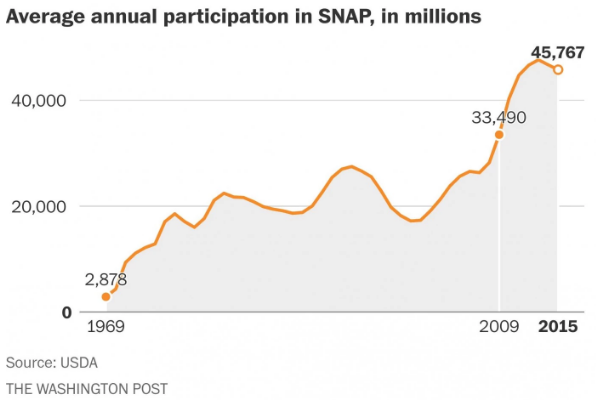
Friday the Washington Post went through all nine points and fact-checked the charts, this being the refutation of the Food Stamps chart.

Food stamps are actually going back down

The whole thing is worth a quick read.

Credit for the piece goes to Philip Bump.

Basketball Finals

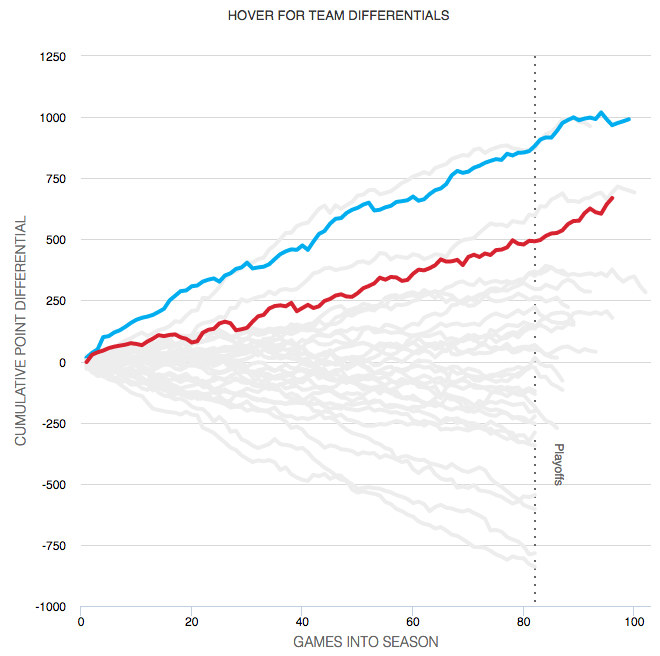
So the basketball finals begin tonight with the Cleveland Cavaliers taking on the Golden State Warriors. This is also the part of the post where I fully admit I know almost nothing about basketball. I did, however, catch this so-labelled infographic from ESPN contrasting the two teams.

Point differential
Point differential

What I appreciate at this piece is that ESPN labelled it an infographics. And while the data might be at times light, this is more a data-rich experience than most infographics these days. Additionally the design degrades fairly nicely as your browser reduces in size.

The chart formats themselves are not too over-the-top (that seemed like a decent basketball pun when I typed it out) with bars, line, and scatter plots. Player illustrations accent the piece, but do not convey information as data-encoded variables. I quibble with the rounded bar charts for the section on each team’s construction, but the section itself is fascinating.

I might not know most of the metrics’ definitions, but I did not mind reading through the piece.

Go Red Sox.

Credit for the piece goes to Luke Knox and Cun Shi.

World Income

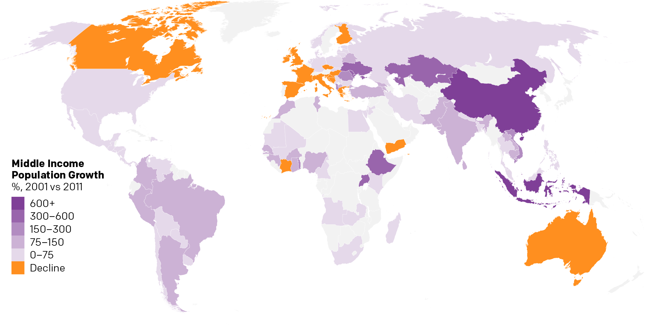
Over the weekend I found myself curious about the notion of a growing global middle class. So I dug up some data from the Pew Research Center and did some analysis. The linked piece here details that analysis.

The growth in middle income populations

I go into more detail than just a map. Hopefully you enjoy the piece and find the analysis informative if not useful.

Credit goes to myself on this one.

Why All the Nationalism?

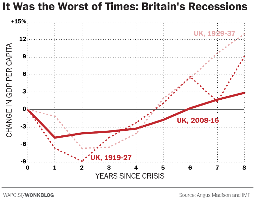
Brexit is coming, Brexit is coming. Something about red coats? I couldn’t resist. But, the prospect of the United Kingdom leaving the European Union is real, though still not likely according to the latest polling data. What drives the sentiment to get out, kick out the illegal immigrants, and restrict new immigrants from arriving—where have I heard that before—? Well, the Washington Post takes a look at a plausible economic cause.

Comparing British recessions

And because I am pretty sure I have heard something similar, the article makes a case for countries beyond the British Isles.

Credit for the piece goes to Matt O’Brien.

Long-distance Amtrak

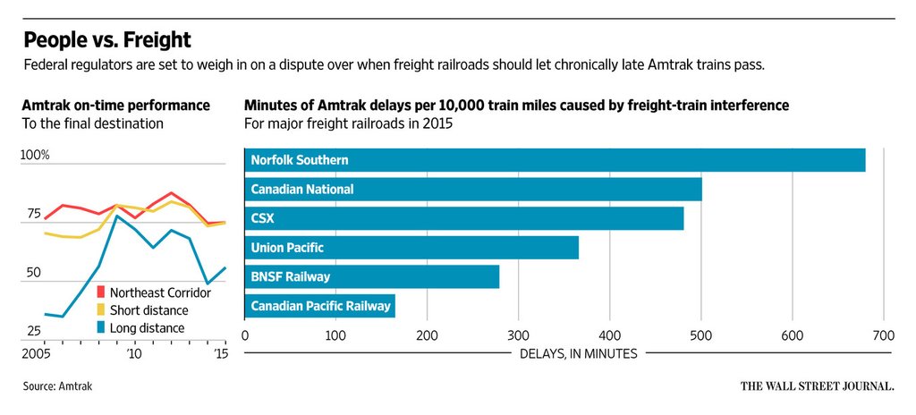
Today’s post is not super complex, but we all know I am a sucker for transit. Especially Amtrak. Back home on the East Coast, it runs both quickly and reliably along the Northeast Corridor and the Keystone Corridor. But as this graphic from the Wall Street Journal shows, that does not quite hold up for the longer distance Amtrak routes. Why? Freight trains.

Long distance is always difficult

Credit for the piece goes to the Wall Street Journal graphics department.

Don’t Go, Big Papi

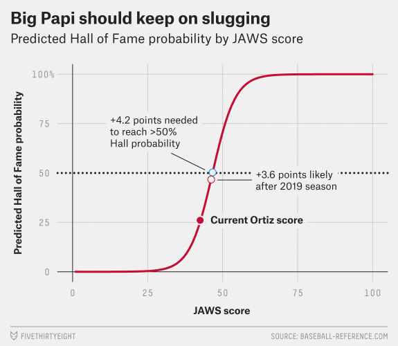
Today’s graphic is not terribly complicated, but it is near and dear to Boston Red Sox fans. This is David Ortiz’s final year as he announced his retirement at the year’s outset. And of so course FiveThirtyEight examined Big Papi’s chances of getting into the Hall of Fame.

Please don't go…
Please don’t go…

Credit for the piece goes to Rob Arthur.

The Decline of the Middle Class in America

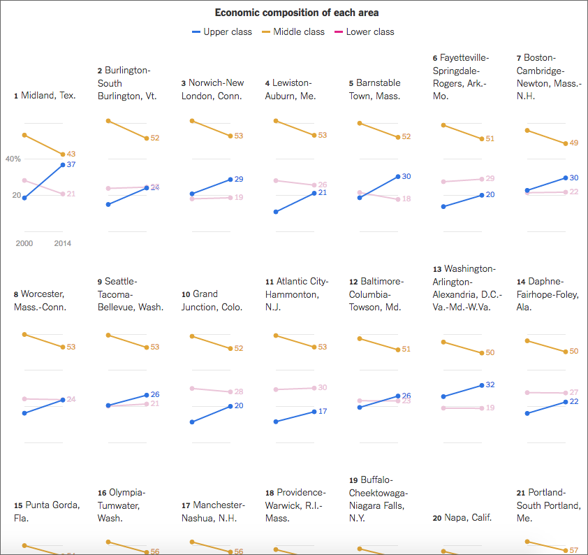
Last week the New York Times published a great piece on the shrinking middle class and they used a series of small multiples to tell the story. They broke the story up into several sections, based on the trends in the data, e.g. in the screenshot below the designer sorted by areas where the middle class fell but upper class rose.

A wide view of the graphic

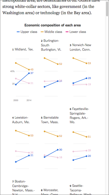
From the responsive design side of things, the piece works well on narrower screens too, because the design choice of small multiple tiles permits the piece to stack and rearrange tiles.

A narrow view of the graphic

Credit for the piece goes to Quoctrung Bui.