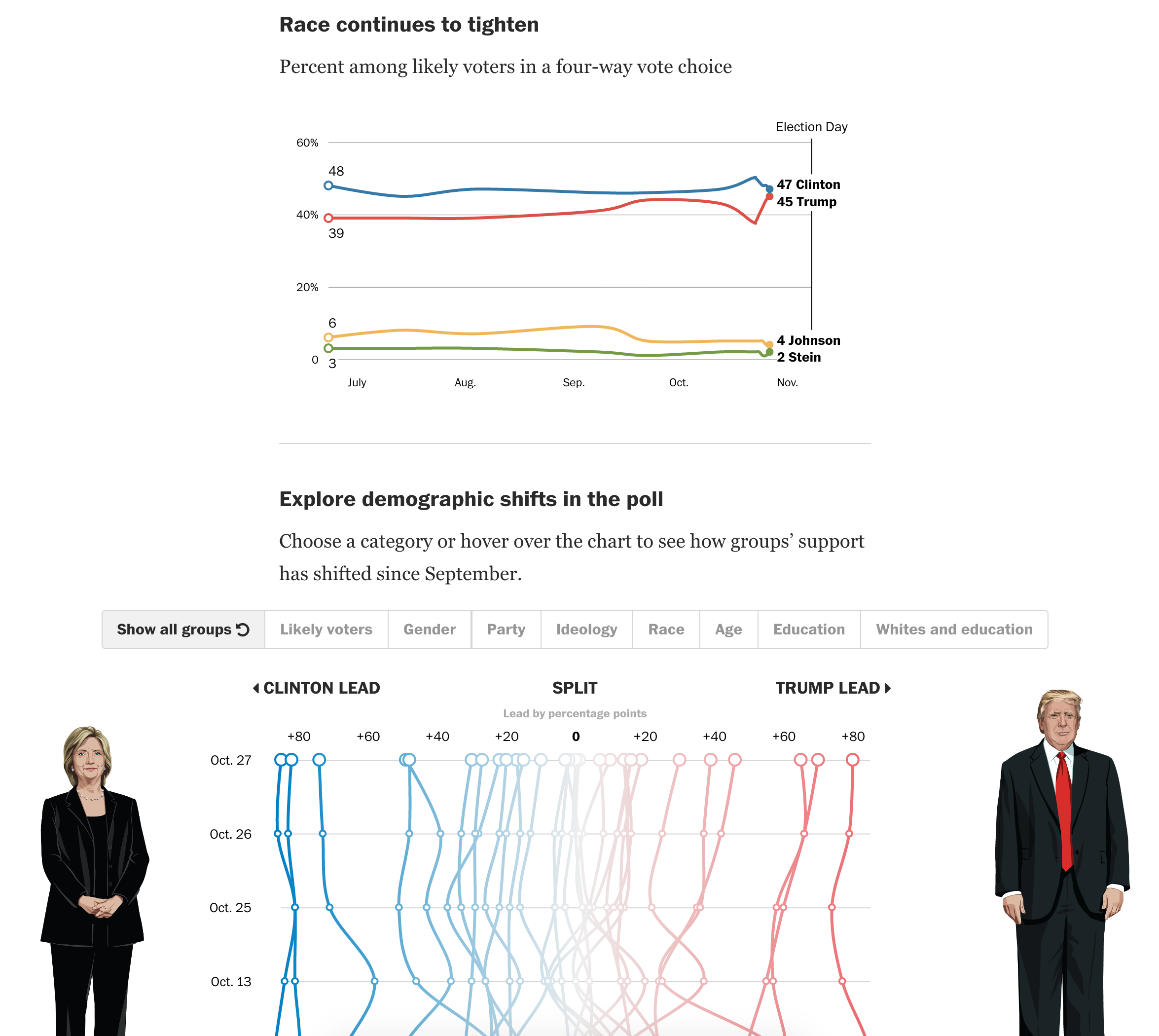
Well the election is next Tuesday, and last Friday and this past weekend was…interesting. So one(ish) week to go, and we are going to turn to a few posts that use data visualisation and graphics to explore topics related to the election.
Today we start with the latest tracking polls, released on Friday. The piece comes from the Washington Post and highlights the closing gap between Clinton and Trump with a sudden spike in Republican candidate support. But what I really like about the piece is the plot below. It displays the 0 axis vertically and plots time with the most recent date at the top. And then support for the various demographics can be filtered by selectable controls above the overall plot.

Of course the really interesting bit is going to be how much this changes in the next seven days. And then what that means for the results when we all wake up on Wednesday morning.
Credit for the piece goes to Chris Alcantara, Kevin Uhrmacher, and Emily Guskin.
Leave a Reply
You must be logged in to post a comment.