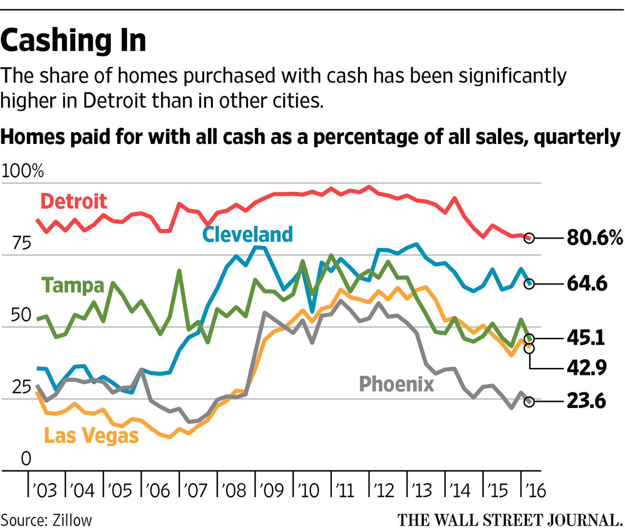
A few weeks ago the Wall Street Journal published a graphic that I thought could use some work. I like line charts, and I think line charts with two or three lines that overlap can be legible. But when I see five in five colours in a small space…well not so much.
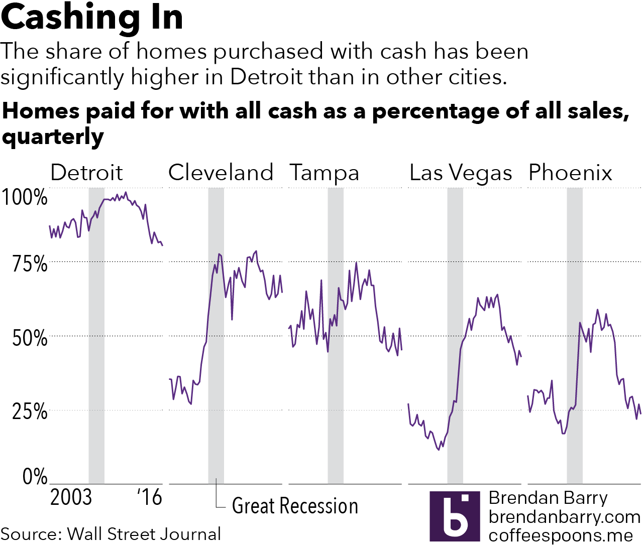
So I spent 45 minutes attempting to rework the graphic. Admittedly, I did not have source data, so I simply traced the lines as they appeared in the graphic. I kept the copy and dimensions and tried to work within those limitations. Clearly I am biased, but I think the work is now a little bit clearer. I also added for context the Great Recession, during which credit tightened, ergo more properties would have been likely purchased with cash. It’s all about the context.
The original:
And my take:
Credit for the original work goes to the Wall Street Journal graphics department.
Leave a Reply
You must be logged in to post a comment.