70+ million people watched the debate last week. But, 2.5 million people have already voted. Me? Well in Pennsylvania there is no early voting, so you queue up on Election Day. But that also means I will have had the full election season to brush up on candidates for president and all the other offices. But what about early voters? Well the Washington Post put together an article last week about the numbers of early voters—hence my figures in the opening—and the amount of information they might have missed.
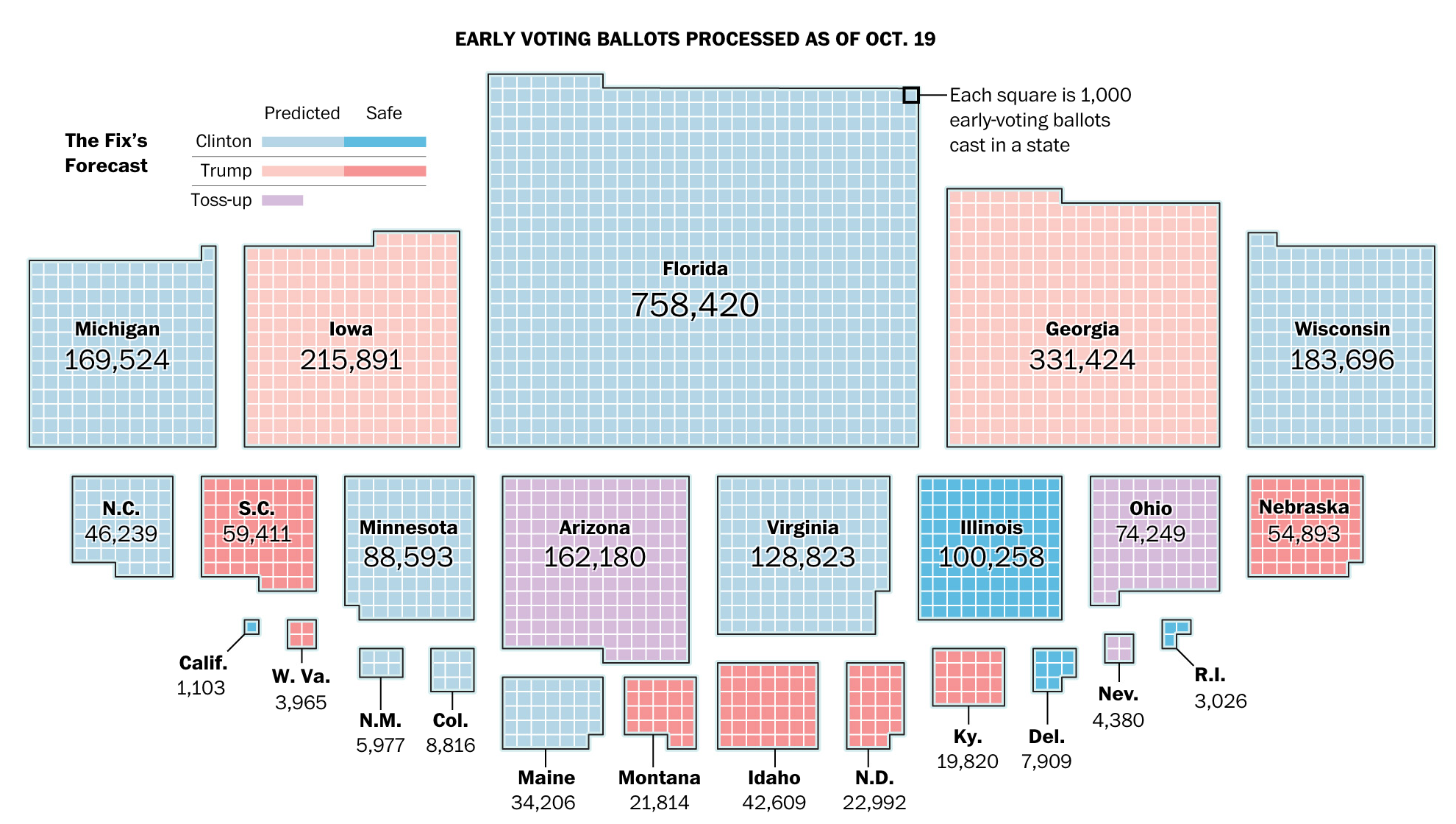
From a design standpoint, it is a really nice article that blends together large centre-piece graphics such as the above to smaller in-line graphics to margin graphics. None are interactive; all are static. But in these cases, users do not need the freedom to interact with the charts. Instead, the designers have selected the points in time or data points more relevant to the story.
Overall the piece is solid work.
Credit for the piece goes to Kevin Uhrmacher and Lazaro Gamio.
Leave a Reply
You must be logged in to post a comment.