Today’s piece comes from the National Journal. It is an interactive bubble chart that compares the educated class of cities in 1980 to those in 2010 (educated meaning the share of population with at least a bachelor’s degree).
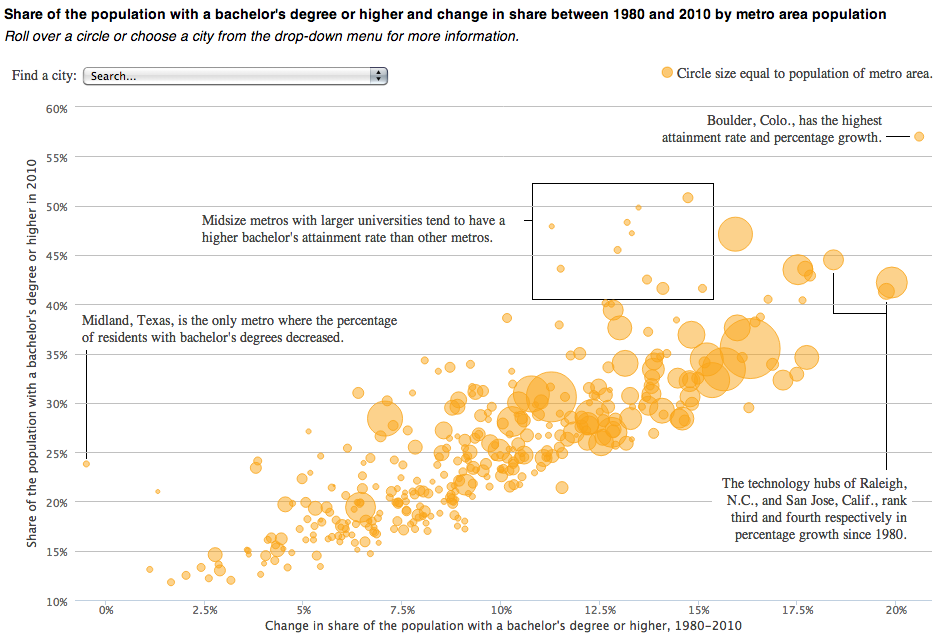
Not a whole lot to say about this one, in a good way. A nice summation at the top with clearly presented data below while annotations on the plot call out particular objects in the series worth noting. And then for those who want to find themselves, a drop down filter at the top allows users to select a particular city.
Credit for the piece goes to Brian McGill and Nancy Cook.
Leave a Reply
You must be logged in to post a comment.