Tag: charting
-
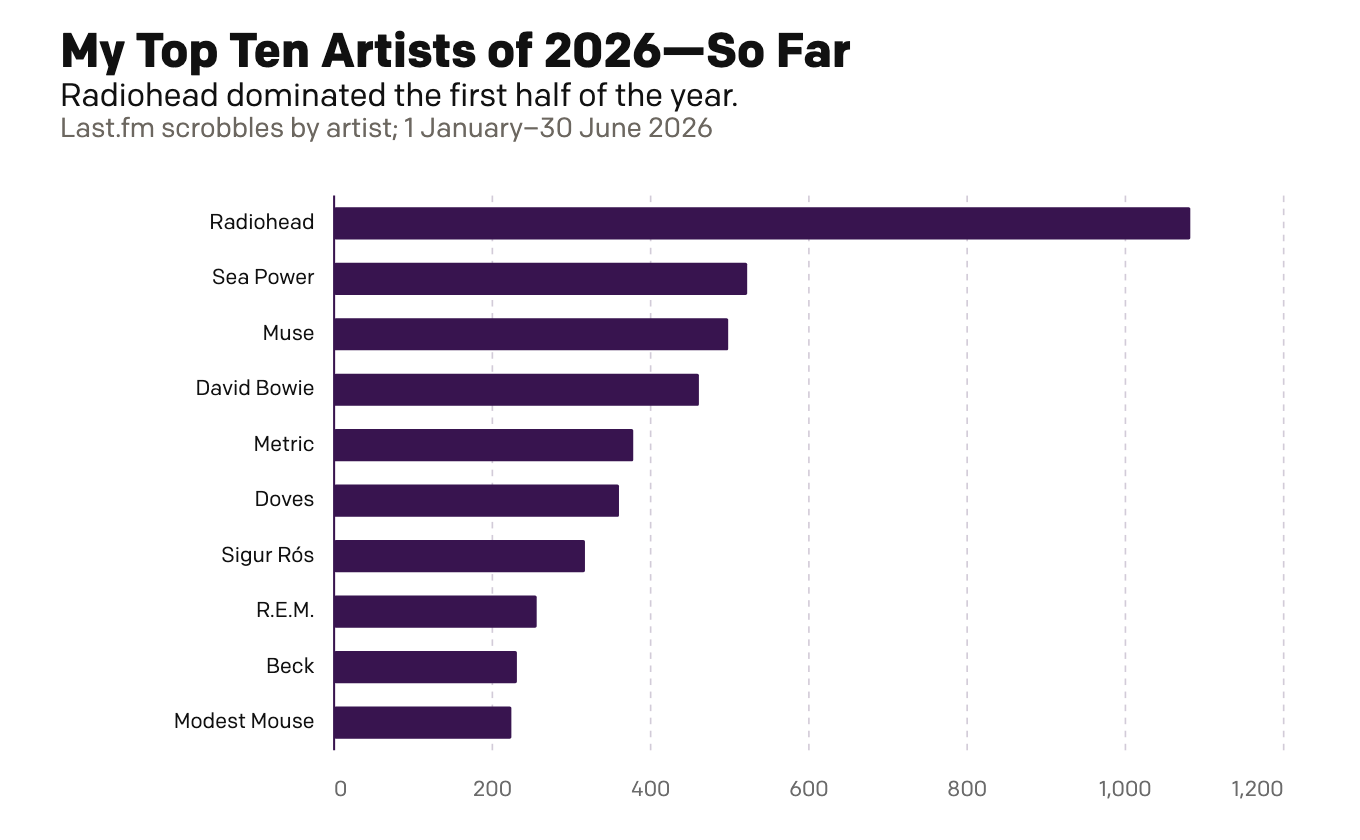
My First Half of Music (Streams)
Because I am headed out of town for several days, today is basically this week’s Friday post—just for fun. Last week I looked at my musical tastes via the vinyl. Today I look at the digital streams of music. This is far less surprising and arguably more representative of my tastes more broadly. Unlike records,…
-
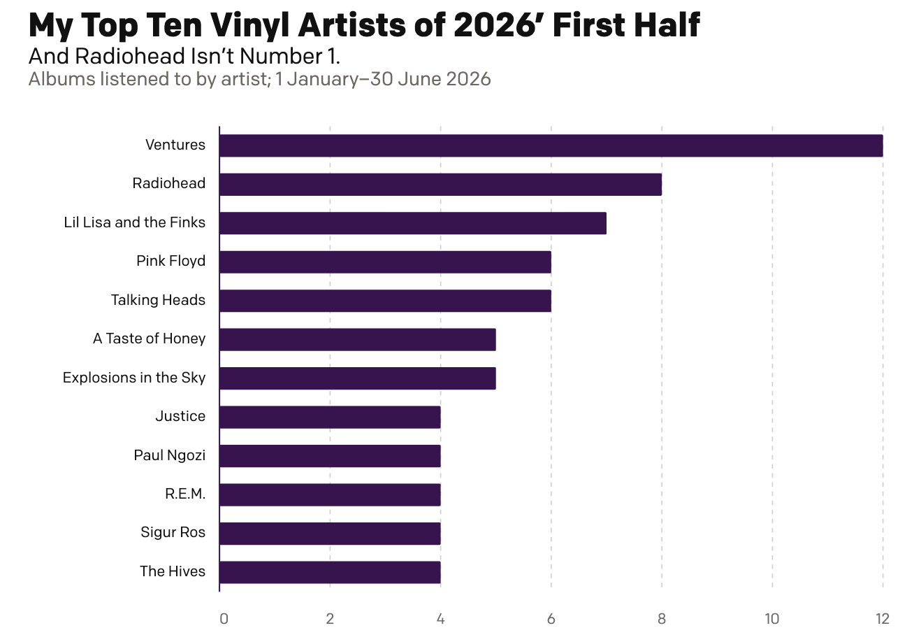
My First Half of Music (Records)
Two Christmases ago, my mother gifted me a record player. Ever since I have been slowly buying records—and then listening to them. And over the last year I have been recording those record plays and with 2026 now half over, I decided to run the numbers and see where I am at. As context, my…
-
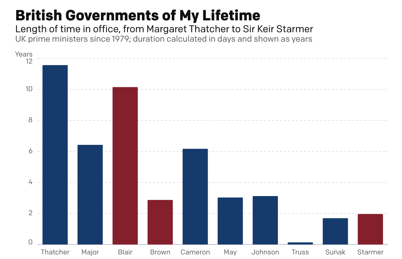
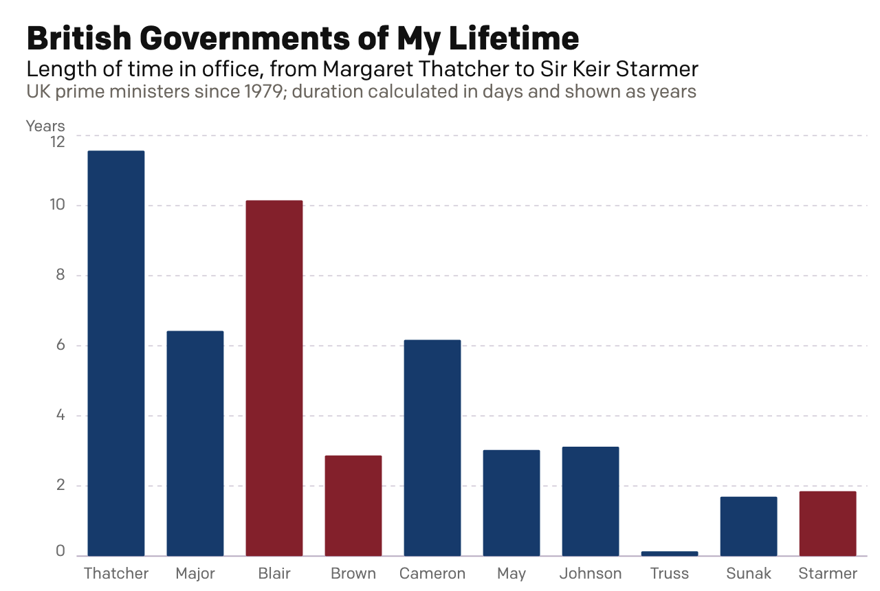
A Dan Miller Coronation?
Six weeks ago I created a small interactive chart on the news that Wes Streeting, the then British health secretary, resigned in order to challenge Prime Minister Sir Keir Starmer for the leadership of the Labour Party. Six weeks hence, Starmer has resigned. Lo and behold, my interactive graphic still works: British Governments of My…
-
Rise of the Nutters
For most of my life I have been interested in British politics. I can recall talking with my mates about Tony Blair’s Prime Minister’s Questions (PMQs) in high school and at university. During the Brexit debate, my American friends would frequently ask me just what was going on across the pond. Through that point in…
-
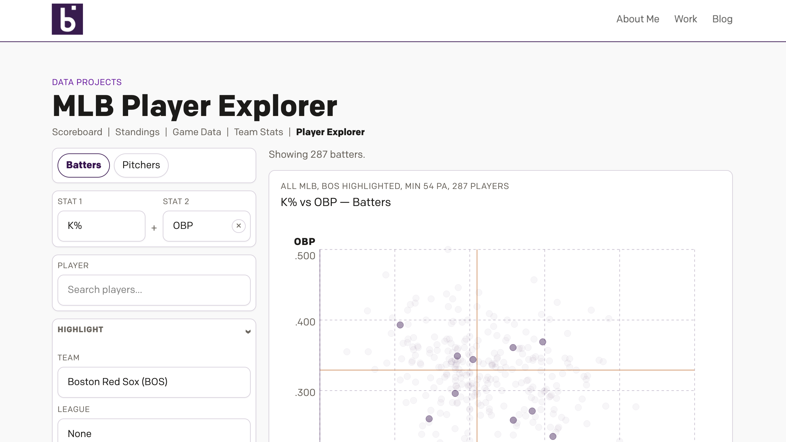
Revenge of the Nerds
This past weekend I thought I would be writing about something else, and perhaps I still will later this week, but for now we turn to the Boston Red Sox firing Alex Cora, their manager; Jason Varitek, beloved Sox icon and in the dugout as game planning and run prevention coach; Ramon Vazquez, bench coach;…
-
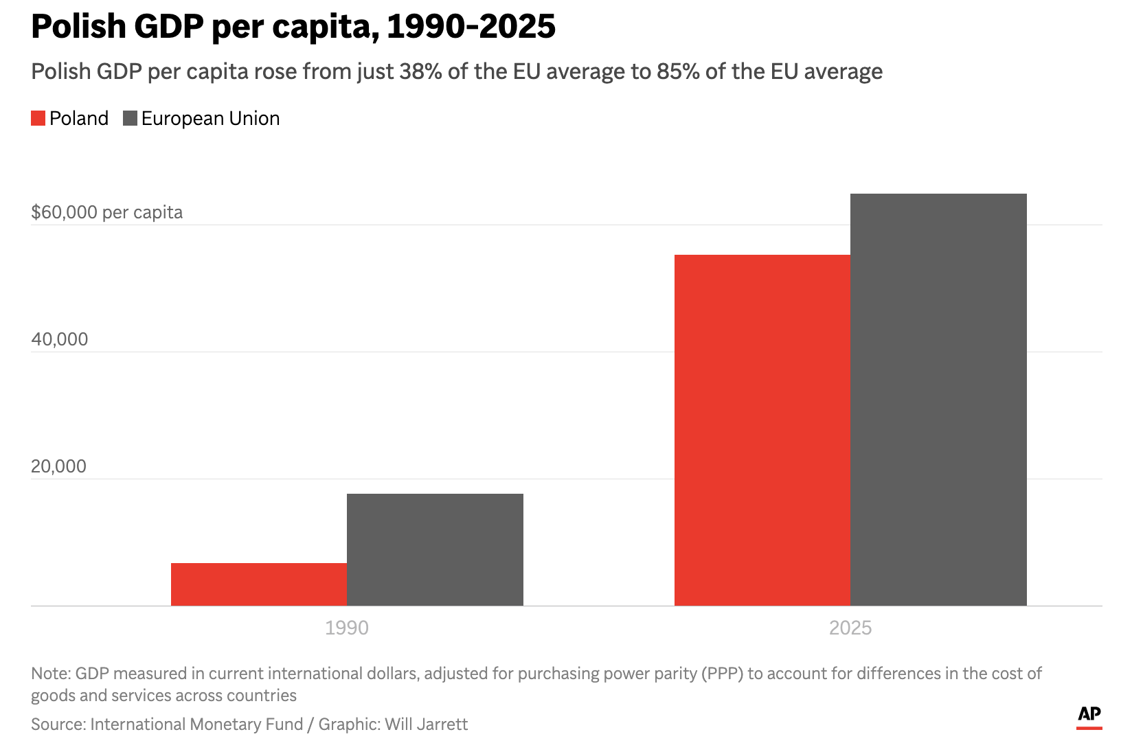
The Axis in Poland
Earlier this week I read an Associated Press (AP) article about Poland’s economic growth since the end of Communism in the former Soviet-bloc state. Generally speaking, things are good in Eastern Europe, though a revanchist Russia to Poland’s east rekindles memories of an earlier era and the disaster after the Molotov–Ribbentrop Pact. The article included…
-
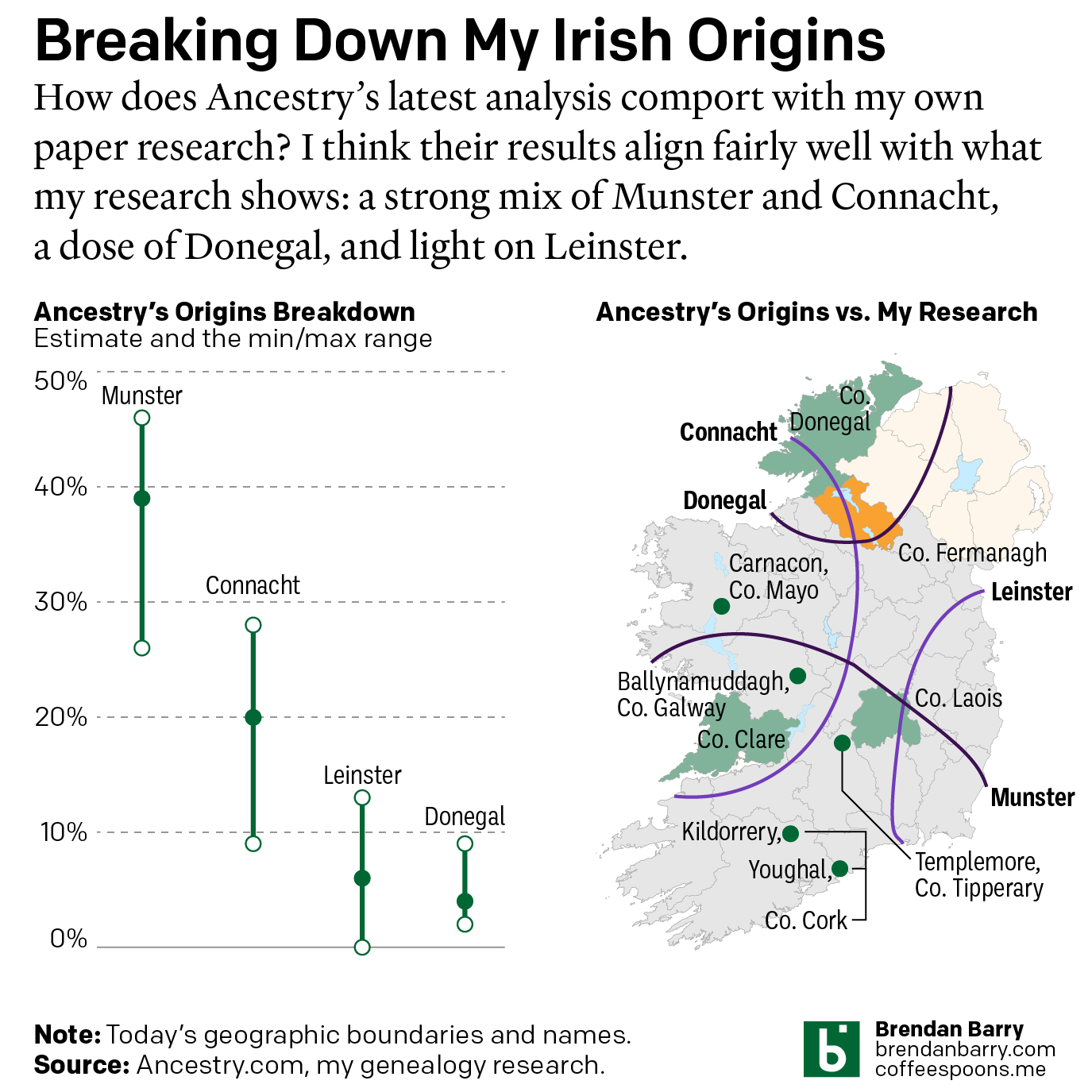
Still Irish
Last October Ancestry.com updated their ethnic origins breakdowns. Longtime readers will know these are not the most useful tools for helping one in their genealogical research. But, if they garner interest in one’s family history and motivate people to explore their own pasts, more power to them. I only encourage those people to dig a…
-
Mission Accomplished
Last weekend the United States and Israel preemptively struck Iran and kicked off a regional war. As I type this Monday morning, the US–Israeli strike forced assassinated the ayatollah and numerous other senior Iranian officials—but this seems to have been anticipated to a degree and the regime quickly retaliated and has delegated roles and responsibilities.…
-
Just a Thought About a Thing That’s Been Nipping at Me
The democratisation of design tools ostensibly allows people to create high-quality graphics. But I think we can all admit to ourselves we see a lot of work that…misses its mark. As a general rule, I do not often post work here by untrained designers. My peers and I have the benefit of education and experience…