More on Those Million Covid-19 Deaths

Yesterday I focused on the big graphic from the New York Times that crossed the full spread of the front/back page. But the graphic was merely the lead graphic for a larger piece. I linked to the online version of the article, but for this post I’m going to stick with the print edition. The article consists of a full-page open then an entire interior spread, all in limited colour. The remainder of the extensive coverage consists of photo essays and interviews that understandably attempt to humanise the data points, after all, each dot from yesterday represented one individual, solitary, human being. That is an important element of a story like this and other national and international tragedies, but we also need to focus on the data and not let the emotion of the story overwhelm our rational and logical analysis.

Sometimes it’s hard to realise we’re in the third year of this pandemic.

From a data visualisation standpoint the first page begins simply enough with a long timeline of the Covid-19 pandemic charting the number of absolute deaths each day. As we looked at yesterday, the absolute deaths tell part of the story. But if we were to have looked at the number of absolute cases in conjunction with the deaths, we could also see how the virus has thus far evolved to be more transmissible but less lethal. Here the number of daily deaths from Omicron surpassed Delta, but fell short of the winter peak in early 2021. But the number of cases exploded with Omicron, making its mortality rate lower. In other words, far more people were getting sick, but as far fewer were dying.

An interesting note is that if you take a look at the online version, there the designers chose a more stylised approach to presenting the data.

All the dots

Here they kept the dot approach and simply stacked and reordered the dots. However, I presume for aesthetic reasons, they kept the stacking loose dots and dropped all the axis lines because it does make for a nice transition from the map to this chart. But they also dropped all headings and descriptors that tell the reader just what they are looking at. These decisions make the chart far less useful as a tool to tell the data-driven element of the story.

There are three annotations that label the number of deaths in New York, the Northeast, and the rest of the United States. But what does the chart say? When are the endpoints for those annotations? And then you can compare the scale of the y-axis of this chart and compare it to the printed version above. A more dramatic scale leads to a more dramatic narrative.

This sort of visual style of flash and fancy transitions over the clear communication of the data is why I find the print piece more compelling and more trustworthy. I find the online version, still useful, but far more lacking and wanting in terms of information design.

The interior spread is where this article shines.

Just a fantastic spread.

From an editorial design standpoint, the symmetry works very well here. It’s a clear presentation and the white space around the graphic blocks lets that content shine as it should in this type of story. Collectively these pieces do a great job telling the story of the pandemic thus far across the nation. The graphics do not need a lot of colour and make do with sparse flash. Annotations call the reader’s attention to salient points and outliers.

Very nice work here.

From a content standpoint, I would be particularly curious if we have robust data for deaths by education level. Earlier this year I recall reading news about a study that said education best correlated to Covid cases, and I would be curious to see if that held true for deaths. Of course these charts do a great job of showing just how effective the vaccines were and remain. They are the best preventative measure we have available to us.

More really nice graphics

Here I disagree with the design decision of how to break down the states into regions. The Census Bureau breaks down the United States into four regions using the same names as in the graphic above. However, if you look closely at the inset map, you will see that Delaware, Maryland, and West Virginia in particular are included as part of the Northeast. (I cannot tell if the District of Columbia is included as part of the Northeast or South.)

Now compare that to the Census Bureau’s definition:

How the government defines US geography

If you ask me to include Delaware and Maryland as part of the Northeast, well, if you’re selling it, I’ll buy it. After all, just because the Census Bureau defines the United States this way does not mean the New York Times has to. Both are connected to the Northeast Corridor via Amtrak and I-95 and are plugged into the Megalopolis economy. Maybe the Potomac should be the demarcation between Northeast and South. But I struggle to understand West Virginia. Before you go and connect it to the Northeast, I would argue that West Virginia has far more in common with the Midwest geographically, economically, and culturally.

More critically, given this issue, it strikes me as a serious problem when the online version of the chart—with the aforementioned issues—does not even include the little inset to highlight this at best unusual regional definition.

Where would you place West Virginia?

And so while I have reservations about the data—how would the data have looked if the states were realigned?—the design of the line charts overall is good.

Again, I am talking about the print version, not that online graphic. I would argue that the above screenshot is barely even a chart and more “data art” or an illustration of data. Consider here, for example, that for the South we have that muted slate blue for the dots, but the spacing and density of the dots leads to areas of lighter slate and darker slate. But a lighter slate means more space between stacked dots and darker slate means a more compact design. A lighter colour therefore pushes the “edge” of the line further up the y-axis and artificially inflates its value, not that we can understand what that value is as the “chart” lacks any sort of y-axis.

Finally the print piece has a set of small multiples breaking down deaths by income in the three largest American cities: New York, Los Angeles, and Chicago. These are just great little charts showing the correlation between income and death from Covid, organised by Zip code.

But this also serves as a stark reminder of just how much better the print piece is over the online version. Because if we take a look at a screenshot from the online article, we have a graphic that addresses all the issues I pointed out earlier.

Why couldn’t the online article kept to this style?

I am left to wonder why the reader of the online version does not have access to this clearer and more accurate representation of the data throughout the piece?

To me this article is a great example of when the print piece far exceeds that of the online version. Content-wise this is a great story that needed to be told this weekend, but design wise we see a significant gap in quality from print to online. Suffice it to say that on Sunday I was very glad I received the print version.

Credit for the piece goes to Sarah Almukhtar, Amy Harmon, Danielle Ivory, Lauren Leatherby, Albert Sun, and Jeremy White.

Substandard Housing in Philadelphia

I took a holiday yesterday and headed down the street to the Philadelphia City Archives, which houses some of the oldest documents dating back to the founding of the colony. But I was there primarily to try and find deeds and property information for my ancestors as part of my genealogy work.

When I walked into the building—the archives moved a few years ago from an older building in University City into this new facility—an interactive exhibit confronted me immediately. Now I did not take the time to really investigate the exhibit, because I anticipated spending the entire day there and wanted to maximise my time.

But there was this one graphic that felt appropriate to share here on Coffeespoons.

Philadelphia’s population crested in the 1950 census, it would decline continually until the 2010 census.

Like a lot of statistical graphics from the mid-20th century we have a single-colour piece because colour printing costs money. It makes use of a stacked bar chart to highlight the share of housing in the city that can be classified as substandard, i.e. dilapidated or without access to a private bath.

The designer chose to separate the nonwhite from the white population on different sides of the date labels, though the scale remains the same. I wonder what would have happened if the nonwhite bars sat immediately below the white bars within each year. That would allow for a more direct comparison of the absolute numbers of housing units.

That would then free up space for a smaller chart dedicated to a comparison of the percentages that are otherwise written as small labels. Because both the absolutes and percentages are important parts of the story here.

The white housing stock increased and the number of substandard units decreased in an absolute sense, leading to a strong decline in percentages.

But with nonwhite housing, the number of substandard units slightly increased, but with larger growth in the sheer number of nonwhite housing units overall, that shrank the overall percentage.

Put it all together and you have significant improvements in white housing, though in an absolute sense there still remain more substandard units for whites than nonwhites. Conversely, we don’t see the same improvements in housing for nonwhites. Rather the improvement from 45% to 35% is due more from the increase in housing units overall. You could therefore argue that nonwhite housing did not improve nearly as much as white housing between 1940 and 1950. Though we need to underline that and say there was indeed improvement.

Anyway, I then went inside and spent several hours looking through deed abstracts. Not sure if those will make it into a post here, but I did have an idea for one over a pint at lunch afterwards.

Credit for the datagraphic goes to some graphics person for some government department.

Credit for the exhibit goes to Talia Greene.

2020 Census Apportionment

Every ten years the United States conducts a census of the entire population living within the United States. My genealogy self uses the federal census as the backbone of my research. But that’s not what it’s really there for. No, it exists to count the people to apportion representation at the federal level (among other reasons).

The founding fathers did not intend for the United States to be a true democracy. They feared the tyranny of mob rule as majority populations are capable of doing and so each level of the government served as a check on the other. The census-counted people elected their representatives for the House, but their senators were chosen by their respective state legislatures. But I digress, because this post is about a piece in the New York Times examining the new census apportionment results.

I received my copy of the Times two Tuesdays ago, so these are photos of the print piece instead of the digital, online editions. The paper landed at my front door with a nice cartogram above the fold.

A cartogram exploded.

Each state consists of squares, each representing one congressional district. This is the first place where I have an issue with the graphic, admittedly a minor one. First we need to look at the graphic’s header, “States That Will Gain or Los Seats in the Next Congress” and then look at the graphic. It’s unclear to me if the squares therefore represent the states today with their numbers of districts, or if we are looking at a reapportioned map. Up in Montana, I know that we are moving from one at-large seat to two seat, and so I can resolve that this is the new apportionment. But I am left wondering if a quick phrase or sentence that declares these represent the 2022 election apportionment and not those of this past decade would be clearer?

Or if you want a graphic treatment, you could have kept all the states grey, but used an unfilled square in those states, like Pennsylvania and Illinois, losing seats, and then a filled square in the states adding seats.

Inside the paper, the article continued and we had a few more graphics. The above graphic served as the foundation for a second graphic that charted the changing number of seats since 1910, when the number of seats was fixed.

Timeline of gains and losses

I really like this graphic. My issue here is more with my mobile that took the picture. Some of these states appear quite light, and they are on the printed page. However, they are not quite as light as these photos make them out to be. That said, could they be darker? Probably. Even in print, the dark grey “no change” instances jump out instead of perhaps falling to the background.

The remaining few graphics are far more straightforward, one isn’t even a graphic technically.

First we have two maps.

Good old primary colours.

Nothing particularly remarkable here. The colours make a lot of sense, with red representing Republicans and blue Democrats. Yellow represents independent commissions and grey is only one state, Pennsylvania, where the legislature is controlled by Republicans and the governorship by Democrats.

Finally we have a table with the raw numbers.

Tables are great for organising information. Do you have a state you’re most curious about, Illinois for example? If so, you can quickly scan down the state column to find the row and then over to the column of interest. What tables don’t allow you to do is quickly identify any visual patterns. Here the designers chose to shade the cells based on positive/negative changes, but that’s not highlighting a pattern.

Overall, this was a really strong piece from the Times. With just a few language tweaks on the front page, this would be superb.

Credit for the piece goes to Weyi Cai and the New York Times graphics department.

Can We Pop Our Political Bubbles?

It’s no secret that Americans—and likely at least Western communities more broadly—live in bubbles, one of which being our political bubbles. And so I want to thank one of my mates for sending me the link to this opinion piece about political bubbles from the New York Times.

The piece is fairly short, but begins with an interactive piece that allows you to plot your address and examine whether or not you live in a political bubble. Using my flat in Philadelphia, the map shows lots of little blue dots, representing Democratic voters, near the marker for my address and comparatively few red dots for Republicans.

An island of blue in a sea of red.

If you then look a bit more broadly, you can see that by summing up the dots, my geographic bubble is largely a political bubble, as only 13% of my neighbours are Republicans. Not terribly surprising for a Democratic city.

A certain lack of diversity in political thought.

And while the piece does then zoom back out a wee bit, it tries to show me that I don’t live too far from a politically integrated bubble. Except in this case, it’s across a decent sized river and getting there isn’t the easiest thing in the world. I’m not headed to Gloucester anytime soon.

Things are better in Jersey?

These interactives serve the purpose of drawing the user into the article, which continues explaining some of the causes of this political segregation, by both policy, redlining, and personal choice, lifestyle. The approach works, because it gives us the most relatable story in a large dataset, ourselves. We’re now emotionally or intellectually invested in the idea, in this case political bubbles, and want to learn all about it. Because the more you know…

The piece uses the same type of map to showcase the bubbles more broadly from the Bay Area to the plains of Wyoming. (No surprises in the nature of those political bubbles.) It wraps up by showing how politicians can use the geography of our political bubbles to create political geographies via gerrymandering that shore up their political careers by creating safe districts. The authors use a gerrymandered northeastern Ohio district that encompasses two cities, Cleveland and Akron, to make that point.

That’s in part why I’m in favour of apolitical, independent boundary commissions to create more competitive congressional districts. Personally, I would have been fascinated to see how Pennsylvania’s congressional districts, redrawn in 2018 by the Pennsylvania Supreme Court, after the court found the gerrymandered districts of 2011 unconstitutional, created political competition between parties instead of within parties. But I digress.

And then for kicks, I looked at how my flat in Chicago compared.

Less island of blue and sea of red, because a lake of blue water alters that geography.

Not surprisingly, my neighbourhood in Lakeview was another political bubble, though this one even more Democratic than my current one.

Lakeview is even more Democratic than Logan Square, Philly’s Logan Square that is.

But if I had wanted to move to an integrated political bubble, instead of Philadelphia, I could have moved to…Jefferson Park.

Because everyone can agree Polish food is good food.

Credit for the piece goes to Gus Wezerek, Ryan D. Enos and Jacob Brown.

Choropleths…Again

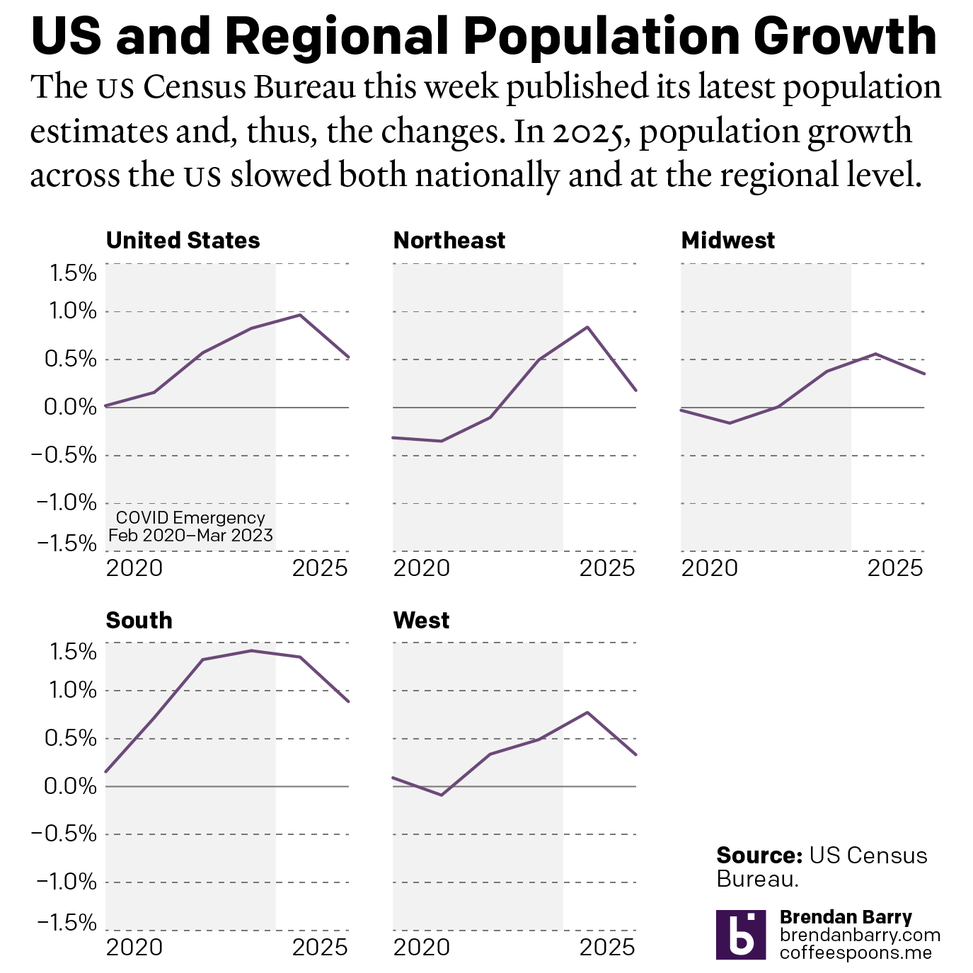
Admittedly, I was trying to find a data set for a piece, but couldn’t find one. So instead for today’s post I’ll turn to something that’s been sitting in my bookmarks for a little while now. It’s a choropleth map from the US Census Bureau looking at population change between the censuses.

Unequal growth

The reason I have it bookmarked is for the apportionment map, but I will save apportionment for another post because, well, it’s complicated. But map colours are a thing we’ve been discussing of late and we can extend that conversation here.

What I find interesting about this map is how they used a very dark blue-grey colour for their positive growth and an orange that is a fair bit brighter for negative growth, or population loss. And because of that difference in brightness, the orange really jumps out at you.

To be fair, that’s ideal if you’re trying to talk about where state populations are shrinking, because it focuses attention on declines. But, if you’re trying to present a more neutral position, like this seems to be, that colour choice might not be ideal.

Another issue is that if you look at the legend it simply says loss for that orange. But, look above and you’ll see four bins clearly delimited by ranges of percents for the positive growth. If we are trying to present a more neutral story, the use of the orange places it visually somewhere near the top of that blue-grey spectrum.

If you look at the percentages, however, Michigan’s population decline was 0.6% and Puerto Rico’s 2.2%. If this map used a legend that treated positive and negative growth equally, you would place that one state and one should-be state in a presumably light orange. The scale of their negative growth is equal to something like Ohio, which is in the lightest blue-grey available.

Consequently, this map is a little bit misleading when it comes to negative growth.

Credit for the piece goes to the Census Bureau graphics team.

Another Look at 500,000

Yesterday we looked at how the New York Times covered the deaths of 500,000 Americans due to Covid-19. But I also read another article, this by the BBC, that attempted to capture the scale of the tragedy.

Instead of looking at the deaths in a timeline, the BBC approached it from a cumulative impact, i.e. 500,000 dead all in one go. To do this, they started with an illustration of 1,000 people. Then they zoomed out and showed how that group of 1,000 fit into a broader picture of 500,000.

We’re going to take a look at this in reverse, starting with the 500,000.

Half a statistic.

I think this part of the graphic works well. There’s just enough resolution to see individual pixels in the smaller squares, connecting us to the people. And of course the number 500 stacks nicely.

My quibble here might be whether the text overlay masks 8,000 people. Initially, I thought the design was akin to hollow square, but when I looked closer I could see the faint grey shapes of the boxes behind a white overlay. Perhaps it could be a bit clearer if the text fell at the end of all the boxes?

But overall, this part works well. So now let’s look at the top.

1,000 tragedies

This is where I have some issues.

When I first saw this, my eyes immediately went to the visual patterns. On the left and right there are rivers or columns of what look like guys in white t-shirts. Of course, once I focused on those, I saw other repeated patterns, the guy in the black jacket with his arms bent out, hands on his hips. The person in the wheelchair occupies a different amount of area and has a distinct shape and so that stood out too.

Upon even closer inspection, I noticed the pattern began to repeat itself. Every other line repeated itself and with the wheelchair person it was easy to see the images were sometimes just flipped to look different.

Now, allow me to let you in on a secret, unless you gave a designer a budget of infinite time, they wouldn’t illustrate 1,000 actual people to fill this box. We don’t have time for that. And I’ll also admit that not all designers are good illustrators—myself first and foremost. A good design team for an organisation that uses illustration should have either a full-time illustrator, or a designer who can capably illustrate things.

But this gets to my problem with the graphic. I normally can distance myself from reading a piece to critiquing it. But here, I immediately fixated on the illustrations, which is not a good sign.

There are three things I think that could have been done. The first two are relatively simple fixes whilst the third is a bit grander in scope.

First, I wonder if a little more time could have been spent with the illustrations. For one, white t-shirt guy, I don’t see his illustration reused, so why not change the colour of his t-shirt. Maybe in some instances make it purple, or orange, or some other colour. I think re-colouring the outfits of the people could actually solve this problem a good bit.

But second, if the patterns still appear visible to readers, mix it up a bit. I understand the lack of desire to spend time creating an individualised row for each row. Crafting each row person by person probably is out of the time requirements—though maybe the people above the designer(s) should know that content takes time to create. So what about repeating smaller blocks? I counted 20 rows, which means there should be 50 people per row. Make each row about ten blocks, and have several different blocks from which you can choose. Ideally, you have more blocks than you need per row, so not all figures are repeated, but if constrained, just make sure that no two rows have the same alignment of blocks.

Thirdly, and here’s the one that would really have required more time for the designer to do their job, make the illustrations meaningful. In a broad sense, we do have some statistics on the deaths in the United States. According to the CDC, 63% of deaths have been by white non-Hispanics, 15% by Black non-Hispanics, and 12% by Hispanic/Latino, 4% by Asian Americans, 1% by Native Americans, 0.3% by Hawaiian and Pacific Islander, and 4% by multiple non-Hispanic. Using those numbers, we would need 630 obviously white illustrations, 150 obviously Black, and so on.

If the designer had infinite time, the illustrations could also be made to try and capture age as well. Older people have been hit harder by this pandemic, and the illustrations could skew to cover that cohort. In other words, few young people. According to the CDC, fewer than 5% of deaths have been by people aged under 40. In other words, no baby illustrations needed.

That’s not to say babies haven’t died—87 deaths of people between 0 and 4 have been reported—but that when creating a representative average, they can be omitted, because that’s less than 0.1%, or not even 1 out of 1000.

To reiterate though, that third concept would take time to properly execute. And it would also require the skills to execute it properly. And I am no illustrator, so could I draw enough representative people to fake 1,000? Sure, but time and money.

The first two options are probably the most effective given I’d bet this was a piece thought up with little time to spare.

Credit for the piece goes to the BBC graphics team.

Biden’s Cabinet

Note: I wanted this to go up on Inauguration Day, but I had some server issues last week. And while I got everything back for Friday and Monday, I didn’t want to wait too long to post this. You’ll note at the end that I have questions about General Austin and whether he could be confirmed as Defence Secretary. Spoiler: He was.

Today is Inauguration Day and at noon, President Trump returns to being a citizen and Joe Biden assumes the office of the presidency. He comes to office with arguably the most diverse cabinet in American history supporting him and his agenda.

CNN took a look at that diversity with this piece, which uses an interactive, animated stacked bar chart.

The proposed cabinet vs. the US ethnic breakdown

I took a screenshot at the ethnic/racial diversity. At the top, each bar represents one member of cabinet who you can reveal after mousing over the bar. Below is a stacked bar chart showing the racial makeup of the United States. You can see how it does resemble, and in some cases exceeds, the diversity of the broader United States.

One thing to note, however, is that we see 26 members of Cabinet. Some of those are the heads of the big executive departments like Treasury and Defence. But I’m not certain everyone is technically a cabinet-level position, e.g. Celia Rouse, Chair of the Council of Economic Advisors. It could be that the position is being elevated to cabinet level like John Kerry’s role as climate envoy. And if I just missed the press announcement, that’s on me. But that could affect the overall numbers.

Regardless, the nominated cabinet is more diverse than the previous two administrations as the CNN piece also shows.

The proposed cabinet vs. the preceding inaugural cabinets

I should point out that usually an incoming administration usually has a few of its national security positions already confirmed or confirmed on the first day, e.g. Defence and State. However, the Republican Senate, obsessed with the lie of a fraudulent election, has only just begun to start the confirmation process. In fact, as of late last night, only Avril Haines has been confirmed by the Senate (84–10) for Director of National Intelligence.

Furthermore, almost every administration has one or two nominations that fail to pass the Senate. George W Bush had Linda Chavez, Barack Obama had Tom Daschle, and Donald Trump had Andrew Puzder, just to give one from each of the last three administrations.

With a 50–50 Senate, I would expect there to be a few nominees who fail to make it over the line. Austin could be one, there appears to be some bipartisan agreement that we ought not nominate recent military officials as civilian heads of said military. Another to keep an eye out for is Neera Tanden. She riles conservatives and angers Bernie Sanders supporters, so whether the Senate will confirm her as Director of the Office of Management and Budget remains an open question in my mind.

Credit for the piece goes to Priya Krishnakumar, Catherine E. Shoichet, Janie Boschma and Kenneth Uzquiano.

Axis Lines in Charts

The British election campaign is wrapping up as it heads towards the general election on Thursday. I haven’t covered it much here, but this piece from the BBC has been at the back of my mind. And not so much for the content, but strictly the design.

In terms of content, the article stems from a question asked in a debate about income levels and where they fall relative to the rest of the population. A man rejected a Labour party proposal for an increase in taxes on those earning more than £80,000 per annum, saying that as someone who earned more than that amount he was “not even in the top 5%, not even the top 50”.

The BBC looked at the data and found that actually the man was certainly within the top 50% and likely in the top 5%, as they earn more than £75,300 per annum. Here in the States, many Americans cannot place their incomes within the actual spreads of income. The income gap here is severe and growing.  But, I want to look at the charts the BBC made to illustrate its points.

The most important is this line chart, which shows the income level and how it fits among the percentages of the population.

Are things lining up? It's tough to say.
Are things lining up? It’s tough to say.

I am often in favour of minimal axis lines and labelling. Too many labels and explicit data points begin to subtract from the visual representation or comparison of the data. If you need to be able to reference a specific data point for a specific point on the curve, you need a table, not a chart.

However, there is utility in having some guideposts as to what income levels fit into what ranges. And so I am left to wonder, why not add some axis lines. Here I took the original graphic file and drew some grey lines.

Better…
Better…

Of course, I prefer the dotted or dashed line approach. The difference in line style provides some additional contrast to the plotted series. And in this case, where the series is a thin but coloured line, the interruptions in the solidity of the axis lines makes it easier to distinguish them from the data.

Better still.
Better still.

But the article also has another chart, a bar chart, that looks at average weekly incomes across different regions of the United Kingdom. (Not surprisingly, London has the highest average.) Like the line chart, this bar chart does not use any axis labels. But what makes this one even more difficult is that the solid black line that we can use in the line charts above to plot out the maximum for 180,000 is not there. Instead we simply have a string of numbers at the bottom for which we need to guess where they fall.

Here we don't even a solid line to take us out to 700.
Here we don’t even a solid line to take us out to 700.

If we assume that the 700 value is at the centre of the text, we can draw some dotted grey lines atop the existing graphic. And now quite clearly we can get a better sense of which regions fall in which ranges of income.

We could have also tried the solid line approach.

But we still have this mess of black digits at the bottom of the graphic. And after 50, the numbers begin to run into each other. It is implied that we are looking at increments of 50, but a little more spacing would have helped. Or, we could simply keep the values at the hundreds and, if necessary, not label the lines at the 50s. Like so.

Much easier to read
Much easier to read

The last bit I would redo in the bar chart is the order of the regions. Unless there is some particular reason for ordering these regions as they are—you could partly argue they are from north to south, but then Scotland would be at the top of the list—they appear an arbitrary lot. I would have sorted them maybe from greatest to least or vice versa. But that bit was outside my ability to do this morning.

So in short, while you don’t want to overcrowd a chart with axis lines and labelling, you still need a few to make it easier for the user to make those visual comparisons.

Credit for the original pieces goes to the BBC graphics department.

The Shifting Suburbs

Last we looked at the revenge of the flyover states, the idea that smaller cities in swing states are trending Republican and defeating the growing Democratic majority in big cities. This week I want to take a look at something a few weeks back, a piece from CityLab about the elections in Virginia, Kentucky, and Mississippi.

There’s nothing radical in this piece. Instead, it’s some solid uses of line charts and bar charts (though I still don’t generally love them stacked). The big flashy graphic was this, a map of Virginia’s state legislative districts, but mapped not by party but by population density.

Democrats now control a majority of these seats.

It classified districts by how how urban, suburban, or rural (or parts thereof) each district was. Of course the premise of the article is that the suburbs are becoming increasingly Democratic and rural areas increasingly Republican.

But it all goes to show that 2020 is going to be a very polarised year.

Credit for the piece goes to David Montgomery.

Urban Heat Islands

Yesterday was the first day of 32º+C (90º+F) in Philadelphia in October in 78 years. Gross. But it made me remember this piece last month from NPR that looked at the correlation between extreme urban heat islands and areas of urban poverty. In addition to the narrative—well worth the read—the piece makes use of choropleths for various US cities to explore said relationship.

My neighbourhood's not bad, but thankfully I live next to a park.
My neighbourhood’s not bad, but thankfully I live next to a park.

As graphics go, these are effective. I don’t love the pure gradient from minimum to maximum, however, my bigger point is about the use of the choropleth compared to perhaps a scatter plot. In these graphics that are trying to show a correlation between impoverished districts and extreme heat, I wonder if a more technical scatterplot showing correlation would be effective.

Another approach could be to map the actual strength of the correlation. What if the designers had created a metric or value to capture the average relationship between income and heat. In that case, each neighbourhood could be mapped as how far above or below that value they are. Because here, the user is forced to mentally transpose the one map atop the other, which is not easy.

For those of you from Chicago, that city is rated as weak or no correlation to the moderately correlated Philadelphia.

I lived near the lake for eight years, and that does a great deal for mitigating temperature extremes.

Granted, that kind of scatterplot probably requires more explanation, and the user cannot quickly find their local neighbourhood, but the graphics could show the correlation more clearly that way.

Finally, it goes almost without saying that I do not love the red/green colour palette. I would have preferred a more colour-blind friendly red/blue or green/purple. Ultimately though, a clearer top label would obviate the need for any colour differentiation at all. The same colour could be used for each metric since they never directly interact.

Overall this is a strong piece and speaks to an important topic. But the graphics could be a wee bit more effective with just a few tweaks.

Credit for the piece goes to Meg Anderson and Sean McMinn.