The Washington Post published this dot plot graphic to explore inequality in household income across numerous American cities.
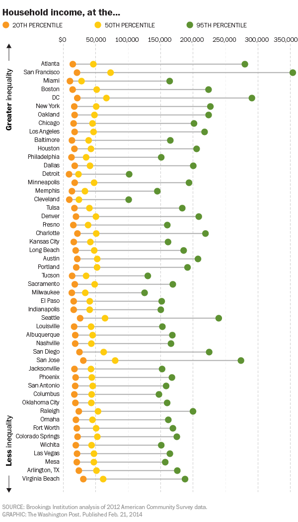
The chart, as most dot plots do, does a good job of showing where several distinct points within a set fall within the entire range of data. Or to put it into other words, where do the poorest, the richest, and the most middlest households in Philadelphia fall within all Philadelphia households? The data is interesting because you will begin to uncover some significant outliers. For example, by quick glance, the 50th percentile in both Detroit and Cleveland earn less than the 20th percentile in San Jose.
Credit for the piece goes to the Washington Post graphics department.
Leave a Reply
You must be logged in to post a comment.