Tag: information design
-
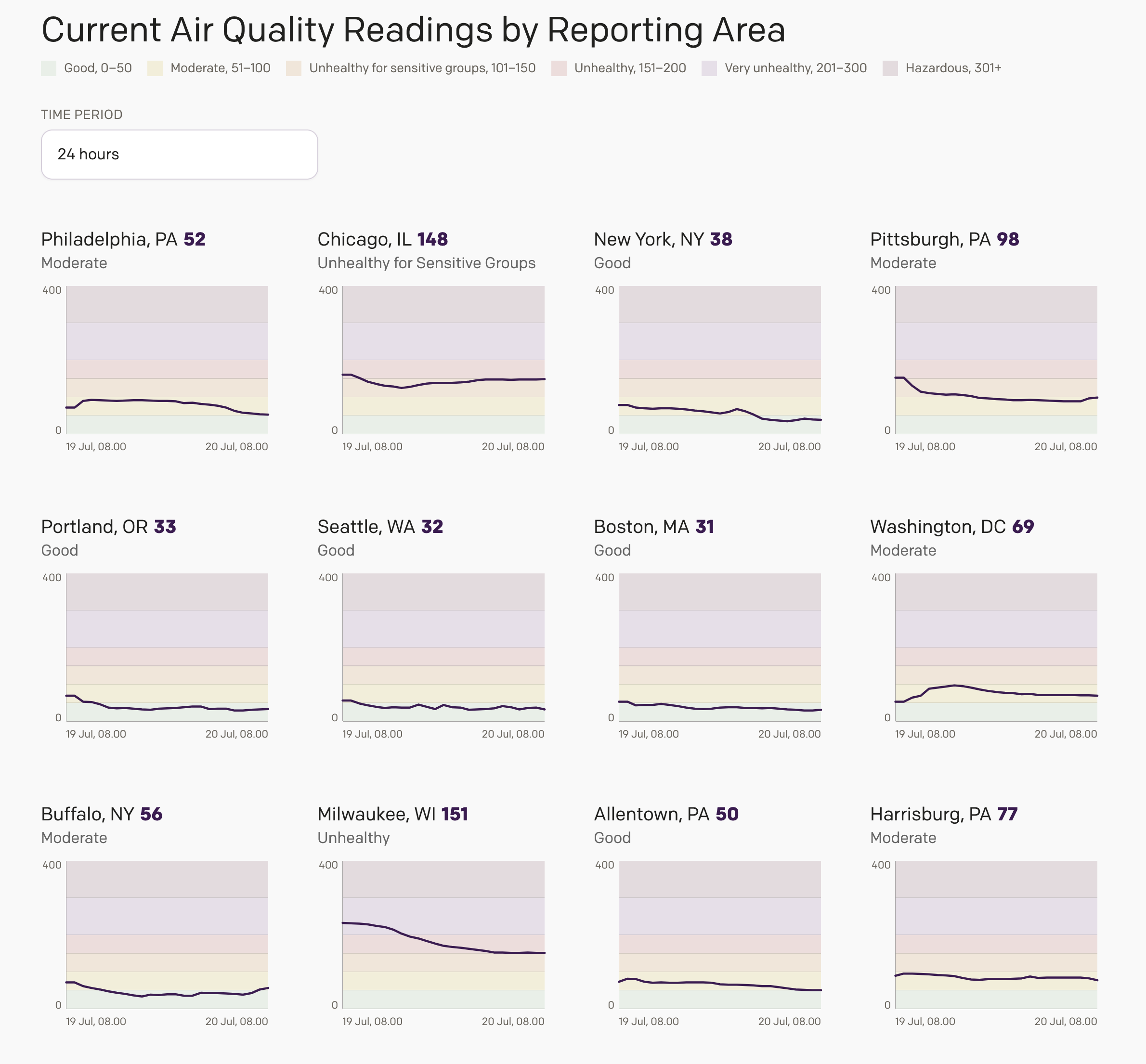
Smoke Here, Smoke There, Smoke Was (Almost) Everywhere
Friday I wrote about an interactive air quality web application I designed for my website after seeing a similar type of dynamically generated graphic in my local rag, the Philadelphia Inquirer. I did not have a lot of time to finish the project, and so it lacked the planned overview page, where I intended to…
-
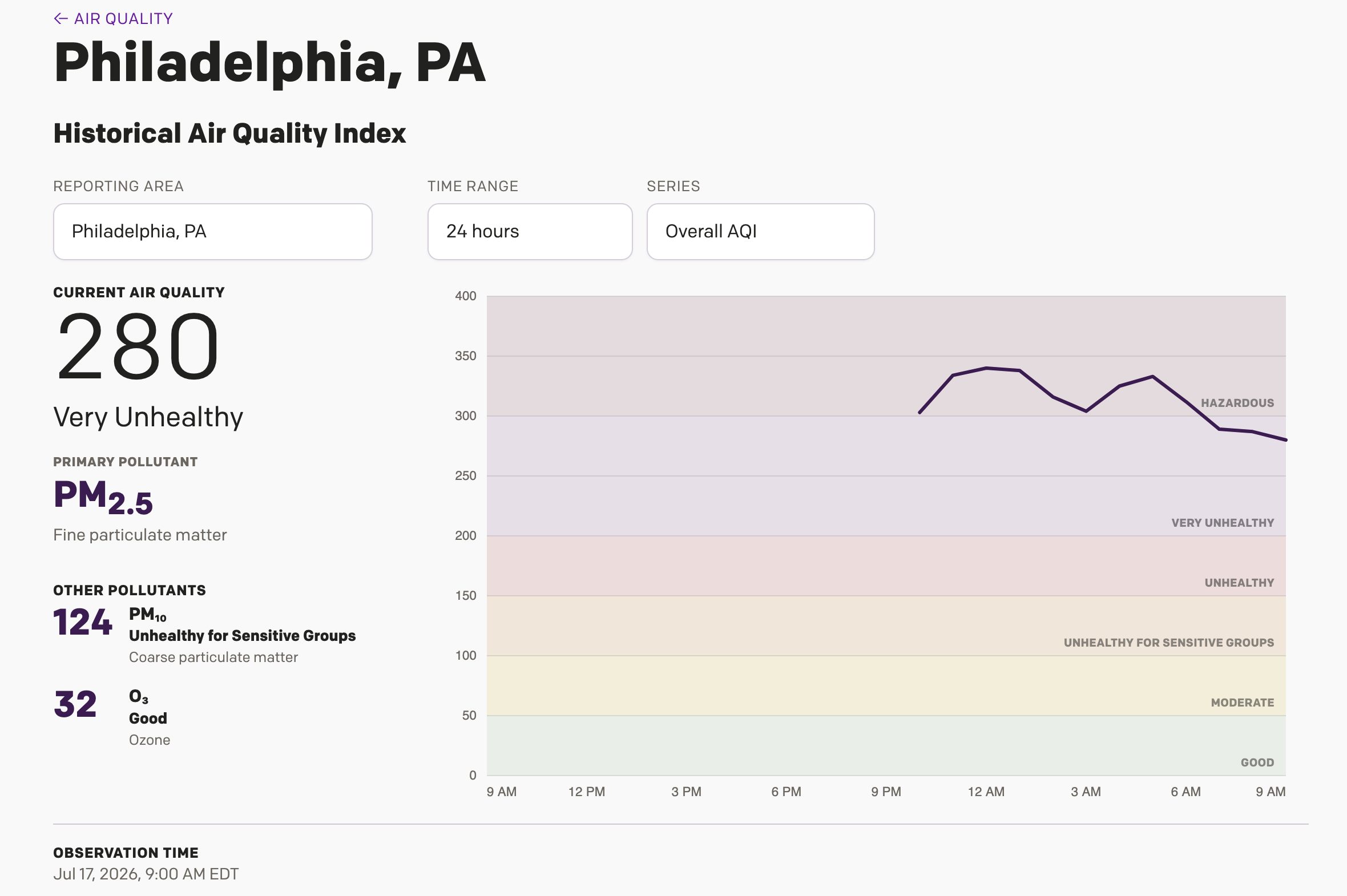
Is It Always Smoky in Philadelphia?
Yesterday I wrote about a Philadelphia Inquirer article, which included an interactive display showing different monitoring stations around the Philadelphia area cataloguing just how bad the Minnesota/Canadian wildfire smoke is in the region. I noted during my piece that it was unclear if the little bars were actually recording the AQI values or just a…
-
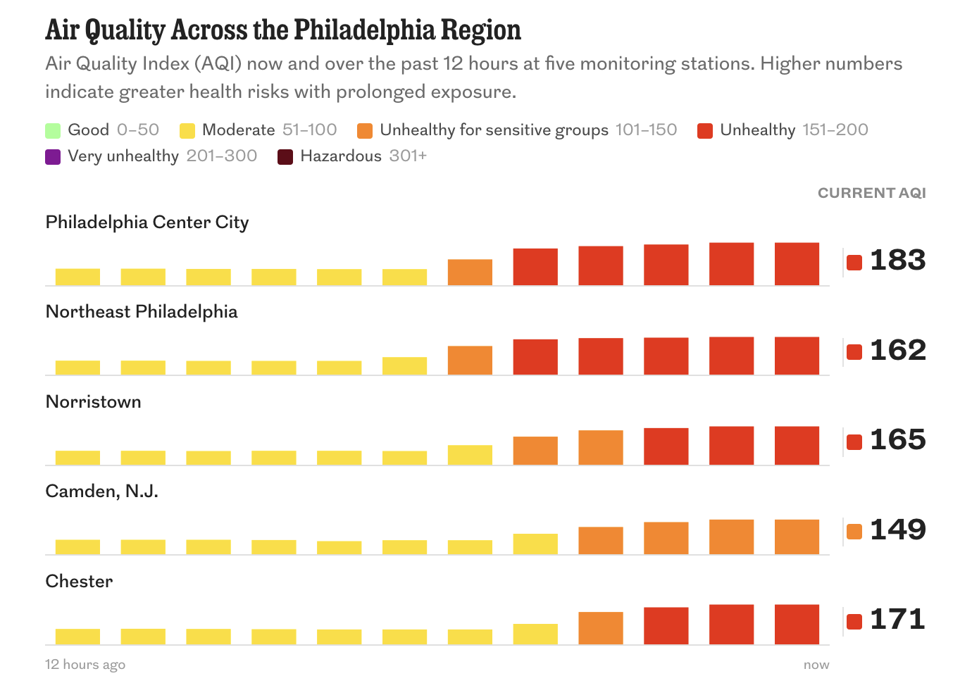
I Prefer My Smoke in My Scotch
Another July day, another heatwave in Philadelphia. But this time we have the added bonus of Canadian wildfire smoke—apparently we call them wildfires and not forest fires now? Just last summer the US administration pointed the finger at Canada for not doing more to prevent and contain these wildfires, but I would humbly suggest that…
-
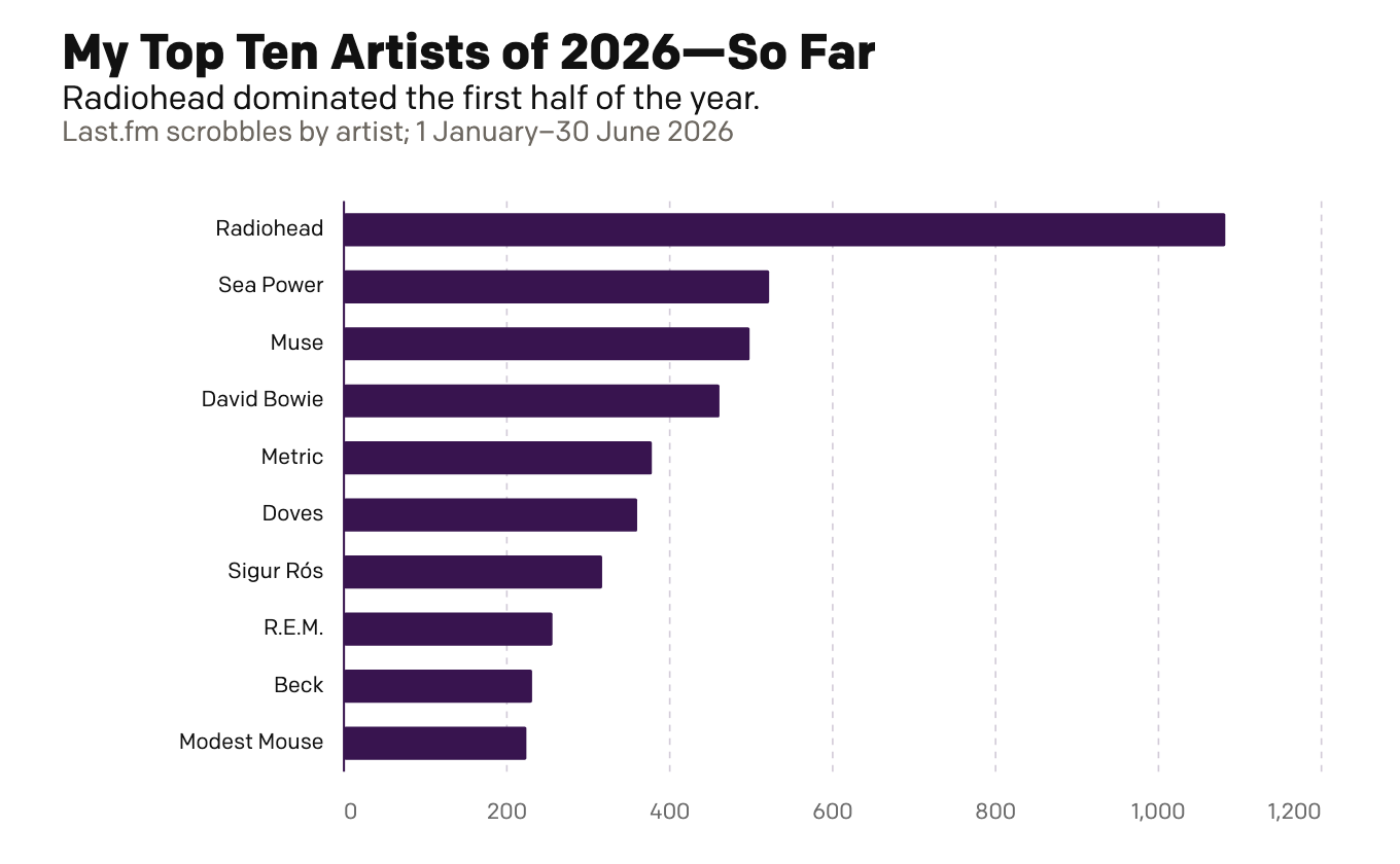
My First Half of Music (Streams)
Because I am headed out of town for several days, today is basically this week’s Friday post—just for fun. Last week I looked at my musical tastes via the vinyl. Today I look at the digital streams of music. This is far less surprising and arguably more representative of my tastes more broadly. Unlike records,…
-
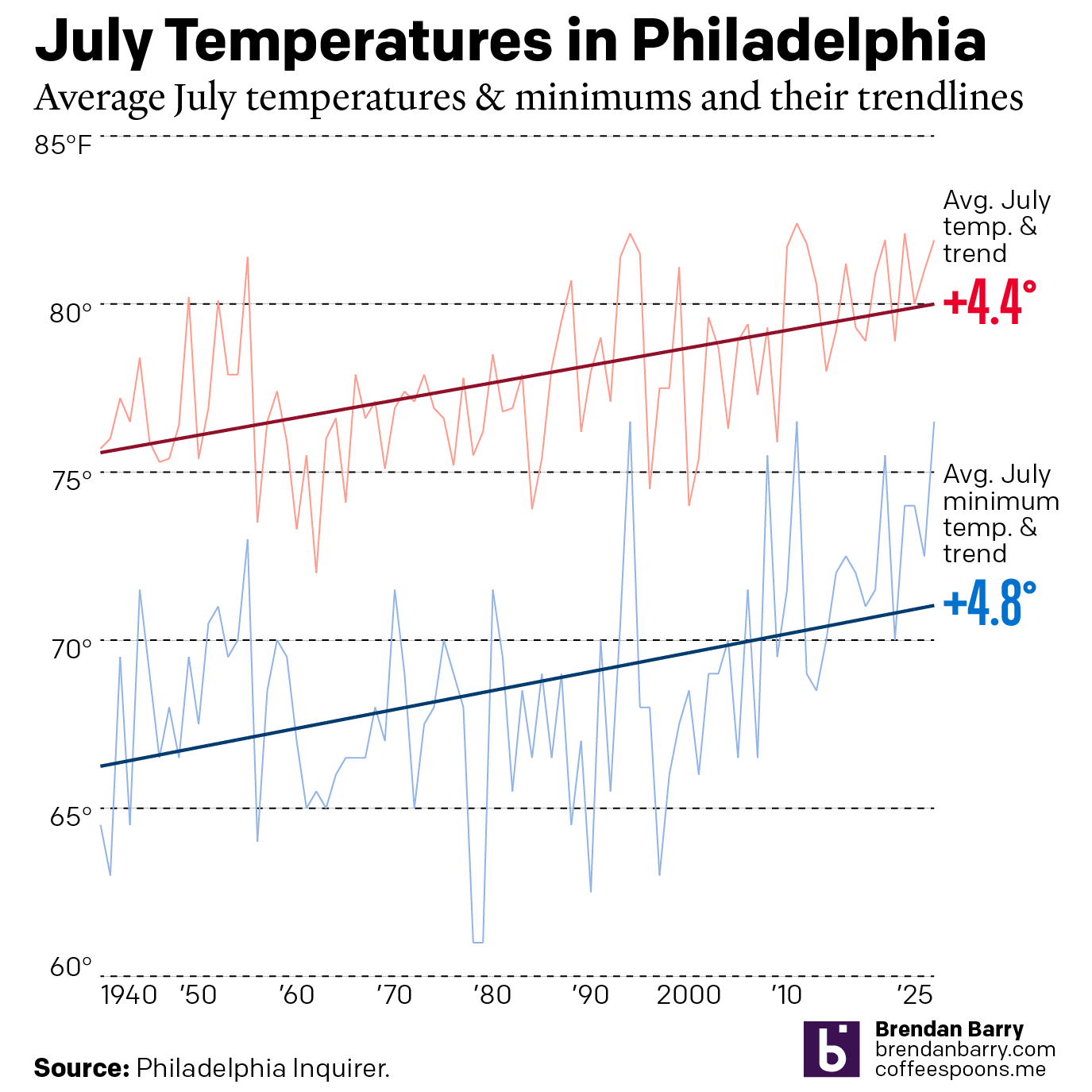
Just a Wee Bit Warm
This past weekend was a hot one in Philadelphia (and many other places across the eastern United States). As we enter July, the Philadelphia Inquirer published an article examining climate change’s impact on summer temperatures. Spoiler: it’s hotter. The article included two interactive line charts. The first one plotted the average high temperature of July…
-
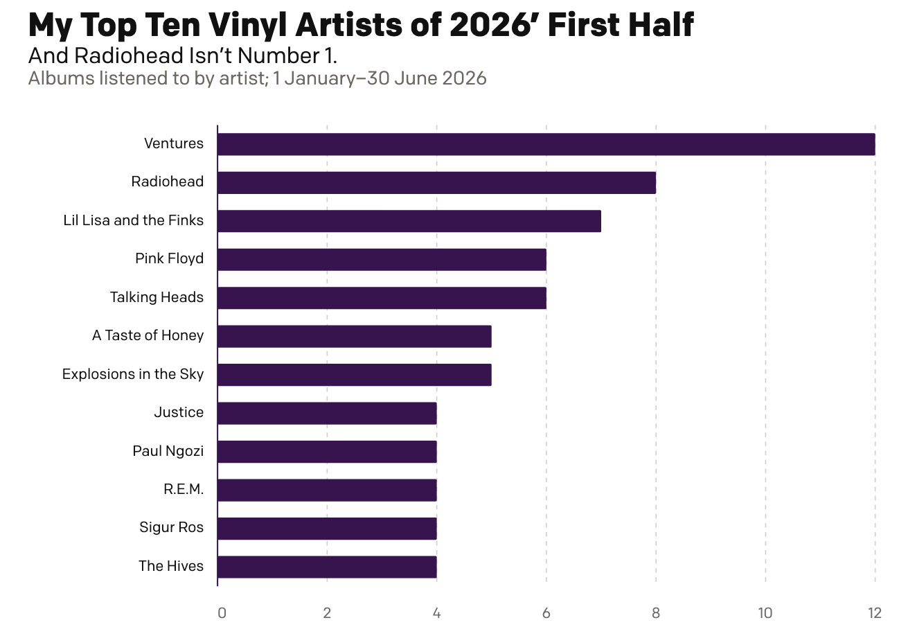
My First Half of Music (Records)
Two Christmases ago, my mother gifted me a record player. Ever since I have been slowly buying records—and then listening to them. And over the last year I have been recording those record plays and with 2026 now half over, I decided to run the numbers and see where I am at. As context, my…
-
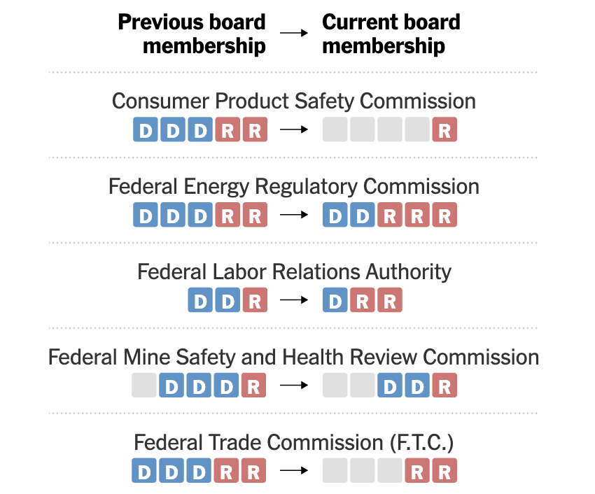
Bye, Bye, Blue Boxes
Yesterday the Supreme Court ruled the executive branch can largely replace the leadership of executives at Senate-confirmed federal agencies at the White House’s discretion. The big exception? The Federal Reserve. The New York Times produced a datagraphic looking at how Trump has changed the boards of nominally independent federal agencies. The graphic works really well…
-
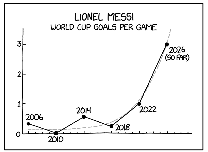
A Messi Hat Trick
Messi. Messy. Get it? The World Cup continues across North America, including in my own hometown of Philadelphia. Argentina has not played in the city, but even here in Philadelphia, you could hear of Lionel Messi’s scoring three goals—a hat trick—against Algeria a little more than a week ago. Messi, the famous Argentinian footballer, then…
-
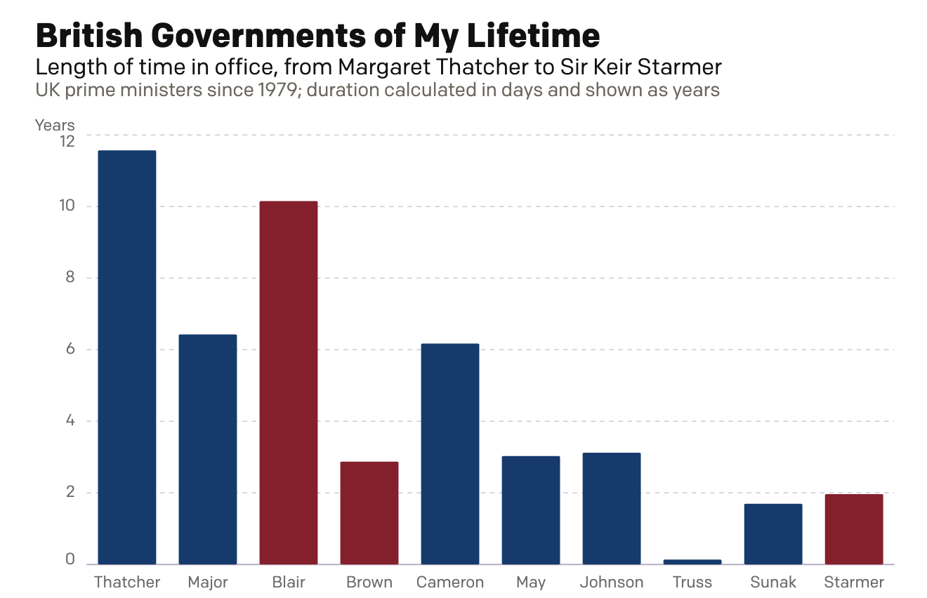
A Dan Miller Coronation?
Six weeks ago I created a small interactive chart on the news that Wes Streeting, the then British health secretary, resigned in order to challenge Prime Minister Sir Keir Starmer for the leadership of the Labour Party. Six weeks hence, Starmer has resigned. Lo and behold, my interactive graphic still works: British Governments of My…