Tag: dot plot
-
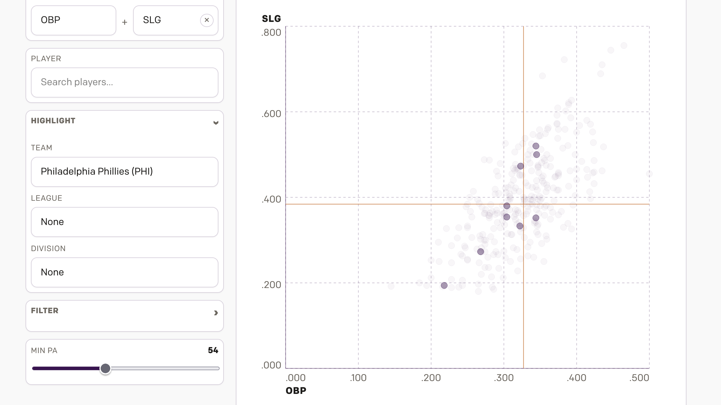
AC to Philly Expressway?
And I am not talking about Atlantic City. No, on Saturday, the Red Sox fired their manager Alex Cora and his entire staff. Or, rather, the staff loyal to him. I wrote about that on Monday. Little did we know that Saturday night, Alex Cora and the chief of baseball operations for the Philadelphia Phillies,…
-
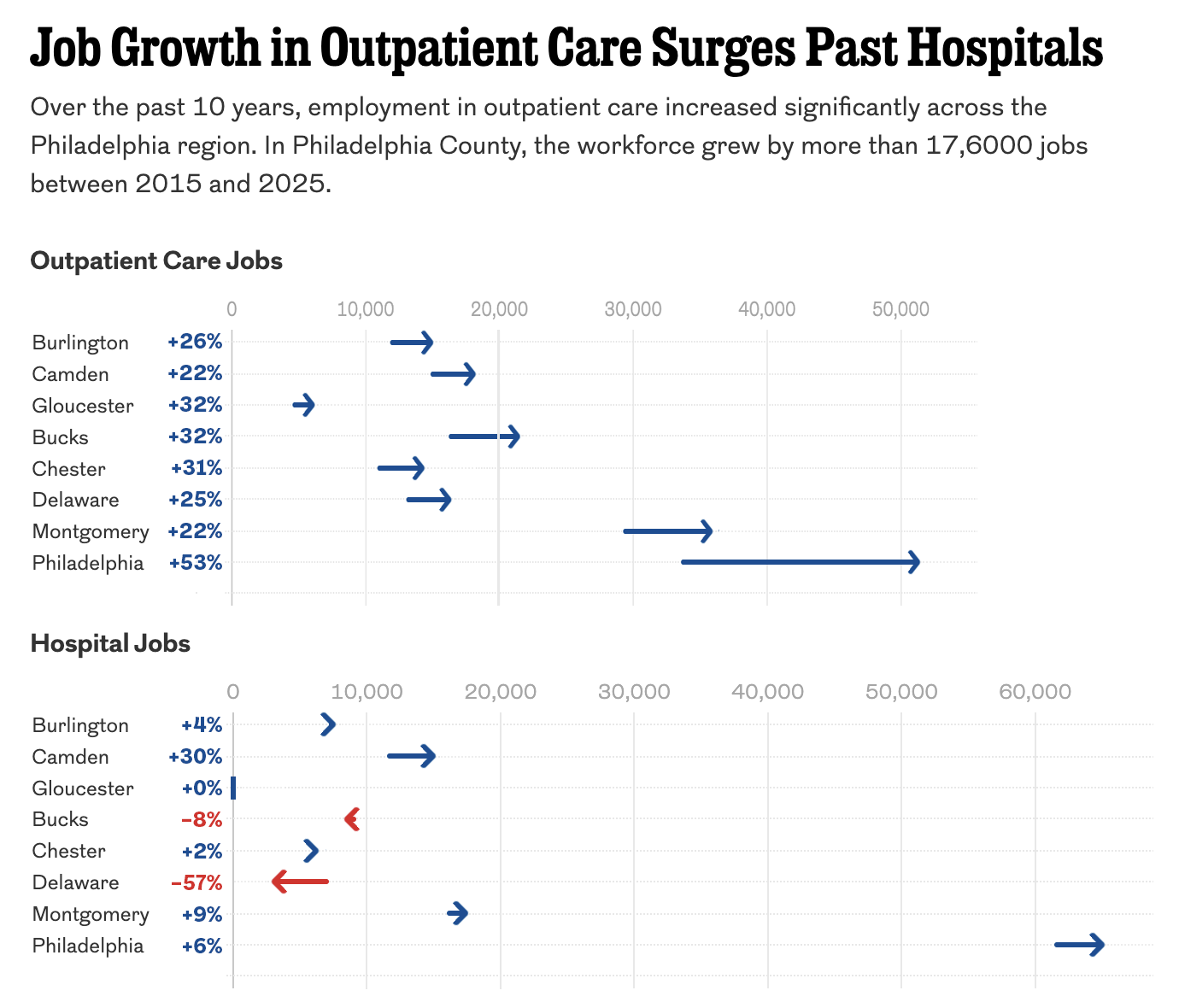
The Arrow Is Pointing Sideways
I was reading an article in my local rag, the Philadelphia Inquirer, when I came upon an article about the healthcare industry’s outsized role in the region’s job growth. The article led off with a staff illustration of medical-looking types on a graphic swirl background—nothing inherently wrong with that. The Inquirer would know best what…
-
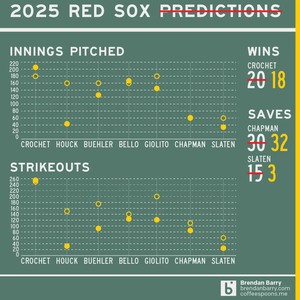
Revisiting My 2025 Red Sox Predictions
Back in March I posted my predictions for the 2025 Boston Red Sox on my social media feeds. I chose not to post it here, because the images had no real data visualisation and the only real information graphic was my prediction of the playoffs via a bracket. I did, however, write about how the…
-

2025 Red Sox Draft Breakdown
Monday and Tuesday, Major League Baseball conducted its amateur player draft, wherein teams select American university and high school players. They have two weeks to sign them and assign them. (Though many will not actually play this year.) Two years ago the Red Sox installed Craig Breslow as their new chief baseball organisation. He has…
-
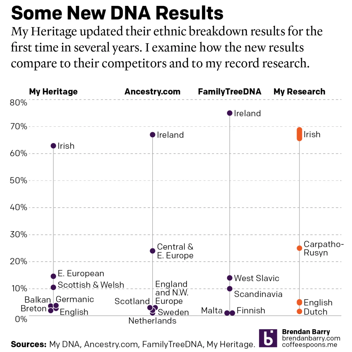
A Refreshed Look at My Ethnic Heritage
Late last week I received an update on my ethnic breakdown from My Heritage, a competitor of Ancestry.com and other genealogy/family history/genetic ancestry companies. For many years, the genealogical community had been waiting for this long-promised update. And it has finally arrived. For my money, My Heritage’s older analysis, v0.95, did not align with my…
-
The Great British Baking
Recently the United Kingdom baked in a significant heatwave. With climate change being a real thing, an extreme heat event in the summer is not terribly surprising. Also not surprisingly, the BBC posted an article about the impact of climate change. The article itself was not about the heatwave, but rather the increasing rate of…
-
Graduate Degrees
Many of us know the debt that comes along with undergraduate degrees. Some of you may still be paying yours down. But what about graduate degrees? A recent article from the Wall Street Journal examined the discrepancies between debt incurred in 2015–16 and the income earned two years later. The designers used dot plots for…
-
Those Are Some Heavy Balls
Unfortunately, I don’t subscribe to Business Insider, but I saw this graphic on the Twitter and felt the need to share it. Primarily because baseball will almost certainly stop at midnight when the owners of the teams will impose a lockout (as opposed to players going on strike). And with that baseball will be on…
-
Low Expectations
Today the 2021 Major League Baseball season begins its playoffs. Tomorrow we get the Los Angeles Dodgers and the St. Louis Cardinals. Why the Dodgers, the team with the second-best record in all of baseball, need to play a one-game play-in is dumb, but a subject for perhaps another post. Tonight, however, is the American…