Pardon the title, but don’t mind the graphic. Sometimes ranking charts tell the story well. The Wall Street Journal has a graphic supporting a larger article about fish. And while I am not sure that I understand the reason behind the colours, they do make it quite clear that catfish is not nearly as popular as it used to be. Unfortunately the article is behind the pay wall, but broadly it appears that the fish on the move here might be banned from the US.
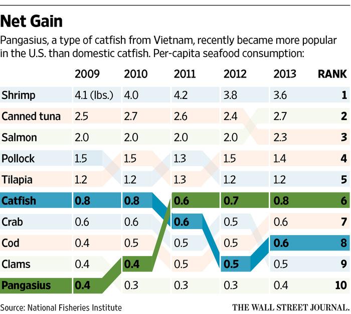
Credit for the piece goes to the Wall Street Journal graphics department.
Author: Brendan Barry
I am a graphic designer who focuses on information design. My day job? Well, they asked me not to say. But to be clear, this blog is my something I do on my own time and does not represent the views of…my employers. I think what I can say is that given my interest in information design—be it in the shape of clear charts, maps, diagrams, or wayfinding systems—I am fortunate that my day job focuses on data visualisation. Outside of work, I try to stay busy with personal design work. Away from the world of design, I have become an amateur genealogist and family historian. You will sometimes see that area of work bleed into my posts.
View all posts by Brendan Barry