The Dawn of a New Nuclear Age?

I grew up less than 15 miles away from the Limerick Nuclear Generating Station, located on the banks of the Schuylkill River northwest of the city of Philadelphia. Our house sat on the north-facing slope of the Great Valley and the cooling towers of Limerick were a ridge line and river valley away from view. But on a clear day, you can see the puffy, billowy clouds of steam rising over the distant horizon—Limerick is splitting the atom.

We all know—or should by now—burning coal, oil, and gas are not terribly great for the planet. They emit carbon dioxide and other gasses that warm the Earth. But the white columns rising over the Schuylkill are water. Fissile uranium is more dense than coal, oil, or gas. And not just by a wee bit. But by orders of magnitude. Splitting the atom provides mankind with enormous amount of energy.

And we need energy. This summer was hot. And I don’t like it hot. Consequently, my air con ran almost nonstop. And I am not the only one. But whence comes all the electricity to power those units? Yes, we can get electricity from the sun, the wind, and the water. But what about when the clouds block the sun? Or the hot, sticky summer air refuses to stir? Or the parched earth has sucked the water from the reservoir?

The uranium atom can still be split, and at a reliable rate. That makes it great to provide a high amount of electricity that can be augmented by the sun, the wind, and the water when conditions permit.

However, in recent years, the cost of oil and gas declined thanks to fracking, and the business cost to run coal plants lowered as environmental standards disappeared. The economics of running nuclear power plants made them less viable than carbon-spewing options. Electricity providers started shutting nuclear plants down.

Things have changed, though. As we run more air con, we need more electricity. As we run more electric busses and trains, we need more electricity. As we charge more electric cars, we need more electricity. As we run more servers for bitcoin mining or AI farms, we need more electricity.

We need more electricity. A lot more.

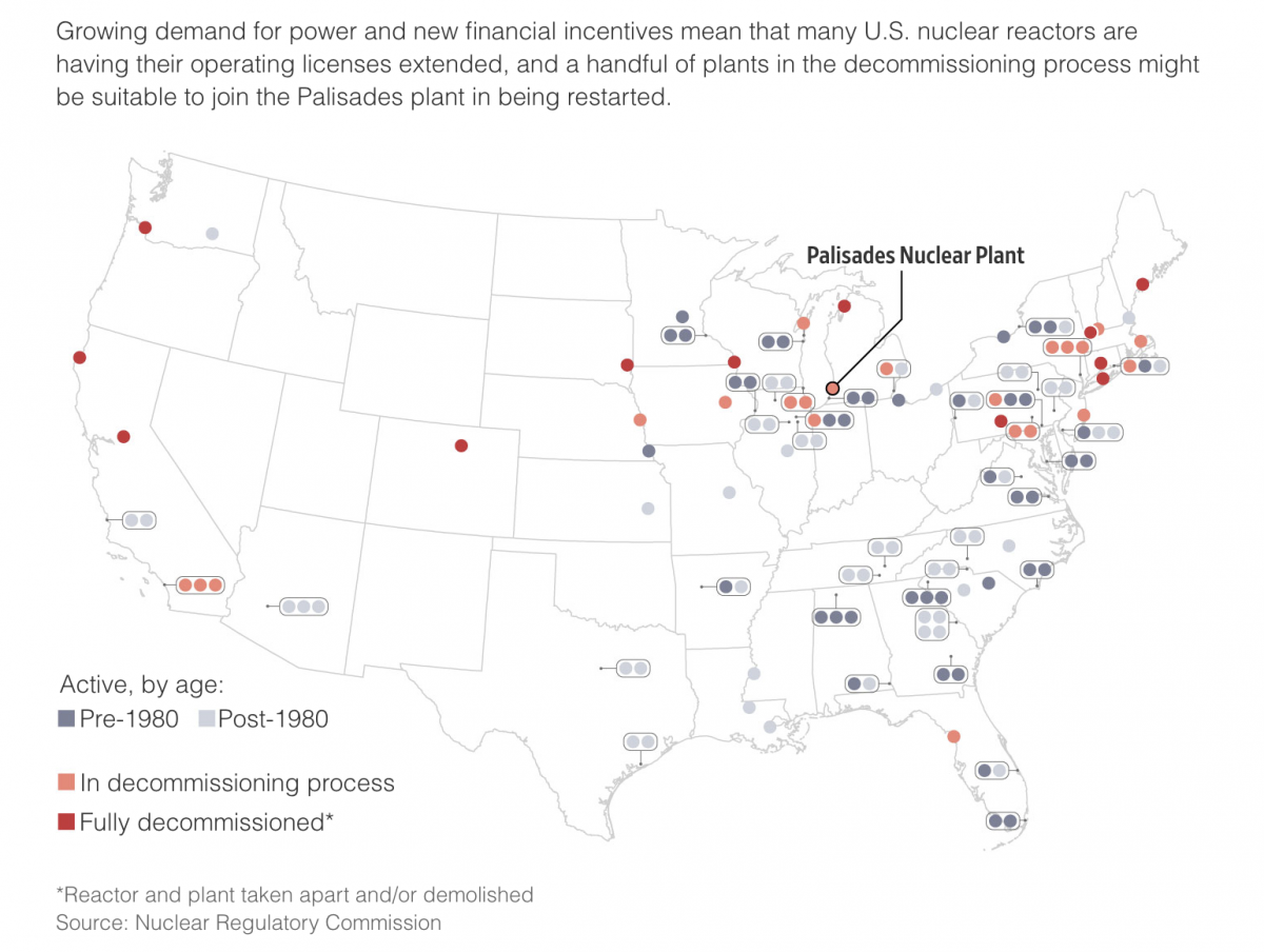
And so the economics of electricity is changing. The Wall Street Journal had a great article about the re-opening of nuclear plant in Michigan. It included some really nice photographs of the control room and the turbine room. But, the reason we are talking about it here today because the article includes a few diagrams and illustrations. This one caught my attention.

First, I really enjoy how the United States is reduced to a grey outline. Perhaps a very faint grey could have been used to infill the states, but here I think white works best because of the use of the light and medium greys for active plants.

The active plants—not the focus of the article—are in those greys, whilst the decommissioned and -ing plants are in tints of red. What I struggled with a long time ago when I made an infographic about southeastern Pennsylvania’s electricity generation was how to show the different plants at a single facility.

Ultimately, I listed each plant by name then an icon representing the type of fuel, because not every plant uses all the same type of fuel. Eddystone Generating Station just south of Philadelphia used both natural gas/oil plants and two coal plants, though those were retired in the 2010s.

Here the designer, not needing to label each plant and aided by the fact each plant is nuclear, simply encloses the dots within a container. Palisades, the plant in question, receives a thicker, black stroke to call it out against the rest of the plants.

Credit for the piece goes to, I think Adrienne Tong. She is credited for a different graphic in the article, but not the one I highlighted, so I’ll give her the credit unless and until someone else gets the credit.

School Shootings

The Wall Street Journal put together a nice piece about the uptick in elementary school shootings, both in the number of shootings and the number of deaths. It used two bar charts, regular and stacked, and a heat map to tell the story. The screenshot below is from a graphic that looks at the proportion of school shootings that occur at elementary schools. They are not as common, but as other graphics in the article show, they can be quite deadly.

Not a great trend…

The graphic above does a nice job of distilling the horror of a tragedy into a single rectangle. That is an important task because it allows us to detach ourselves and more rationally analyse the situation. Unfortunately the analysis is that yes, Virginia, things really have been getting worse.

Overall the article is simple but soberingly effective. School shootings are a problem with which American society has not dealt and my cynical side believes with which we will continue to not deal.

Credit for the piece goes to James Benedict and Danny Dougherty.

Graduate Degrees

Many of us know the debt that comes along with undergraduate degrees. Some of you may still be paying yours down. But what about graduate degrees? A recent article from the Wall Street Journal examined the discrepancies between debt incurred in 2015–16 and the income earned two years later.

The designers used dot plots for their comparisons, which narratively reveal themselves through a scrolling story. The author focuses on the differences between the University of Southern California and California State University, Long Beach. This screenshot captures the differences between the two in both debt and income.

Pretty divergent outcomes…

Some simple colour choices guide the reader through the article and their consistent use makes it easy for the reader to visually compare the schools.

From a content standpoint, these two series, income and debt, can be combined to create an income to debt ratio. Simply put, does the degree pay for itself?

What’s really nice from a personal standpoint is that the end of the article features an exploratory tool that allows the user to search the data set for schools of interest. More than just that, they don’t limit that tool to just graduate degrees. You can search for undergraduate degrees.

Below the dot plot you also have a table that provides the exact data points, instead of cluttering up the visual design with that level of information. And when you search for a specific school through the filtering mechanism, you can see that school highlighted in the dot plot and brought to the top of the table.

Fortunately my alma mater is included in the data set.

Welp.

Unfortunately you can see that the data suggests that graduates with design and applied arts degrees earn less (as a median) than they spend to obtain the degree. That’s not ideal.

Overall this was a really nice, solid piece. And probably speaks to the discussions we need to have more broadly about post-secondary education in the United States. But that’s for another post.

Credit for the piece goes to James Benedict, Andrea Fuller, and Lindsay Huth.

How Far You Won’t Go

Housekeeping first, as you may have noticed, I haven’t been publishing as much lately. That’s because I’ve been on holiday. After a tremendously busy year, I need to use up all the time I didn’t spend on holiday. Consequently, I’m only going to be posting a handful or so more times before the end of the year. The plan is to return in early January to my regular posting schedule. For this week that means the next few days before I’m off for American Thanksgiving.

But on with the show.

One of the things I haven’t been doing too much of is travelling. There are many reasons for this, but one is that air travel in the United States has, of late, been, shall we say unreliable. Hundreds if not thousands of flight cancellations, sometimes with no obvious cause. And in one notorious case, Southwest claimed inclement weather cancelled flights in Florida, but it was the only airline to cancel significant numbers of flights. In other words, it wasn’t the weather.

The Wall Street Journal recently posted an article that explored the issue, doing so via a great example. It followed the literal path of one Southwest aircraft over one long holiday weekend. The screenshot below captures two of the graphics with a wee bit of text between.

What’s nice about the graphics’ design is how they use small multiples and consistent colours. The intended route is always on the left and what actually happened is on the right. Red and blue colours depict those throughout.

The only thing I quibble with is the embedded HTML text. Sometimes the page loads fine for me, other times it looks like it did this morning for this screenshot. Note how for some city labels the final letters get dropped to a second line, e.g. the “o” in Chicago or the “e” in Baltimore.

This is far from a deal breaker on this being a good graphic, but I find it mildly annoying, especially when in situations like the bottom left Orlando, there’s no obvious reason as to why, because the little airplane departure icon sits atop the final letter.

I understand the idea behind using native HTML text in graphics, but when things like this happen, I wonder if it wouldn’t simply be better to include the text as part of the graphic and avoid these potential mishaps altogether.

Credit for the piece goes to Emma Brown.

But Where Are the Spiders?

Yesterday I mentioned more about revolutions, well today we’re talking about Mars, a planet that revolves around the Sun. Late last week scientists working with the InSight lander on the Red Planet published their findings. Turns out we need to rethink what we know about Mars.

First, the planet is probably much older than Earth. Mars’ composition also differs from Earth in some significant ways. InSight mapped the interior of Mars by studying the seismic waves (think like sound waves but through the inside of planets) of marsquakes.

The Wall Street Journal published a great article spelling out the findings in detail that is well worth the read. It also included some nice graphics helping to support the piece. The one I wanted to highlight, however, was a brilliant comparison of Mars to Earth.

But how many licks to get to the centre?

Conceptually this is important, because many diagrams and graphics I’ve seen about these findings only detail the interior of Mars. But what makes Mars important is how it differs from Earth, and let’s be honest, how many of us remember our Earth science classes at school and can diagram out the interior of Earth?

And right here the designer compares the smaller—and now older—brother of Earth. Again, read the article for the details, but in short, some of the key findings are that the core is larger, but also lighter, than we thought. Our planet’s core differs because Earth has two parts: a solid and heavy ball of iron and nickel surrounded by a liquid core that spins. That spinning core creates the magnetic fields that protect our planet from the Sun and have kept our atmosphere intact. Mars doesn’t have that. And that’s in part because, given the core is larger than we thought, the mantle is smaller.

A smaller mantle means that certain materials couldn’t form that insulate the Earth’s core. So while Earth’s core has been prevented from cooling and slowing down, Mars was not. And so while it did have a magnetic field at one point, that slowing, cooling core slowly dissipated the magnetic field. That may be why the planet, once rich in water, now is a barren rock exposed to the Sun.

Again, this is a big deal in terms of planetary science. Consider that Earth and Mars are broadly made of the same materials that orbited the Sun billions of years ago. But Mars took those same ingredients and made itself into a very different planet. And now we know quite a good deal more about the Red Planet.

One last point to make about the graphic above. Again, many illustrations will increase the size of the crust to make it more visible. Here the designer chose to keep it more in proportion to the scale of the planets’ interiors. (Even though Mars’ crust is quite a bit thicker than Earth’s.) I think that’s important because it puts us into perspective. We can build monuments like the Pyramids that last thousands of years and dig bore holes miles deep and tunnel out connections through mountain ranges, but that also just scratches the surface of the crust. But that crust is the thinnest of shells over the mantle and cores of these planets.

That life began and took hold on Earth, on that thinnest of shells protected by a magnetic field because of a spinning molten core buried at the centre of the planet…something to think about sometimes.

Credit for the piece goes to Merrill Sherman.

Hamas’ Rocket Swarms

Last week I wrote about the deaths in Gaza and Israel, where a ceasefire is holding at the time of writing. But I also included a graphic about the size of Hamas’ rocket arsenal. In a social media post I commented about how it appeared Hamas had also changed its tactics given Israel’s Iron Dome missile defence system.

Specifically, in the past Hamas launched rockets at a fairly even pace. However, with Iron Dome, Israel could—and did—defend about 90% of incoming fire. Consequently, Hamas tried to swarm Israel’s defences and some fire did leak through, killing over a dozen Israelis. I was looking for data on that, but couldn’t find what I wanted.

Clearly I didn’t look hard enough. This graphic appeared in the Wall Street Journal last week. It shows the cumulative number of rockets launched at Israel during this most recent surge in violence compared to the 2014 war between Israel and Hamas.

A very different profile for Hamas’ attack

In 2014, you can see even, incremental steps up in the total count of rockets. But from earlier this month, you can see much steeper increases on a daily basis with more time between those swarms.

From a design standpoint, it’s a really nice graphic. I will often say that good graphics don’t need to be crazy or flashy. This is neither. It relies on solid fundamentals and executes well. All the axis lines are labelled and the data series fall within the bounds of the x- and y-axis. The colours chosen contrast nicely.

Credit for the piece goes to the Wall Street Journal graphics department.

The Evolution of the S&P 500

I found myself doing a bit of summer cleaning yesterday and I stumbled upon a few graphics of interest. This one comes from a September 2016 Wall Street Journal article about the changes in the S&P 500, a composite index of American stocks, some of the 500 largest.

In terms of the page design, if it were not for that giant 1/6 page advert in the lower right corner, this graphic could potentially dominate the visual page.  The bulk of it sits above the page’s fold and the only other competing element is a headshot to the upper-right. Regardless, it was clearly enough to grab my attention as I was going through some papers.

The overall page
The overall page

As for the graphic itself, I probably would have some done things differently.

Trees?
Trees?

To start, are these actual tree maps? Or are they things attempting to look like tree maps? It is difficult to tell. In an actual tree map, the rectangles are not just arranged by convenience, as they appear to be here. Instead, they are in descending—or perhaps occasionally ascending—area, within groupings.

The groupings would have been particularly powerful here.  Imagine instead of disparate blue boxes for industrials and utilities in the latter two years that they were combined into a single box. In 2001, that box may have been larger than the orange financials. Then by 2016, you would have seen those boxes switch places—in both years well behind the green boxes of 2001 debuts. If instead the goal was to show the percentages, as it might be given each percentage is labelled, a straight bar chart would have sufficed.

I am not always a fan of the circle for sizes along the bottom. But the bigger problem I have here is the alignment of the labelling and the pseudo-tree maps. One of my first questions was “how big are these years?”. However, that was one of the last points displayed, and it is separated from the tree maps from the listing of the largest company in the index from that year. I would have kept the total market cap closer to the trees, and perhaps used the whole length of line beneath the trees and instead pushed the table labels somewhere between the rather large gap from 1976 and 2001.

Credit for the piece goes to the Wall Street Journal graphics department.

The Economic Impact of Hurricanes

Yesterday Hurricane Ophelia hit Ireland and the United Kingdom. Yes, the two islands get hit with ferocious storms from time to time, but rarely do they enjoy the hurricanes like we do on the eastern seaboards of Canada, Mexico, and the United States.

Earlier this hurricane season the US had to deal with Harvey, Irma, and Maria. And in early October the Wall Street Journal published a piece that looked at the economic impact of the former two hurricanes as exhibited in economic data.

Overall the piece does a nice job explaining how hurricanes impact different sectors of the economy, well, differently. And wouldn’t you know it that leisure and hospitality is the hardest hit? But then they put together this stacked bar chart showing the impact of the hurricanes on both Florida/Georgia and Texas for Irma and Harvey, respectively.

I just want a common baseline…

The problem is that the stacked bar chart does not allow us to examine each hurricane as a specific data set. Because the Harvey data set is first, we have the common baseline and can compare the lengths of the magenta-ish bars. But what about the blue sets for Irma? How large is natural resources and mining compared to professional and business services? It is incredibly difficult to tell because neither bar starts at the same point. You must mentally move the bars to the same baseline and then hope your brain can accurately capture the length.

Instead, a split bar chart with each sector having two bars would have been preferable. Or, barring that, two plots under the same title. Then you could even sort the data sets and make it even easier to see which sectors were more important in the impacted areas.

Stacked bar charts work when you are trying to show total magnitude and the breakdowns are incidental to the point. But as soon as the comparison of the breakdowns becomes important, it’s time to make another chart.

Credit for the piece goes to Andrew Van Dam.

Harvey’s Rainfall Totals

Hurricane Harvey landed north of Corpus Christi, Texas late Friday night. By Monday morning, Houston has been flooded as nearly two feet of water have fallen upon the city, built on and around wetlands long ago paved over with concrete. Naturally the news has covered this story in depth all weekend. Even leading up to it, when I was still posting eclipse things, various outlets had projections and why we should care graphics. But as the storm begins to move back into the Gulf—only to move back inland tomorrow—I wanted to compare some of the graphics I have been seeing.

Of course, not all graphics are the same, let alone cover the same things. So this morning we are looking at just the rainfall total maps of a few different outlets.

From the Washington Post, we have the following graphic.

The Post's rainfall graphic
The Post’s rainfall graphic

The palette chosen performs well at quickly scaling up to the record level of rainfall, i.e. the 20+ inches realm, but quickly shifting from the green–blue palette into dark purples.

Then we have the Wall Street Journal’s graphic.

The Journal's graphic
The Journal’s graphic

Here we have a more familiar blue–red diverging spectrum. The point of divergence set to 20 inches.

Lastly, we have the New York Times graphic. Though in this case, it’s not an exact like-for-like comparison. I could not find a graphic mapping total rainfall, instead this is for projected rainfall totals. But the design is for the same type of map, i.e. how much rain falls in a location.

The Times' graphic
The Times’ graphic

The Post takes the closest approach to the true continuous spectrum palette, where the shift from dry to drenched is gradual. It makes for a smoother, more blended looking map. Somewhere around that 20 inch point, however, the palette shifts from the green to blue range to purple. It emphasises the record-hitting point, but otherwise the totals are presented as more fluid. Perhaps correctly since rain does not neatly fall evenly into pixels.

By comparison, the Journal segments the rainfall totals into bins of blues. The scale is not even, the lighter blues incorporate two inches, the darkers upwards of five. And then again, like the Post, separate 20+ as a different colour, here switching to reds.

Lastly the Times keeps to a simple segmented bin palette of all blues. 20+ inches is rendered is just a dark blue.

Each map has pluses, each has minuses. The Times map, for example, is simple and quick to understand. Southeastern Texas will be wet by the middle of next week. If your goal is only to communicate that point, well this map has done its job. It is worth noting, again, that this is a map of projections. Because the other thing missing from this map is the storm’s path. So if the goal were to showcase the rainfall along the storm’s path, well this graphic does not accomplish that nearly as well as the other two.

The Post and the Journal both show the track of the storm. The Journal takes it one step further and plots its projected course through Thursday. This helps us really see if not understand the east side problem of hurricanes. That is, the eastern quadrants of hurricanes typically experience the heaviest amounts of rain. And as the darker portions of the map all fall to the north and east of those lines, it reaffirms this for us.

So what really differentiates the two? The colour palette and its application. The Post’s palette is more natural as, again, rain does not fall neatly into bins and instead makes for blurred and messy totals across a map. Separating the heaviest rains into the purples, however, makes a lot of sense as that amount of rainfall, as we are seeing this morning, makes for a mess in Houston.

But the point of a graphic is to translate nature and the observed into a digestible and pointed statement of the observed. What should I learn? Why should I care? The Journal, like the Post, does a fantastic job of splitting out the 20+ inch totals by using a divergent palette. But instead of blending into that colour, the distinction is sharp. And then below that threshold, we get rainfall totals segmented into just a few bins. These help the reader see, also more starkly because of the selection of the specific blues, just where the bands of heavy rain will fall.

I do want to point out, however, that all of these maps occur in articles with lots of other fantastic graphics that visually explore lots of details about the story. And in particular, I want to highlight that the normal bit where I state the credits includes a lot of people. Creating a whole host of graphics to support a story takes a lot of work.

Credit for the Washington Post piece goes to Darla Cameron, Samuel Granados, Chris Alcantara, and Gabriel Florit.

Credit for the Wall Street Journal piece goes to Bradley Olson, Arian Campo-Flores, Miguel Bustillo, Dan Frosch, Erin Ailworth, Christopher M. Matthews, and Russell Gold.

Credit for the New York Times piece goes to Gregor Aisch, Sarah Almukhtar, Jeremy Ashkenas, Matthew Bloch, Joe Burgess, Audrey Carlsen, Ford Fessenden, Troy Griggs, K.K. Rebecca Lai, Jasmine C. Lee, Jugal K. Patel, Adam Pearce, Bedel Saget, Anjali Singhvi, Joe Ward, and Josh Williams.

The World’s Fighter Jets

As you know, I am a sucker for military-related things. So here we have a piece from the Wall Street Journal on the leading fighter jets of the world. If you have a bone to pick on which jets were included, please take that up with them and not me.

Of course, speed isn't everything…
Of course, speed isn’t everything…

The screenshot is from the end of an animation where they depict the maximum range and the relative speed of each aircraft against each other.

Credit for the piece goes to Andrew Barnett, Jason French, and Robert Wall.