Editor’s note: I wrote this Friday afternoon, and then on Saturday afternoon a new BBC article included a graphic similar to my design. I address later on in this post. (I am also my own editor.)
Friday’s US Supreme Court ruling struck down President Trump’s tariffs—mostly, not all—as unconstitutional. I had a browser tab up from BBC News to follow the reactions and this graphic came up on my screen and it struck me, in its context, as odd.
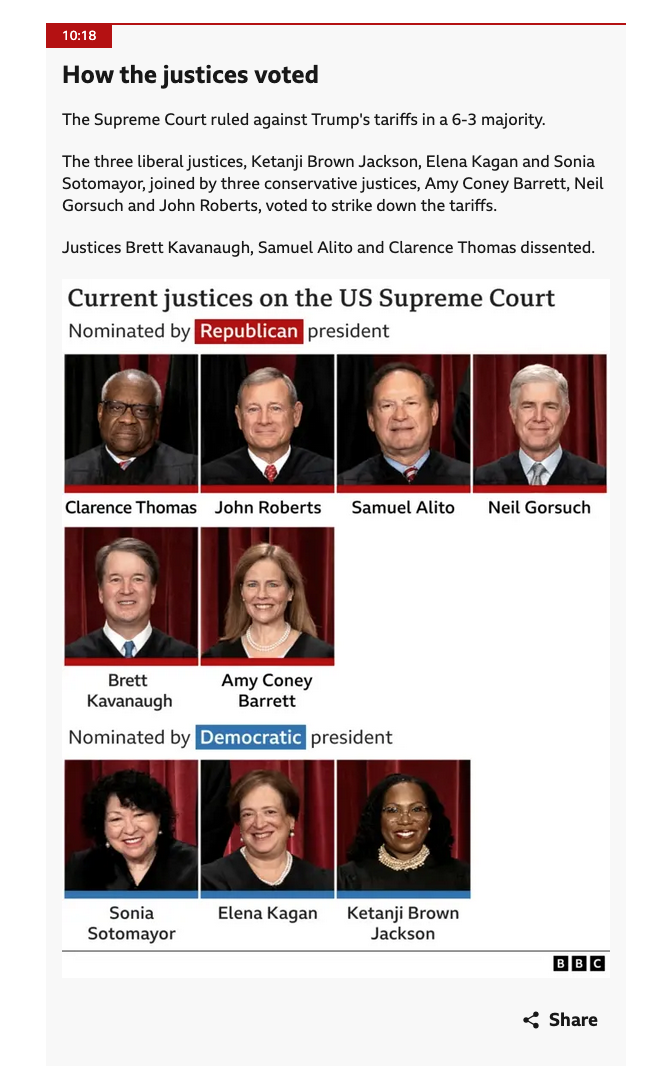
Look at the “article” headline and you’ll see the title How the Justices Voted. Brilliant. Makes perfect sense. After the verdict, in these hyperpartisan days one of the first things I look for is the breakdown of the vote.
Contextually, I already knew the decision was 6–3 against the tariffs. At first glance I see six boxes above and three boxes below. Ah, the votes in favour and the votes against. Reading a bit more closely as I focus on the article, I see the graphic’s header: Current Justices on the Supreme Court.
The graphic then provides a headshot of each justice with a red for Republican and blue for Democratic bar below each box. Makes sense to me.
But the graphic does not meaningfully help tell the story here. Yes, the article says in words who voted for which position, but does so framing the justices as the three liberals joined three conservatives.
In short, the graphic is good and correct, but fits poorly in the article as is. Nothing is wrong per se, but the post was…sub-optimal.
I spent about half an hour editing my screenshot in Photoshop and landed on this. I did have to extend the graphic by 10–20 pixels, and the fonts are not to the BBC’s brand, but it gets the idea across.
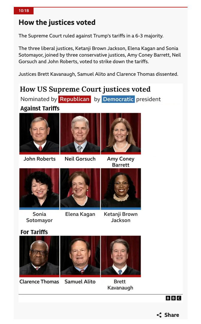
Here we keep the headshots, keep the colour bars, and keep the nomination definitions. We just regroup the headshots and add labelling to say who voted which way. These are small, subtle tweaks to the information architecture, but now the graphic aligns significantly better with the article and its text.
As I noted at the top, when I wrote this Friday afternoon, this was all true. Technically it remains true, because my initial link and screenshot holds true. But on Saturday, Trump announced new tariffs at a higher rate under a different law and the BBC article about the newest developments included the following graphic.
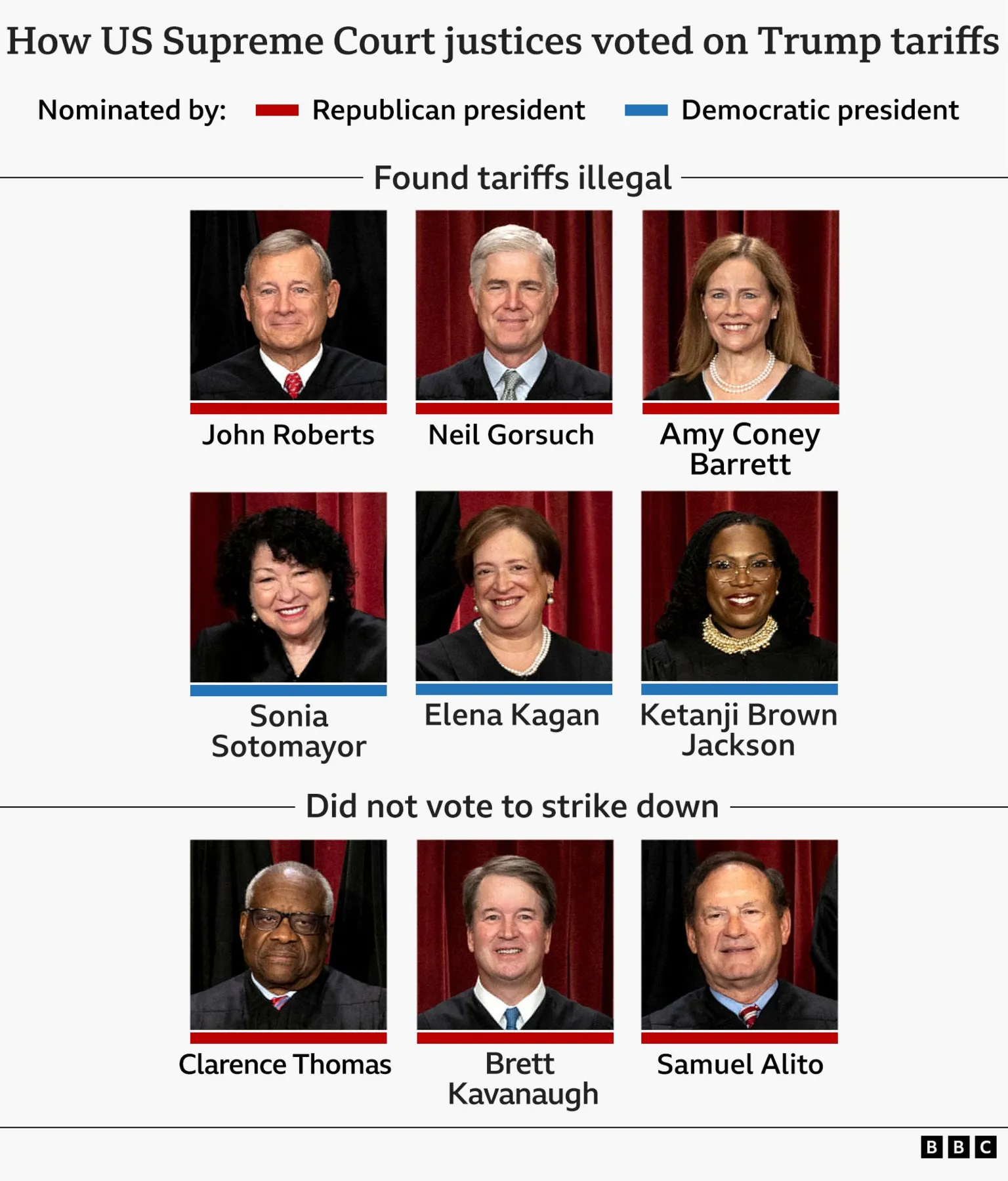
You can see here the BBC’s graphics team put together a new graphic visually aligned with my quick Photoshop edits. This would have been a great graphic to include in Friday’s content as it dovetails perfectly with the point of the post.
At the end of the day, I am just glad to see the BBC spent the time to create a better version of the graphic, even if it took an extra day.
Credit for the piece goes to the BBC graphics department.
Credit for the edit is mine.