Today’s post features an animated map by a doctoral candidate at Penn State. It plots out month-by-month protests across the world. It moves a bit fast and could perhaps make use out of some guided navigation, e.g. focusing the user’s attention on specific areas at specific times, but is still an interesting view of the world.
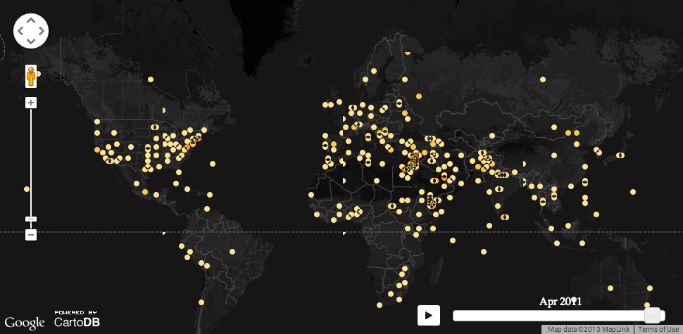
Credit for the piece goes to John Beieler.
Leave a Reply
You must be logged in to post a comment.