Tag: maps
-
New(ish) Data for the Old Country
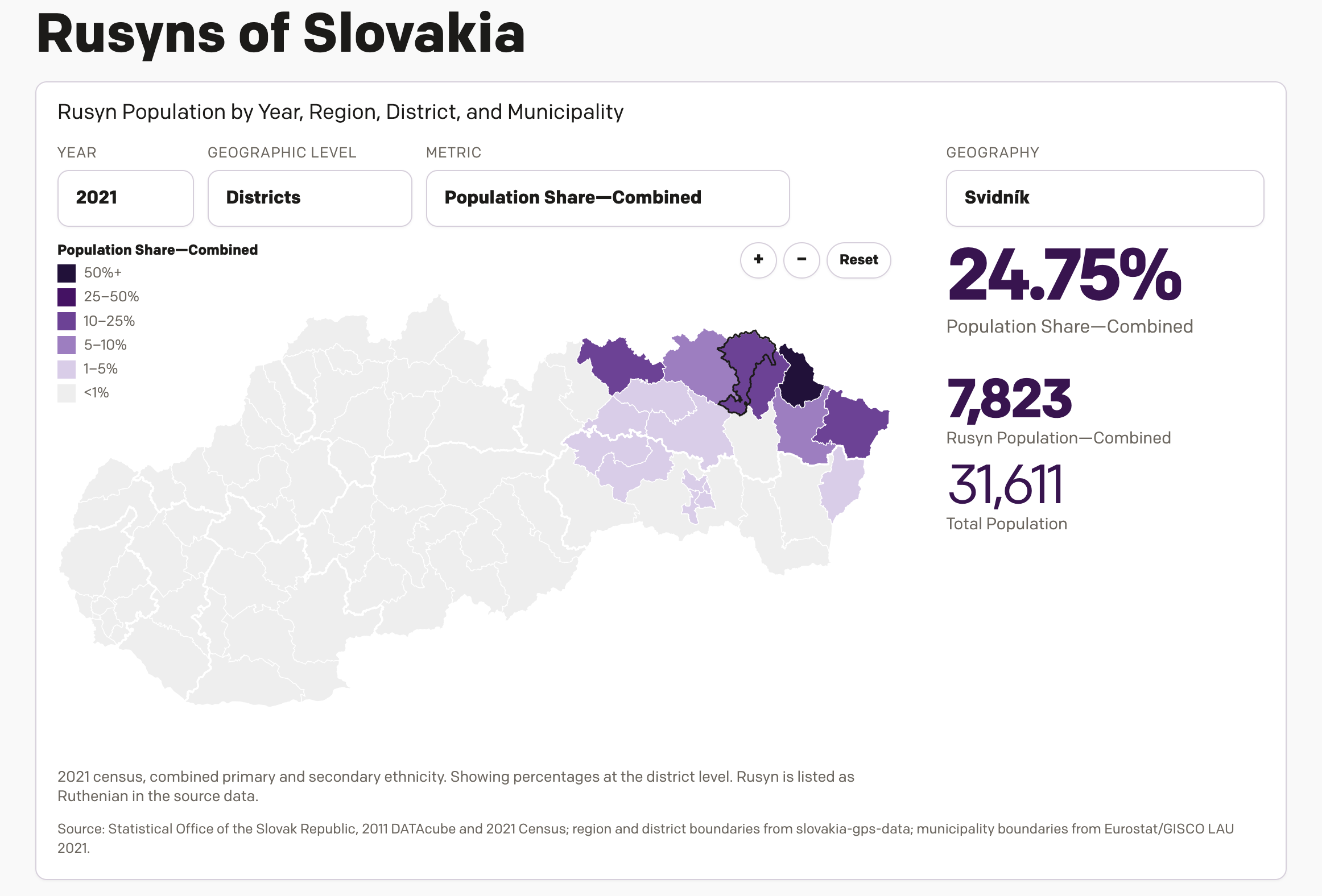
One of the most popular pieces of content on my website over the last several years has been a datagraphic I designed, which explores the Slovakian census data from 2011 on the Carpatho–Rusyns of Slovakia. I wrote about it for Coffeespoons back in 2012. The Carpatho–Rusyns, as they are known in the United States and…
-
USAI! My Eyes!
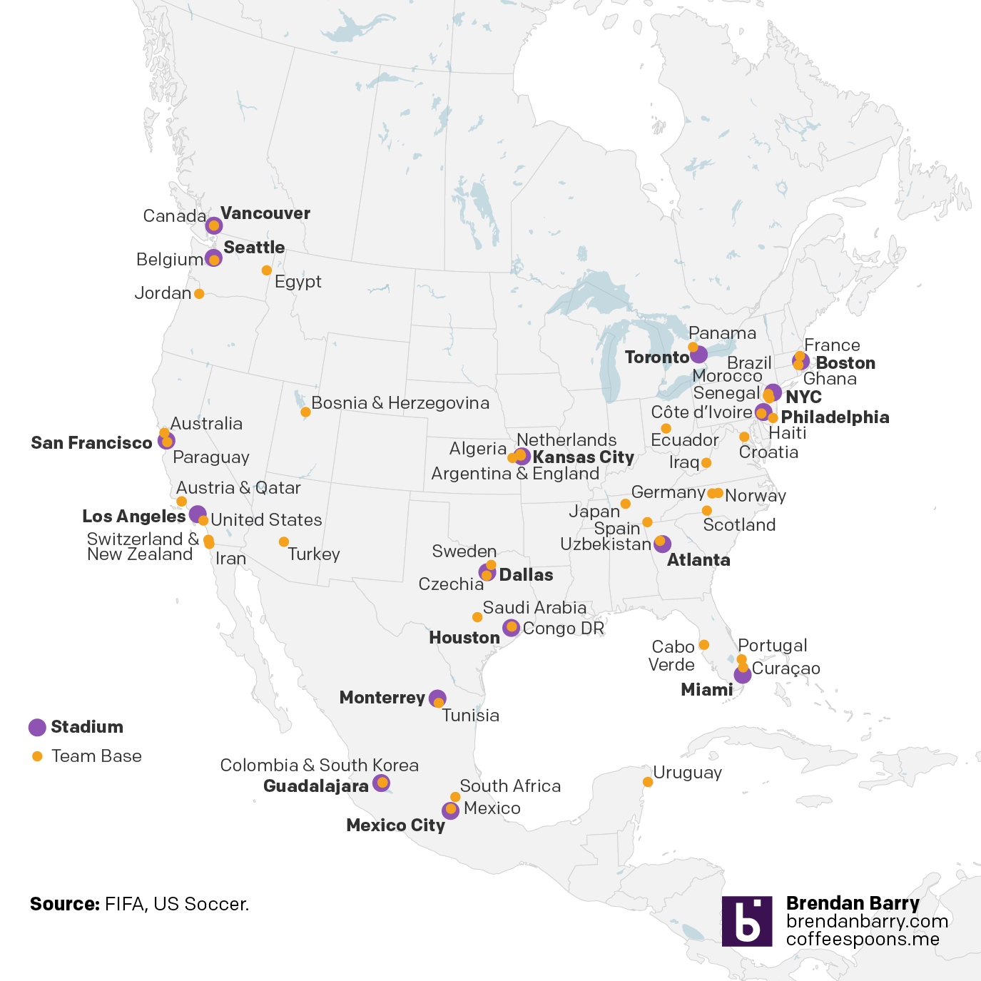
Of all things, this came to me through social media I follow for news about the Red Sox. But it’s Friday and after seeing this I definitely need a drink. The AI-made map purports to show the locations of World Cup home bases for the various competing teams. It certainly shows…uh…something. It does not take…
-
Board of Modern Religious Architecture
Yesterday evening I received an e-mail about some of my work over on my Ganister website, where I try to capture, record, and preserve the history of the small quarry town in western Pennsylvania whence my grandfather came. The e-mail’s contents led me back to some old photographs I took from my trip to the…
-
Just a Little Annoying
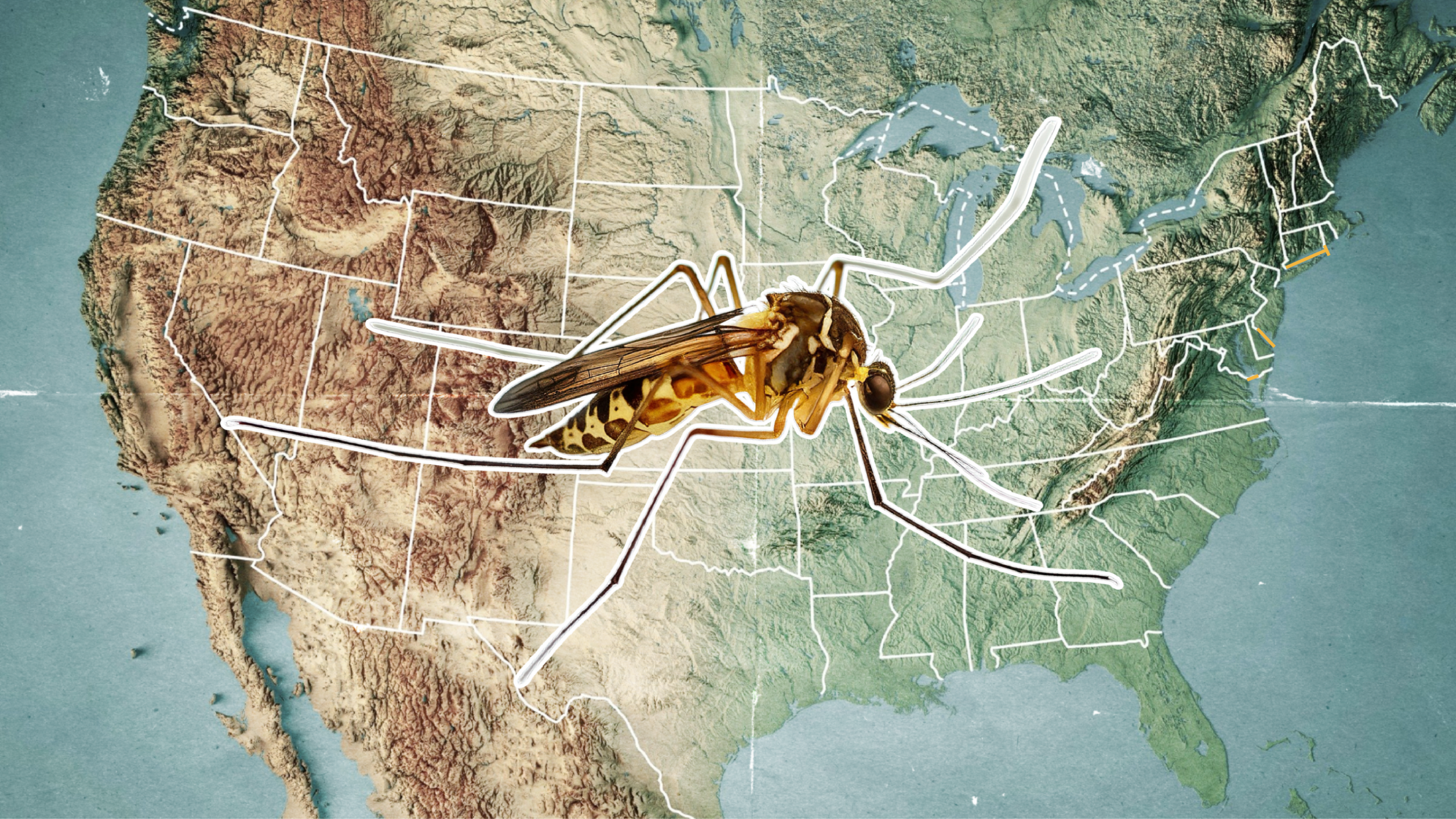
To be clear, this is a comment on a hero graphic—not an actual graphic representing data. Nevertheless, it does represent the borders of states within the United States. Most obviously, because there is not a giant state called Mosquita occupying the centre of the United States. (Fun fact: there is a Mosquito Coast located in…
-
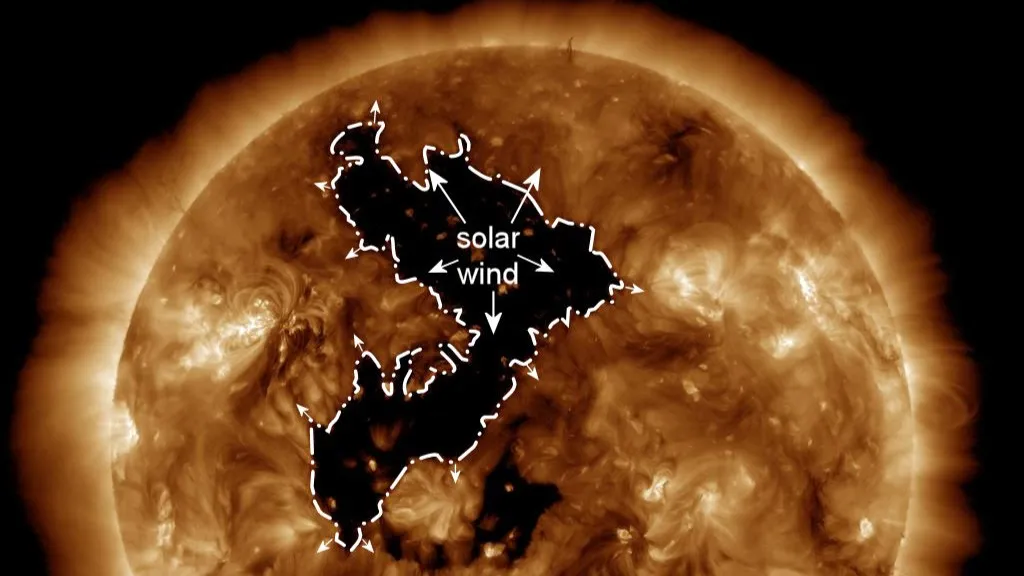
Here Came the Sun
Sorry, George, had to change the verb tense. As I alluded to on Friday, today we are looking at some space weather news. This past weekend, the Sun put on a light show over Canada and northern US states with the aurora borealis. Of course the grandeur and spectacle is not a thing that comes…
-
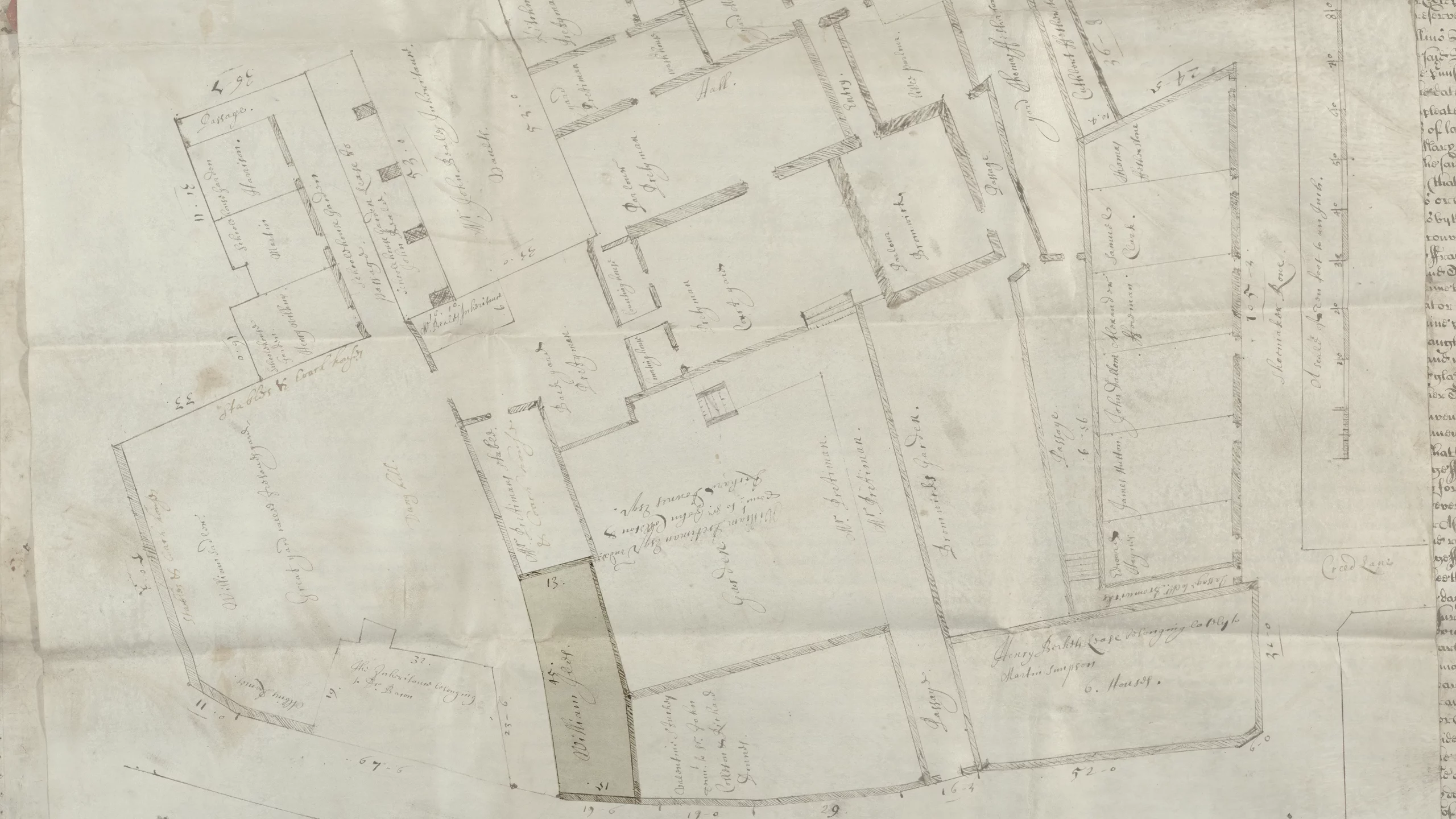
A House by Any Other Address
Yesterday, the BBC reported a William Shakespeare expert’s research into unrelated materials uncovered the lost address of a home owned by the Bard in Central London. Ironically, the very spot the researcher, Professor Lucy Munro of King’s College, identified is presently marked by a blue plaque—a marker system used in the UK to identify sites…
-
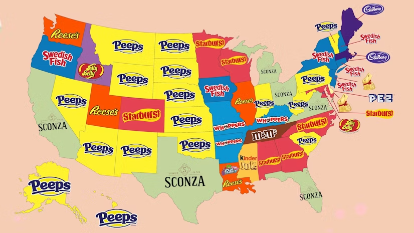
Peeps People in Pennsylvania
As many long-time readers know, my Carpatho–Rusyn origins means my family observes Orthodox Easter, which usually does not coincide with what I call Catholic Easter—because the other part of my background is Irish Catholic, so growing up there were two Easters. Now we just observe the one and so later today I am headed back…
-
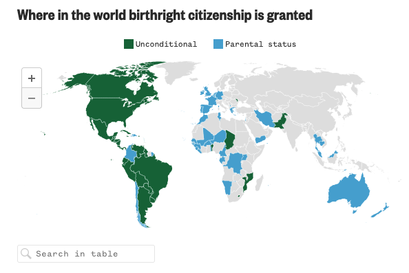
Born in the U.S.A.
Last Wednesday, when I was more focused on the Artemis II launch, the Supreme Court held oral arguments about the administration’s attempt to end birthright citizenship and overturn the 14th Amendment to the United States’ constitution. Kind of a big deal. NBC News ran a live blog covering the arguments and included an interactive map…
-
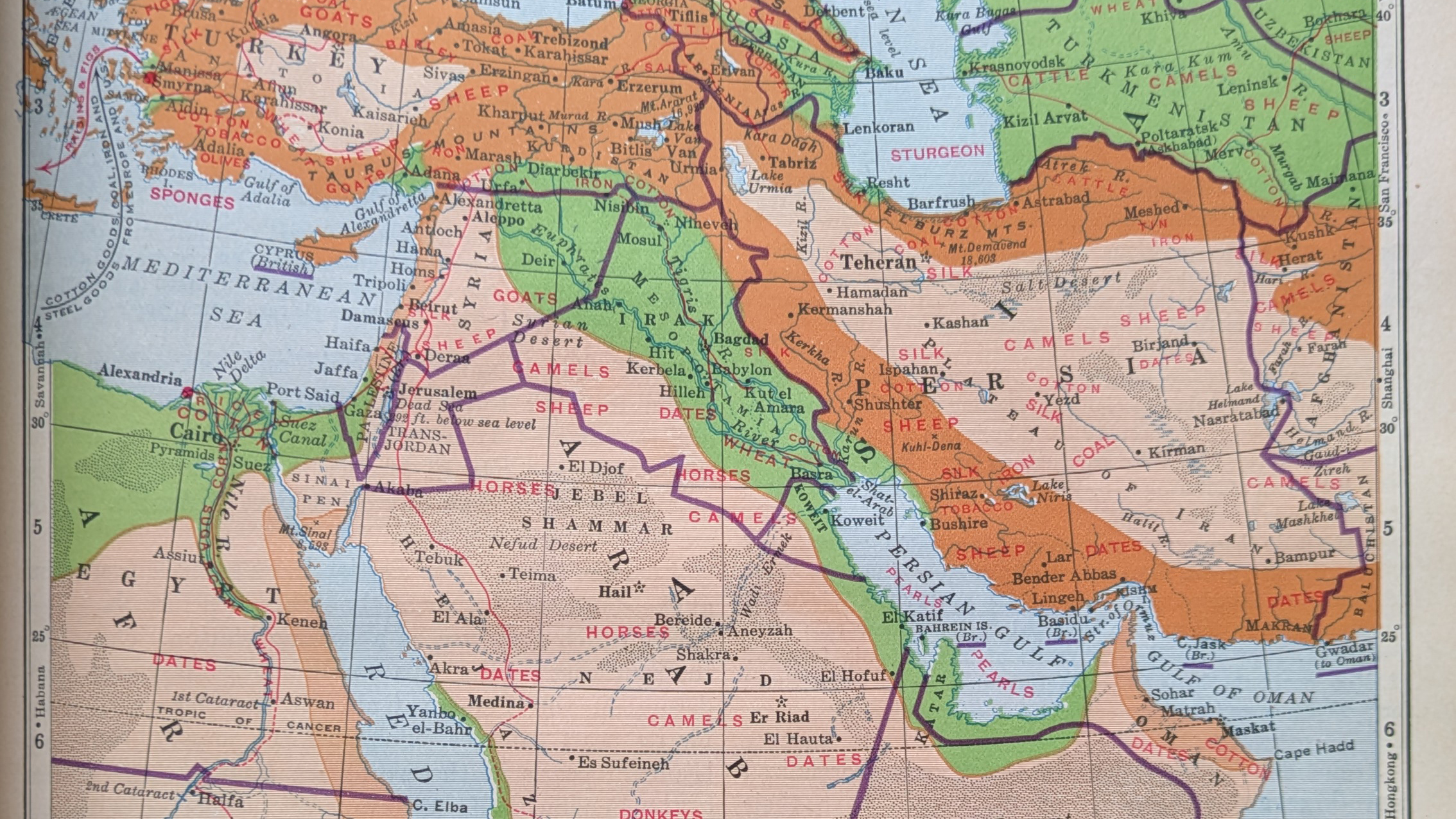
Iran, Not Persia
So if you’ve a date in Tehran, she’ll be waiting, in, well, Tehran. Happy Friday, all. On Monday I critiqued a graphic from Bloomberg about airstrikes in the Middle East. As we head into the weekend, I opted to pull one of my (many) atlases off the bookshelf, because I just wanted to see how…
-
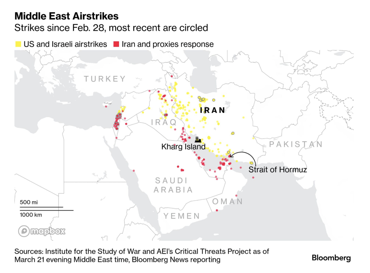
Gooood Morning, Bomb Iran?
As I ate breakfast this morning, I read through the Morning Briefing I receive from Bloomberg. These days, it provides a good update of what happened in Iran and the Middle East. Every once in a while I will flag one of their graphics to share here, but never decide to ultimately do it because…