Congratulations on making it to Friday. Though it was a short week for my American audience.
Now that the State’s Labour Day holiday has passed, the 2024 electoral season can begin in earnest. And to begin the insanity we have a helpful graphic from xkcd.
Clearly I’m not cut out for high office with a name of seven letters.
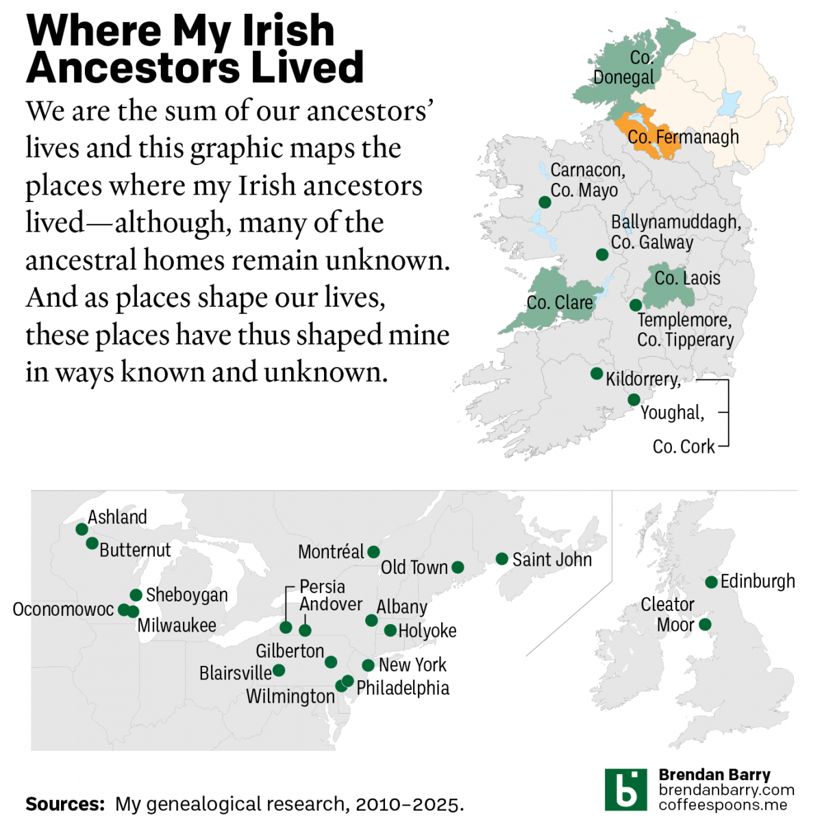
Yesterday was Saint Patrick’s Day and those who have followed me at Coffeespoons—or more generally know me—are well aware that my background is predominantly Irish. Those same people probably also know of my keen interest in genealogy. And that’s what today’s post is all about.
Irish genealogy is difficult because of the lack of records and lack of record access. My struggle is often in connecting an ancestor to a specific place in Ireland, necessary for any work to identify baptism, marriage, or death records. Starting with my maternal lines, it’s easy to see how ancestors were from “Ireland”, but I’ve been able to place precious few into a specific geographic context.
Thomas Doyle is the only ancestor I can place into a specific parish, and he wasn’t the key person who allowed it. For those interested in genealogy, it’s always worthwhile to investigate siblings, cousins, aunts, uncles, and sometimes even friends and neighbours because they often can provide clues, as it did in the case of the Doyles.
Sometimes you also need to step outside and get lost in a cemetery. I took a drive one weekend before the pandemic to find the graves of John Hickey and his family. Until that point, I knew nothing about the origins of him or his wife. Luckily his gravestone went one step beyond Ireland and stated he was born in Queen’s County, now County Laois. But I’ve still found no evidence of where in Laois he was born and so tracking the rest of his family is difficult, perhaps impossible.
Furthermore, you can also see that I have little specific information about when these ancestors all arrived. None were present in the 1850 US Census, so we can reasonably work from a starting hypothesis that they arrived after 1850 and then when each had children documented born in the US—or the rarer occasion of a US marriage record—we can reasonably assume they arrived between 1850 and the child’s birth.
On my maternal side there is a lot of work to do, which belies all the effort put into just getting this far over the last decade plus. Contrast that to my paternal side.
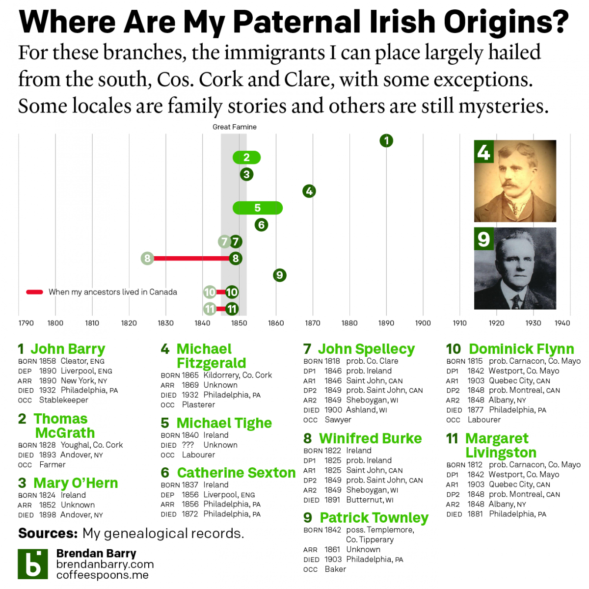
Here I have more Irish ancestors to investigate and I’m fortunate that I have more of an American paper trail, which when stitched together allowed me to get snippets of counties of birth or marriage, which, with some helpfully uncommon names, allowed me to dial in on specific parishes and towns. In other cases, my Irish ancestors first settled in Canada or the United Kingdom, which have much better preserved records. And finally a few have had family histories written and documented elsewhere, which allowed me to check the paper trail and validate the work.
And obviously when dealing with people in the mid-19th century, we don’t have a lot of photography and I’m lucky to have found a website—no longer extant, rest in peace Geocities—that had photos of my ancestors and a cousin over in Ireland who had a few photos sent my ancestors to their relations—though we’re not sure how they’re related, another story for another day—that I can put two faces to 18 names of direct Irish immigrant ancestors.
And of course the thing of note for all these people is that grey bar in the middle of the timeline: the Great Famine. In a roughly seven year period, over one million Irish died in Ireland and another over one million people left Ireland for places like the UK, Canada, the United States, Australia, New Zealand, among other places. It’s partly the reason for the massive Irish diaspora and why Saint Patrick’s Day is celebrated globally.
You can see some of my Irish ancestry is clearly unrelated, at least directly, to the Great Famine. But when you dig a bit deeper, you see the indirect connection. That John Barry who was an Irish stablekeeper who left Edinburgh for Philadelphia via Liverpool and New York, he was born to Irish parents in Cumberland, England—now Cumbria—who married there just after the end of the Great Famine and for whom there is no record prior to the Great Famine. In other words, they likely fled their home for fear of starvation and then in one generation their children all left England for America.
Irish genealogy is incredibly difficult, but it can also be incredibly rewarding. But you have have to keep digging and digging for even sometimes the shallowest roots.
Not the band, but the long-range strategic bomber employed by the United States Air Force. This isn’t strictly related to Ukraine, but it’s military adjacent if you will.
I thought about creating a graphic a few years ago to celebrate the longevity of the B-52 Stratofortress, more commonly called the BUFF, Big Ugly Fat Fucker. Obviously I did not, but over at Air Force Magazine, they created a graphic timeline showing the history of the aircraft, specifically as it relates to its engines, which will now be replaced in an effort to extend the life of the bombers.
I don’t love the image of the bomber behind the graphic, but I understand why it’s there given the B-52 is the focus of the timeline. I wonder if a different layout could have highlighted the placement of the engines and separated the timeline from the image of the bomber.
Overall I like the graphic, but it could just be that right now I’m spotlighting and working on a lot of graphics dealing with military issues and Ukraine in particular.
Credit for the piece goes to Dash Parham and Mike Tsukamoto.
Depending upon where you live, autumn presents us with a spectacular tapestry of colour with bright piercing yellows, soft warm oranges, and attention-grabbing reds all situated among still verdant green grasses and calming blue skies. But this technicolour dreamcoat that drapes the landscape disappears after only a few weeks. For those that chase the colour, the leaf peepers, they need to know the best time to travel.
For that we have this interactive timeline/map from SmokyMountains.com. It’s pretty simple as far as graphics go. We have a choropleth map coloured by a county’s status from no change to past peak, when the colours begin to dull.
The map itself is not interactive, i.e. you cannot mouse over a county and get a label or some additional information. But the time slider at the bottom does allow you to see the progression of colour throughout the autumn.
Normally, as my longtime readers know, I am not a fan of the traffic light colour palette: green to red. Here, however, it makes sense in the context of changing colours of plant leaves. No, not all trees turn red, some stay yellow. Broadly speaking, though, the colours make sense.
And to that end, the designers of the map chose their colours well, because this map avoids the issues we often see—or don’t—when it comes to red-green colour blindness. This being the reason why a default of green-to-red is a poor choice. Their green is distinct from the red, as these two proof colour screenshots show (thanks to Photoshop’s Proof Colour option).
The choice isn’t great, don’t get me wrong. You can see how the green still falls into the shades of red. A blue would be a better choice. (And that’s why I always counsel people to stick to a blue-to-red palette.) Compare, for example, what happens when I add a massive Borg cube of blue to the area of Texas and Oklahoma—not that you have a choice, because resistance is futile.
Here the blue is very clearly different than the reds. That makes it very distinct, but again, I think in the context of a map about the changing of leaf colours from greens to reds, a green-to-red map is appropriate. But only if, as these designers have, the colours are chosen so that the green can be distinguished from the reds.
As I always say, know the rules—don’t use red-to-green as one—so that you know the few instances when and where it’s appropriate to break them. As this map is.
Credit for the piece goes to the SmokyMountains.com
Earlier this week I was researching something for my day job that prompted me to look through an 1820 city directory for Philadelphia. Whilst looking for my information I came upon this graphic depicting how Ben Franklin advised people divide their time during the day.
Notably, this is all done in 1820, and so the typesetters used metal type, not graphics in our present-day sense, to create this. Although, that does leave room for a few issues of where these breaks actually occur. But overall this is remarkably similar to a day in the life in, well let’s just say January 2020 in the before times. An eight-hour work day with an hour’s break for lunch. And then four hours to yourself in the evening. Seven hours of sleep and then three hours to yourself in the morning.
Of course in the pre-electricity era, you can see how these times are focused around, you know, daylight. No lingering at the pub until well after midnight. It’s also notable how the emphasis on dining is at noon, not in the evening as we tend to do today.
Whilst this is billed as Franklin’s advice on how to structure your time, it should be pointed out that by 1820, Franklin had been dead just over 30 years. But that’s just one generation’s time removed.
Enjoy your weekend, everyone.
Credit for the piece goes to I’m guessing the book’s printers, McCarty and Davis.
We all know Joe Biden as the Irish American president. And that’s no malarkey. But, go back far enough in your family tree and you may find some interesting ancestry and ethnic origins and that’s no different with Joe Biden. Keep in mind that our number of ancestors doubles every generation. You have four grandparents, and many of us met most of them. But you had eight great-grandparents. How many of those did you know? And you had 16 great-great-grandparents, you likely didn’t know any of them personally. It becomes pretty easy for an ethnic line to sneak into your ancestry.
And in Biden’s case it may well be English. Although sneaking in is probably a stretch, as this BBC article points out, because his patrilineal line, i.e. his father’s father’s father’s, &c., is likely English. Of course back in the day the Irish and the English mixing would have been unconscionable, at least as my grandmother would have described it. And so it’s easy to see how the exact origins of family lines are quietly forgotten. But that’s why we have genealogists.
The article eschews the traditional family tree graphic and instead uses only two charts. The first is a simple timeline of Biden’s direct ancestors.
No, it’s no family tree, but timelines are a critical tool used by genealogists because at its core, genealogy is all about time and place. And a timeline has got one of those two facets covered.
Timelines help visualise stories in chronological order. I cannot tell you the number of family trees I have seen where people who create trees casually simply copy and paste data without scrutiny. Children born well after the deaths of parents are common. Or children born to parents in their 50s or 60s—perhaps not strictly impossible, but certainly highly irregular. And so to see Biden’s ancestors plotted out chronologically is a common graphic for those who do any work in genealogy, which my regular readers know is my hobby.
That alone would make the article worth sharing. Because, I enjoyed that graphic. I probably would have created a separate line for the birthplace of each individual, but I quibble.
However, we have another graphic that’s not so great. And once again with the BBC I’m talking about axis lines.
Here we have a chart looking at US ancestry as claimed in the US censuses of 1980 and 2000. But we do not have any vertical lines making it easy for readers to accurately compare the lengths of the various bars. Twice lately I’ve postedabout axis lines and the BBC. Third time’s the charm?
We can also look at using these not as bars, but as line charts as I did in this re-imagining to the right.
First, we no longer need two distinct colours, though you could argue the English line should be a highlight or call out colour given its role in the article. Instead each line receives a label at the right and only the English line crosses any other, but given their point-to-point slope, it’s not confusing like a line chart with all years between 1980 and 2000 could be.
Secondly, the slope here of the line reinforces the idea of falling population numbers. The bar chart also shows this, but through a leftward movement in bars. The bar option certainly works and there’s nothing wrong with it, but these lines offer a more intuitive concept of falling numbers.
I also added some clarification to the data definition. These lines represent the number of people who reported at least one ethnic ancestry—at the time US census respondents could enter upwards of two. For myself, as an example, I could have entered Irish and Carpatho-Rusyn. But my own small sliver of English ancestry would have been left off the list.
Ultimately, the declining numbers of responses along with some reporting on self-identification points to the disappearing concepts of “Irish American” or “English American” as many increasingly see themselves as simply White Americans. But that’s a story for another day.
In the meantime, we have Joe Biden, the Irish American president, with a small bit of English ancestry. Those interested in the genealogy, the article also includes some nice photos of baptismal records and marriage records. It’s an interesting read, though I’m hungry for more as it’s a very light duty pass.
Credit for the BBC pieces goes to the BBC graphics department.
If all goes according to plan, your author today will receive his first dose of the Covid-19 vaccine, the Pfizer variety for the curious. As such, it feels appropriate to share this recent piece from xkcd.
All joking aside, it should be said that, and as this graphic illustrates, just because you receive your first dose, doesn’t mean you should be out socialising and seeing people later that night.
You are not fully vaccinated until two weeks after your second dose, or the first if you received Johnson & Johnson. And so while I may be receiving my first dose this afternoon, it is going to be close to a month and a half before I’m able to leave my household unit and socialise with others. Probably three weeks for my second dose and then another two weeks for the vaccine to fully take effect.
Doesn’t mean I won’t be counting the days, though.
Last week the Philadelphia Inquirer published an investigation of the staggering number of horse deaths in Pennsylvania’s race track facilities. I found the article fascinating, but admittedly at a point or two a wee bit squeamish when the author described how horses essentially die. Then about halfway through the article I ran into the first of two graphics looking at the data.
The first is pretty simple, a timeline of deaths over the course of one year, 2019. Overall it works, you can clearly see clusters of racing deaths, but that those clusters spread across the year. When I sat with the graphic for a moment, however, a few things began to stick out at me. The first was a distracting vibration in the background. Not the alternating beige and blue of the months, but if you look closely you’ll see tightly spaced lines within the colour fields: presumably the days of the month for aligning the deaths.
On a large enough graphic it makes all the sense to tick off sub-monthly increments, but in this space I would have probably opted to show only the months. Maybe weeks could have worked, as that approach may have reinforced the statistic about a horse dying every six days on average.
The second point is the black stroke or outline of each dot. Here the designer faces a challenging constraint. Essentially, the smaller the dot (or the symbol) the brighter the colour. In a rich, blood red colour you have a dark heavier colour. Compare that to say a stop sign that is bright red. It has a lighter feel. The blood red colour, in a given space, has let’s say an amount of black ink or pixels—I’m simplifying here—mixed in with the red. But in a large area, there’s enough red ink or pixels to still be clearly blood red. The stop sign red has no other colours but red. And in large areas, it can be an eye-stabbing amount of red—precisely why it’s likely so useful for, you know, stop signs.
But at the small scale of these very small dots, you still proportionally have the same amount of red and black ink, but with fewer and fewer amounts, the eye can begin to experience difficulty in truly reading the colour for what it is. For example, in an area of say 49 pixels (7×7), while the ratio of red to black may be consistent, you still only have a total of 49 pixels with which to convey “red” to the reader. Consequently, in smaller spaces, you may find that designers sometimes opt for brighter colours, a la stop sign red, than they would in larger fields of colour.
Here we have a nice use of brighter red, green, and yellow. (I will quickly add that the choice of red and green can be problematic for colour blindness, but I don’t want to revisit that here.) But to provide better separation between those small, circle sized fields of colour a border probably helps. A thin black line, or stroke, makes sense. But the black is darker than the colours themselves, thus it can draw more attention than the colour fill. And that begins to happen here. I wonder if a thin white stroke may have been less distracting and placed more emphasis on the fill colours.
As I said, overall a really nice if not sobering graphic in an important but disturbing article. I think a few small tweaks could really bring the graphic over the finish line. Pun fully intended. Sorry, not sorry.
The United States surpassed 500,000 deaths from Covid-19. On Sunday, in advance of that sobering statistic, the New York Times published a front-page graphic that dominated the layout.
Usually a front-page graphic will make use of the four-colour process and present richly coloured graphics. This, however, starkly lays out the timeline of deaths in the United States in black and white.
Meaningful graphics do not need to reinvent the wheel. This takes each life lost as a black dot and then, starting at the top in February, plots each day.
The colour here serves as the annotation. The red circle drawing attention to the first reported death. And down the side the tick marks for days. Red lines indicate 50,000 death increments. The labels tell the story, we’ve needed fewer and fewer days to reach each subsequent 50,000 milestone.
As the first wave intensifies in March and April, the space fills with black dots. But as we enter summer and deaths fell, the space lightens. Late autumn and winter bring more death and you can see clearly towards the bottom of the chart, as we approach today, the graphic is nearly solid black.
If we want to look towards a hopeful point in the content, we can see first that it took 17 days then 15 to reach 400,00 deaths and 450,000 deaths, respectively. But it took 19 days to reach 500,000. As a nation we appear to finally be on the downward slope of this wave.
Returning to the piece, it’s a gut punch of simplicity in design.
Credit for the piece goes to Lazaro Gambio, Lauren Leatherby, Bill Marsh, and Andrew Sondern.
Yesterday was Armistice Day, a bank holiday hence the lack of posting. So I spent a few hours yesterday looking at my ancestors to see who participated in World War I. It turned out that on my paternal side, my one great-grandfather was too old and the other was both the right age and signed up for the draft, but was not selected.
And so the only two that served were my maternal great-grandfathers. One served a few months in the naval reserve towards the end of the war. My other great-grandfather served for a year, a good chunk of it in France. This I largely knew from my great aunt, who had told us stories about how he had told her about blowing up bridges they had just built to prevent Germans from capturing them. And then how after the war he served as military police, arresting drunk American soldiers in France. But I had never realised some of the documents I had collected told more of the skeletal structure like units and ranks. Consequently, I decided to make this graphic.