Apologies for the long layoff, but life threw me a curveball or two. But in that time I did manage to go out to Boston and catch some of Big Papi’s last regular season games with the Red Sox at Fenway Park. Whilst there, I caught an advert for Boston’s new City Score, which updates the public on how city services are performing. Below is a screenshot from the site.
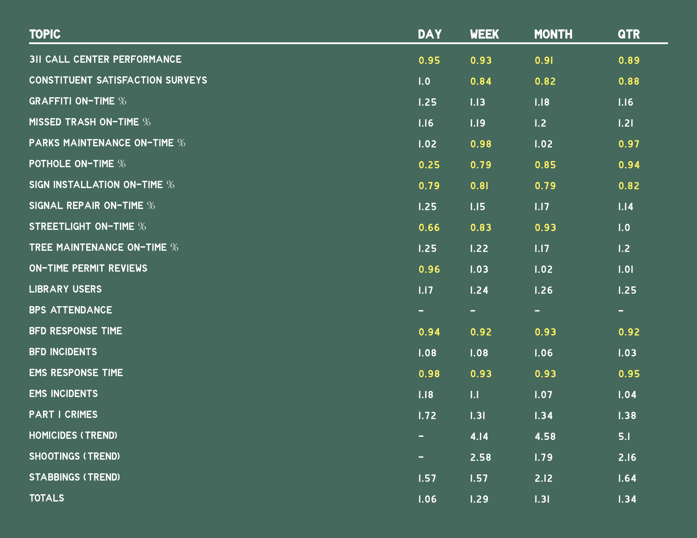
Not every datapoint needs to be visualised—sometimes a table does just fine. But, admittedly, what really drew me to the table was its design. For those of you unfamiliar with Fenway and the Red Sox, this table could fit in on the Green Monster with the same colours and type.
Credit for the piece goes to Boston’s design team.
Leave a Reply
You must be logged in to post a comment.