Tag: Boston
-
Fear the Floodwaters
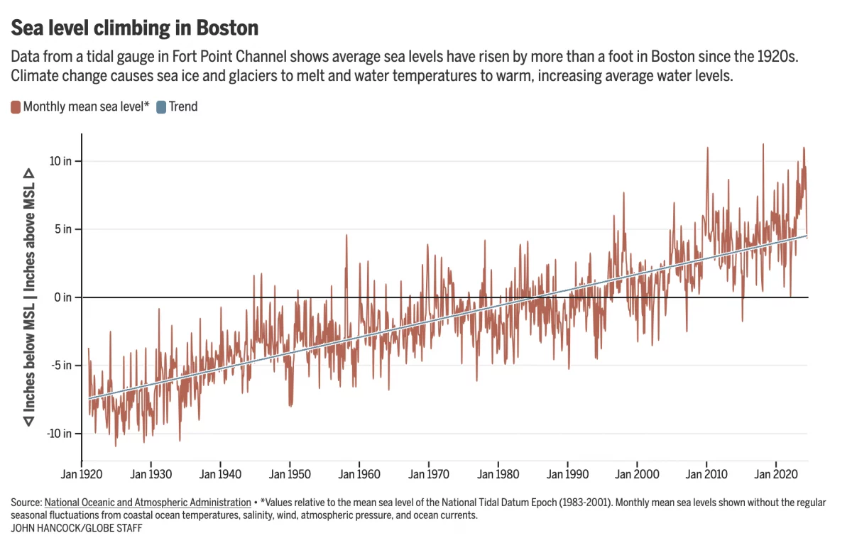
This past weekend saw some flooding along the East Coast due to the Moon pulling on Earth’s water. In Boston that meant downtown flooding, including Long Wharf. The Boston Globe’s article about the flooding dwelt with more impact, causes, and long-term forecasts—none of which really warranted data visualisation or information graphics. Nonetheless, the article included…
-
Building Back Better Boston Transit
The alliteration failed at that last word, but it gets the point across. No mater how you may want to define infrastructure, the term always includes transit. In the Boston Globe, an opinion piece proposed how the city and region of Boston could improve upon the city’s mass transit options. And they made a map.…
-
Wicked Hot Islands
Though the temperatures might not always feel it, at least in Philadelphia, summer is ending and autumn beginning. Consequently I wanted to share this neat little work that explores urban heat islands. Specifically, this post’s author looks at Massachusetts and starts with a screenshot of the Boston area. The author points out that the Boston…
-
Boston Marathon Times
Yesterday was Patriots’ Day, celebrated in Massachusetts and Maine—and in my research for this post, apparently now in Connecticut as of this year and Wisconsin of all places—with the date used as that of the famous Boston Marathon. Since I live in none of those states, I know it only because to my knowledge it…
-
Scoring Boston
Apologies for the long layoff, but life threw me a curveball or two. But in that time I did manage to go out to Boston and catch some of Big Papi’s last regular season games with the Red Sox at Fenway Park. Whilst there, I caught an advert for Boston’s new City Score, which updates…
-
Boston Bruins New Breakout Play
If you guys have not yet figured out, I am a baseball guy. But that is pretty much my only sport. And so maybe you can help explain to me just what is going on in today’s piece from the Boston Globe. I think it is attempting to explain hockey formations for the Boston Bruins.…
-
Foul Balls at Fenway
Happy Friday, everyone. Foul balls are the souvenirs of fortune at baseball games. (Home runs as well I suppose.) You can’t buy them, you can only hope to be one of the lucky few who catch one. So the Boston Globe ran an article with an integrated interactive piece that told the story of a…
-
Who Are the Red Sox?
As Massachusetts and Maine celebrate Patriots’ Day, the Boston Red Sox are set to play their earliest game of the year with an 11.00 start time. (Yes, there is also a marathon today.) So after two weeks or twelve games, the question people want answered is what Red Sox do we get this year? FiveThirtyEight…
-
Boston’s Snowy 2015
Boston has finally had it. And by it I mean the snowfall that broke the record. And by record I mean the record for the most snowfall in a year. Well, at least since they started recording it in 1872. The Washington Post has a nice chart placing the season not just in context, but…