North Korea wanted to launch a missile, but failed miserably in doing it. Richard Johnson at the National Post created an infographic, prior to the missile’s launch, that looked at what the North Koreans wanted to do.
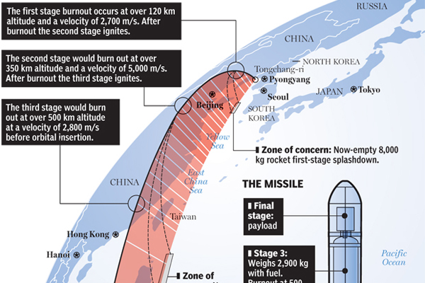
North Korea wanted to launch a missile, but failed miserably in doing it. Richard Johnson at the National Post created an infographic, prior to the missile’s launch, that looked at what the North Koreans wanted to do.

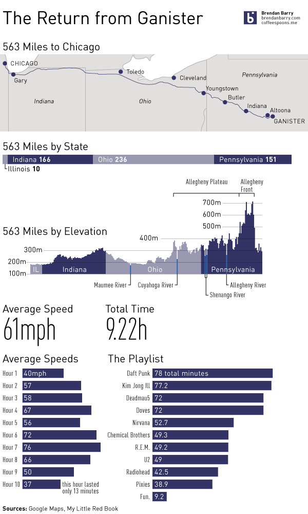
Last weekend I visited Ganister, Pennsylvania to see family, meet some old family friends, do some research, and generally just get out of Chicago. After I arrived, I realised I wasted an opportunity to tell the story of the drive out. So, I made a mental note to record some data on the long drive back. This infographic is the result.
The anniversary of the RMS Titanic’s sinking led to a flurry of graphics related to the sinking, two of which I covered last week. Today’s is from the National Post and looks at the people onboard, most of whom died. Specifically, it breaks out the survivors and those who perished into their class—by berth not birth—and age. It also shows how empty most of the lifeboats were when they launched.
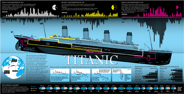
Credit for the piece goes to Richard Johnson.
Global warming is probably not the worst-branded concept out there, but it is not particularly effective. Mostly because it implies the world will warm and warm evenly. In truth, some parts will get colder, some parts drier, some parts wetter, and yes, some parts warmer. Hence the better term is climate change.
In the US, we have a tendency to be rather skeptical of climate change and the degree to which, if not whether entirely, it is due to mankind. So, the New York Times released the results of a survey about whether Americans believe recent weather events are related to global warming—their word choice, not mine.
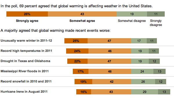
While not all bars sum to 100, probably due to rounding, note how the bars are all aligned against the point of divergence between the scales of agreement and disagreement and then sorted according to agreement.
On the back burner of infographics to post is this piece from the National Post. The early data indicates that most of Canada’s high population growth rate comes from immigrants to the country. And while those details are not yet available, the piece looks at the 2006 data for an indication of from which places the immigrants are likely to come.

Credit for the piece goes to Richard Johnson.
For the past two posts I focused on the sinking of the RMS Titanic, an historical event that has always been of some interest to me, but is not always the most uplifting of subjects. When in high-school, I once had an English teacher who took to heart our complaints that our literature selection was rather dark and depressing. So after finishing yet another such story, he had us turn to a specific page in our reader. The title of that day’s story was To the Gas Chambers, Ladies and Gentlemen; it was a story about the Holocaust.
Here is today’s uplifting story. What would happen if a dirty bomb was detonated in lower Manhattan. Courtesy of the National Post.
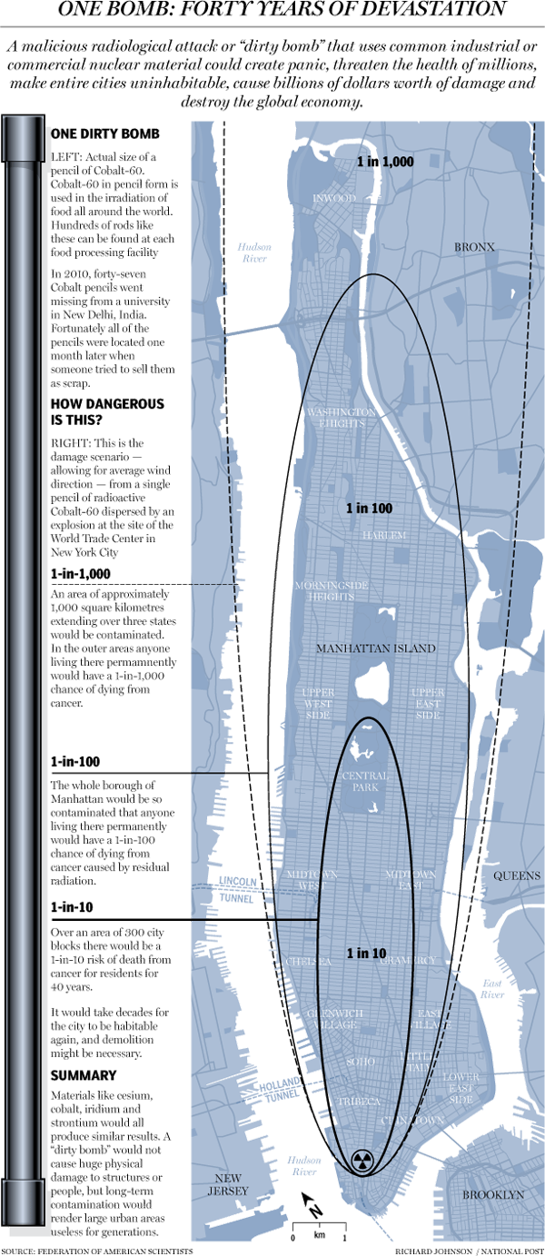
Credit for the piece goes to Richard Johnson.
On 14 April 1912—that is 100 years—RMS Titanic avoided slamming bow-on into an iceberg. But her turn allowed the iceberg to slice a long gash beneath the waterline and the North Atlantic gushed into watertight compartment after watertight compartment. Several hours later over 1500 people would be dead.
The BBC has published several articles about the sinking in the lead-up to the anniversary. This one is an illustration through small multiples of how the Titanic sank, from the bow slipping beneath the waves to the point at which the liner split in two to the stern rising vertically out of the water before it too plummeted to the seabed.

At the end of the graphic is an exploration of the wreck and a small chart showing the scale of the depth at which the wreck now sits, slowly deteriorating.
Credit for the painting goes to Ken Marchshall.
Saturday will be the 100th anniversary of the sinking of the RMS Titanic. She struck an iceberg just before midnight—at the time the crew thought merely as a glancing blow—and within three hours she would be headed towards the seabed. By the time the survivors were all picked up, over 1500 people would die in what is perhaps the most (in)famous sinking in human history.
But, what about the iceberg? There are of course the reports that a ship scouring the sea for survivors after the sinking found the killer berg. But how did it get there? The New York Times put together an infographic exploring the science behind how the RMS Titanic might have ended up colliding with what originally was part of (probably) a Greenlandic glacier.
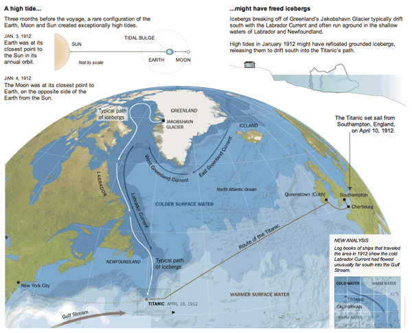
Also in the piece are explanations of how it is possible that the SS Californian did not come to the rescue of the stricken RMS Titanic.
Credit for the piece goes to Mika Gröndahl and Joe Burgess.
So Rick Santorum is now out of the race. Mitt Romney is basically now set to run against the President. But why should Santorum go out without an infographic looking back at the Republican primary race. (Since neither Newt nor Ron come even close to running the same race as Rick.)
The New York Times put out an infographic looking at Rick Santorum’s campaign. And as one can see, he did do well in the evangelical and Christian conservative heartland of the United States. It just was not quite enough to beat Romney’s supporters.

But, Santorum did manage to last longer in the race than many others have in recent years. So who knows, depending on how the election in November turns out, we may just see more of Rick in the future.

And the baseball season is kicking off (perhaps a bit slowly for my 1–3 Red Sox, but I’m not worried…yet). The Washington Post, the newspaper for those most likely to be following the Washington Nationals, put out a little while ago an interactive graphic looking at the payroll figures for the Top-3 starting pitchers in each team’s rotation.

Credit for the piece goes to Sisi Wei and Todd Lindeman.