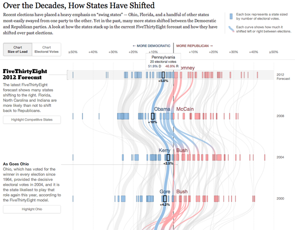
Problems with my access to the tubes of the internets prevented me from posting this piece last week. But it’s still good and still relevant, especially in the wake of last night’s presidential debate. The New York Times and the FiveThirtyEight forecast came together to create this interactive flow chart, if you will, of the ebb and flow of electoral politics.

Two different views, one based on electoral votes and the other on the margin of victory, determine the basic chart type. But both let you watch swings states vacillate between Republican and Democratic support. Context is provided to the side of the main graphic to explain just what was going on in particular elections.
Credit for the piece goes to Mike Bostock, Shan Carter, and Amanda Cox.
Leave a Reply
You must be logged in to post a comment.