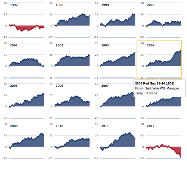
The Boston Red Sox hired John Farrell this weekend to be their manager just one season after hiring Bobby Valentine for the role. There is a lot to be said about just who is to blame about the Red Sox’ awful season. But it was pretty awful. How awful? The Boston Globe shows us in this interactive piece.
It’s a series of small multiples of line charts. However, one of the big problems with the infographic is that the labels are entirely absent. As best I can tell the line is the number of games over .500, i.e. an even split between wins and losses. But, it could be more clearly called out if not in the legend or on the axes than in the title.
But over all it does put this past season into a sober perspective.

Credit for the piece goes to Daigo Fujiwara.
Leave a Reply
You must be logged in to post a comment.