Category: Illustration
-
Reticulating Splines
Happy Friday, all. In looking at my calendar the other day, I saw that in three weeks I will be in Appalachia for Orthodox Easter. That means driving through Pennsylvania’s Ridge and Valley region and then sleeping in the mountains. But wherefore the mountains? Thankfully, xkcd posted a map explaining why all the natural features.…
-
On a Pale Blue Dot, Talking ’bout Little Red Dots
Well that certainly was a week. I would say we made it and, technically, I would be correct because I the writer and you the reader are here to type and read these words. But many hundreds of others are not, because decision makers in Jerusalem and Washington chose to go to war. To try…
-
Not the Momma
Well, we made it to the weekend once again. Sometimes—often if I’m being honest—I will sit and watch birds hop around on my balcony, chirping to each other for a minute or two before they fly off to destinations unknown. And in the back of my mind I am always thinking, that little guy is…
-
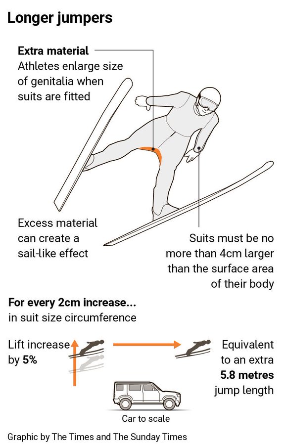
A Matter of Millimetres
Well we have made it to the weekend. And so it is the time to look at the area of men’s genitalia. This week on baseball Twitter the following graphic made the rounds. The graphic itself claims to be from the Times—the original, not the New York version for my American audience—though I have been…
-
Space Is Cool
Well we made it to Friday. One of my longtime goals is to see the aurora borealis, or Northern Lights. My plan for the winter of 2020 was to travel to Norway, maybe visit a friend, and then head north to Tromsø and take in the Polar Night and, fingers crossed, catch the show. Then…
-
The Sun’s Over the Yardarm
After all, matey, ’tis Friday. For those unfamiliar with the expression, what is a yardarm you ask? On traditional sailing vessels the tall thing holding the sail is the mast. Back in the day it was often crafted from a tall tree—see the critical timber industry of New England and the white pines provided to…
-
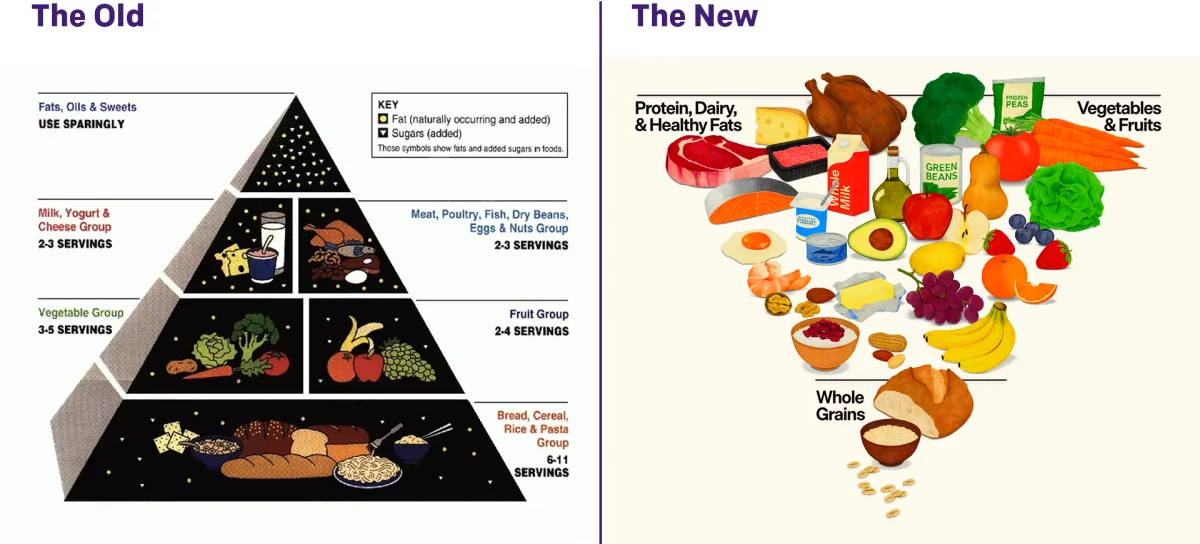
Turning the Pyramid Upside Down
Literally. Last week amongst all the things, the administration released new dietary guidelines, including a brand new food pyramid. The guidelines needed some tweaking as dietary and nutritional science evolves. The administration made a big deal about replacing the old pyramid with the new pyramid, and you can see the comparison here. I am not…
-
Flow Diagram from Hell
Well, not hell, but xkcd. The last several months I have had to use a number of websites where the user experience broke down and I was forced to switch to using a phone. Only to have the phone try and direct me back to the website. Nightmarish stuff, people. So Happy Friday! Credit for…
-
Pick Your Pizza
As many longtime readers know, I lived in Chicago for eight years. I probably had Chicago-style pizza fewer than eight times in my life. I grew up in the Philadelphia suburbs and for the last nine years I have lived in central Philadelphia, where pizza is very much a different thing. And in my life…
-
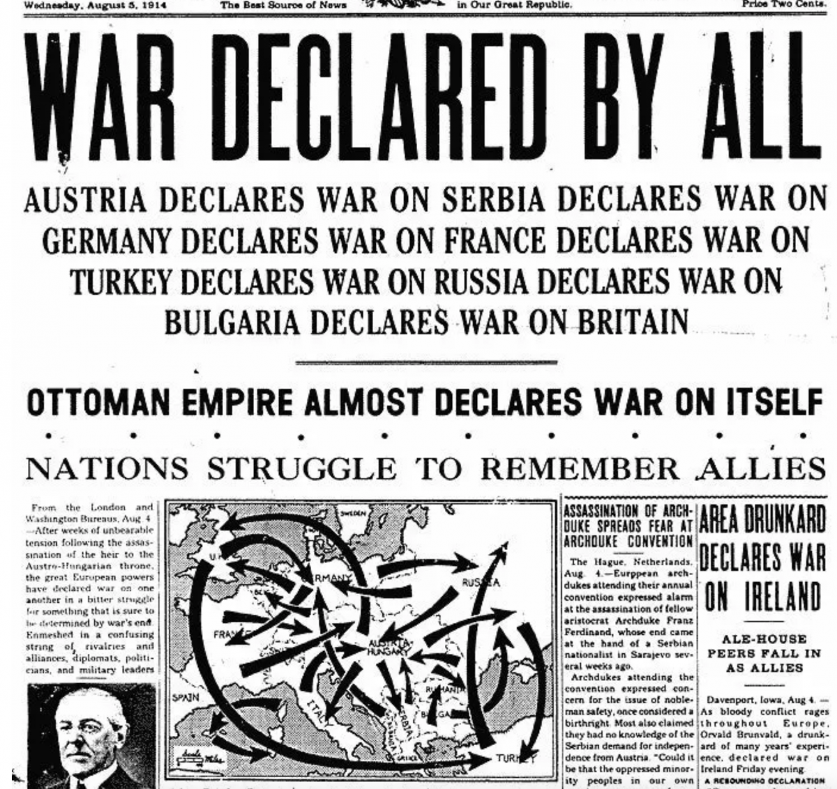
You Get a War, You Get a War, You Get a War…
A good friend of mine sent me this graphic earlier this week. The World Wars fascinate me—to be fair, most history does, and yes, that even includes the obligatory guy thinking of the Roman Empire—and I can see on my bookshelf as I type this post up my books on naval warships from World War…