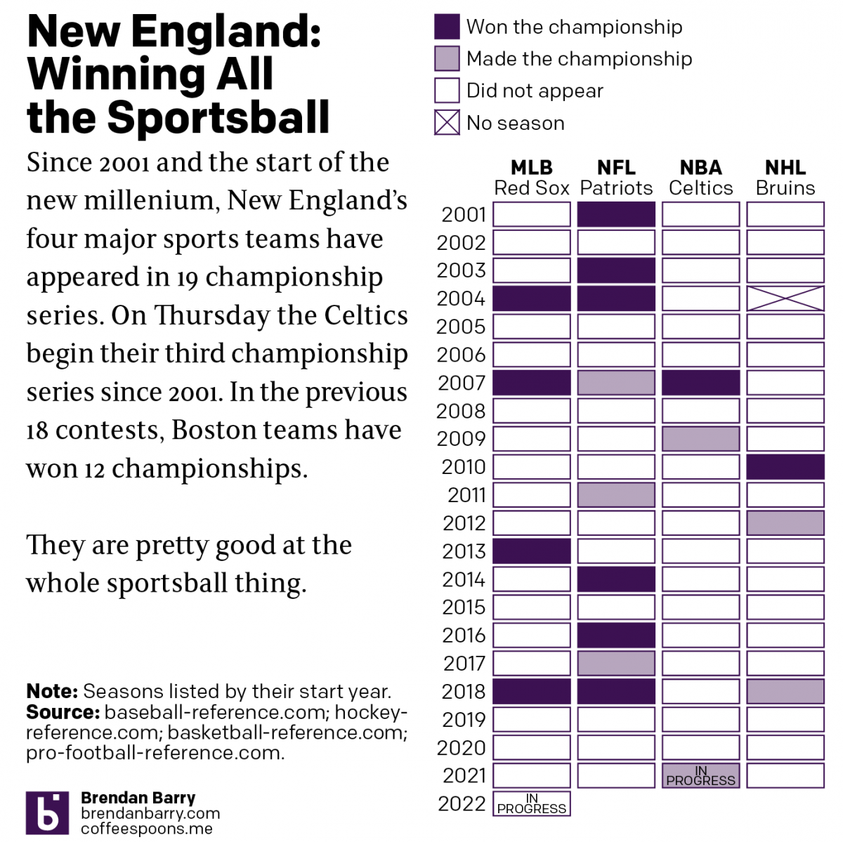
Boston: Sportstown of the 21st Century

Tonight the Boston Celtics play in Game 1 of the NBA Finals against the Golden State Warriors, one of the most dominant NBA teams over the last several years. But since the start of the new century and the new millennium, more broadly Boston’s four major sports teams have dominated the championship series of those sports. In fact tonight marks the 19th championship series a New England team has played since 2001. And in those 18 series thus far, Boston teams have a 12–6 record.

Let’s go Celtics.

Of the 12 titles won, the New England Patriots account for half with six Super Bowl victories out of nine appearances. The Boston Red Sox have won all four World Series they have played in since 2001. Rounding out the list, the Celtics and Bruins have each won a single championship with the Bruins appearing in three Stanley Cups and the Celtics in two NBA Finals. Tonight begins their third.

Credit for the piece is mine.

The Armchair General…

Manager.

Of the New England Patriots.

As many of my long-term readers know, I am really only a one sport kind of guy. And that sport is baseball. American football, well, I’ve seen one match live and in person and it was…boring. But it’s a big deal in America. And this is the time of the year when teams begin signing free agents.

I happened to be reading the Boston Globe for news on the Red Sox, my team, when I saw a link to this interactive tool allowing users to build their own roster with free agent signings.

Go Pats

Conceptually, the piece is fairly simple. There is a filterable list of free agents, broken out by whether their forecast signing values falls into the high-, middle-, or low-end of the range. Plus a draft pick.

I root for the Patriots. However, if you asked me to name a single player on last season’s roster, I could only name Cam Newton. Apparently he wasn’t great. I really and truly don’t follow the sport.

The piece displays the available free agents, along with those no longer available. (Though, the piece does offer you the option to go back to the beginning of free agent season and pretend reality didn’t happen.)

I have no idea who any of these people are.

I went through and began semi-randomly picking names. I’d heard of some of them, and others were blind choices. Once you’ve selected within the budget, you can choose a draft pick. They all appear in list format to the right with the ability to remove them via a small X button.

Nope, not a clue.

Once you’ve confirmed your choices you’re taken to a screen that reviews your selection. You are able to either tweet it to the world—which I did not do—or start over again. I would do that, but I wouldn’t do any better than how I just did.

I hope I did at least okay.

Overall, the piece felt intuitive and I never had any issues selecting my free agents. Of course, it would help if I knew anything about the sport. But that’s a user problem.

Credit for the piece goes to Ben Volin.

The Internationalism in Sport

Whilst away, I came upon this piece in the following of my offseason baseball news. The New York Times published it between Christmas and New Years and the piece looks at the origins of sports persons in European football leagues compared to several American sports leagues, including American football, baseball, and basketball.

I was most confused by US women's football, which I had not realised has not been a single continuous organisation
I was most confused by US women’s football, which I had not realised has not been a single continuous organisation

The piece features an opening set of small multiples comparing all the leagues. Maddeningly, I wanted details and mouseovers and annotations at the start. Fortunately, as the reader continues through the article, each small multiple becomes big and the reader can explore the details of the league.

Credit for the piece goes to Gregor Aisch, Kevin Quealy, and Rory Smith.

How to Choose the Match to Broadcast

I was reading the Sunday paper yesterday and whilst I normally skip the sports section, especially during baseball’s offseason, this time a brightly coloured map caught my attention. Of course then I had to read the article, but I am glad that I did.

On Sunday the New York Times ran a print piece—I mean I assume I can find it online (I did.)—about CBS chooses which American football matches to air in the country’s markets. It is a wee bit complicated. And if you can find it, you should read it. The process is fascinating.

But I want to quickly talk about the design of the thing. Remember how I said a map caught my attention. That was pretty important, because the map was not the largest part of the article. Instead that went to a nice big photo. But the information designer I am, well, my eyes went straight to the map below that.

The story dominated the section page

There is nothing too special about the map in particular. It is a choropleth where media markets are coloured by the game being aired yesterday. (The piece explains the blackout rules that changed a few years ago from what I remember growing up.)

But then on the inside, the article takes up another page, this time fully. It runs maps down the side to highlight the matches and scenarios the author discusses, reusing the same map as above, but because this is an interior page, in black and white. It probably looks even better online as they likely kept the colour. (They did. But the maps are smaller.)

To have that much space in which to design an article…

Overall, I really enjoyed the piece and the maps and visuals not only drew me into the piece, but helped contextualise the story.

Credit for the piece goes to Kevin Draper.

2-point Conversions

I rarely watch American football. But I do like charts about it. So today’s post looks at a piece from Benjamin Morris who explored the scenarios in which a team should opt for the two-point conversion. For those of you who know even less about American football, you can attempt such a conversion after your team scores a touchdown. More often than not your team will go for the far safer and more assured one-point conversion, which if made makes a touchdown of seven points.

It turns out that teams should probably be looking for those two points a wee bit more often than they presently do. And to help teams figure that out, Morris made a small multiple chart looking at many different scenarios.

When to do it
When to do it

Credit for the piece goes to Benjamin Morris.

Colin Kaepernick

Colin Kaepernick is a contentious figure in American football because of the protests he started against the US national anthem. While other protesting players remain on teams and play, Kaepernick remains unsigned despite what some say is a talent above other players. And as the American football season just began, this article from the Washington Post caught my attention.

Some of the arguments I have seen for Kaepernick’s unsigned status allege he just is not very good. But is that so? What does the data show? Well thankfully the Post dived into that and is running what we can best call a Kaepernick tracker comparing him to qualified quarterbacks in the NFL.

Clearly better than a host of other quarterbacks

It turns out, he is a middle-of-the-pack quarterback, demonstrably better than half-a-dozen and sitting solidly amongst an almost third-tier or cluster of players. The data clearly shows that poor performance is not the reason for remaining unsigned, otherwise he would have replaced any number of quarterbacks. True, it could come down to his dollar cost, but most likely his remaining unsigned, compared to almost a dozen players underperforming him, is related to his protests.

Now from the design standpoint, I also wanted to call attention to this article because of the way it handles definitions. The article uses the statistic adjusted net yards per attempt to assess performance. But what does that actually mean? Well, in the digital margins of the piece, the designers include an explanation of that statistic. I thought this was a really well-done part of the article, not interrupting the main narrative flow for a definition that a portion of the audience probably knows. But the more casual followers or people more interested in the political nature of the story would have no idea, and this does a great job of explaining it to us laymen.

What does it all mean?

Credit for the piece goes to Reuben Fischer-Baum, Neil Greenberg, and Mike Hume.

The NFL Draft Comes to Philadelphia

The joke I have been telling everyone in person this past week: I changed jobs and moved 750 miles from Chicago to Philadelphia, but I still cannot escape the NFL Draft. The two previous drafts occurred across the street from my last job and this year they are three blocks away from my new flat. Traffic is a bloody nightmare. So while there is a lot of news to cover through data visualisation and design, the local story is the NFL Draft that begins tonight next to the Rocky statue and in front of the Art Museum. We will return to trade wars with Canada, tax cuts for the rich, North Korea, climate change, and other things over the next few weeks.

Today’s piece comes from the Washington Post and looks at NFL Draft success across the NFL. Unfortunately for all of you, I know almost nothing about the NFL except Free Tom Brady. (I have to transfer my Red Sox allegiance somewhere, right?) But this set of small multiples looks fantastic and generally tells me that the Colts and Packers—the latter likely to the chagrin of my Chicago-born followers—have historically done well.

While I fail to understand the references/anecdotes, the grid looks nice…

Aesthetically, I am not sure about the handwriting typeface. I wonder: could the content have been handled better by a more traditional face?

Credit for the piece goes to Reuben Fischer-Baum.

Monday Morning Quarterbacking the Quarterbacks

As most of you know, I am a huge baseball fan. I am not so much a huge fan of American football. But I will watch it from time to time. And as a Red Sox fan, that means I will root for the Patriots. So I guess you know how my Sunday night went.

But this past week, I started my subscription to the printed New York Times. And on Sunday I opened the sports section to this full-page graphic.

Page design
Page design

It comprises three graphics: The big one on the left looks at completions under pressure. Despite being a full-colour page, the designers only needed two colours to convey the message—black and orange.

Under pressure
Under pressure

Similarly, on the right, the third-down graphic also uses a more limited palette. But, for the heat map it does make some sense to use a full colour palette.

Performance in the pocket

Overall, the page shows that colour, when thoughtfully restrained, makes not just the graphic clearer, but also good sense.

Credit fort he piece goes to David K. Anderson and Joe Ward.

Road to Victory

Among my recent life changes, I have moved back to Philadelphia from Chicago. That means Sundays the bars and streets are full of people wearing the jerseys of their favourite Eagles (American) football players. And apparently this year, they are off to a good start. FiveThirtyEight took a look at other 3-0 teams to compare the 2016 Eagles and examine their chances for the playoffs.

Comparing the Eagles offense and defence

Credit for the piece goes to Chase Stuart.