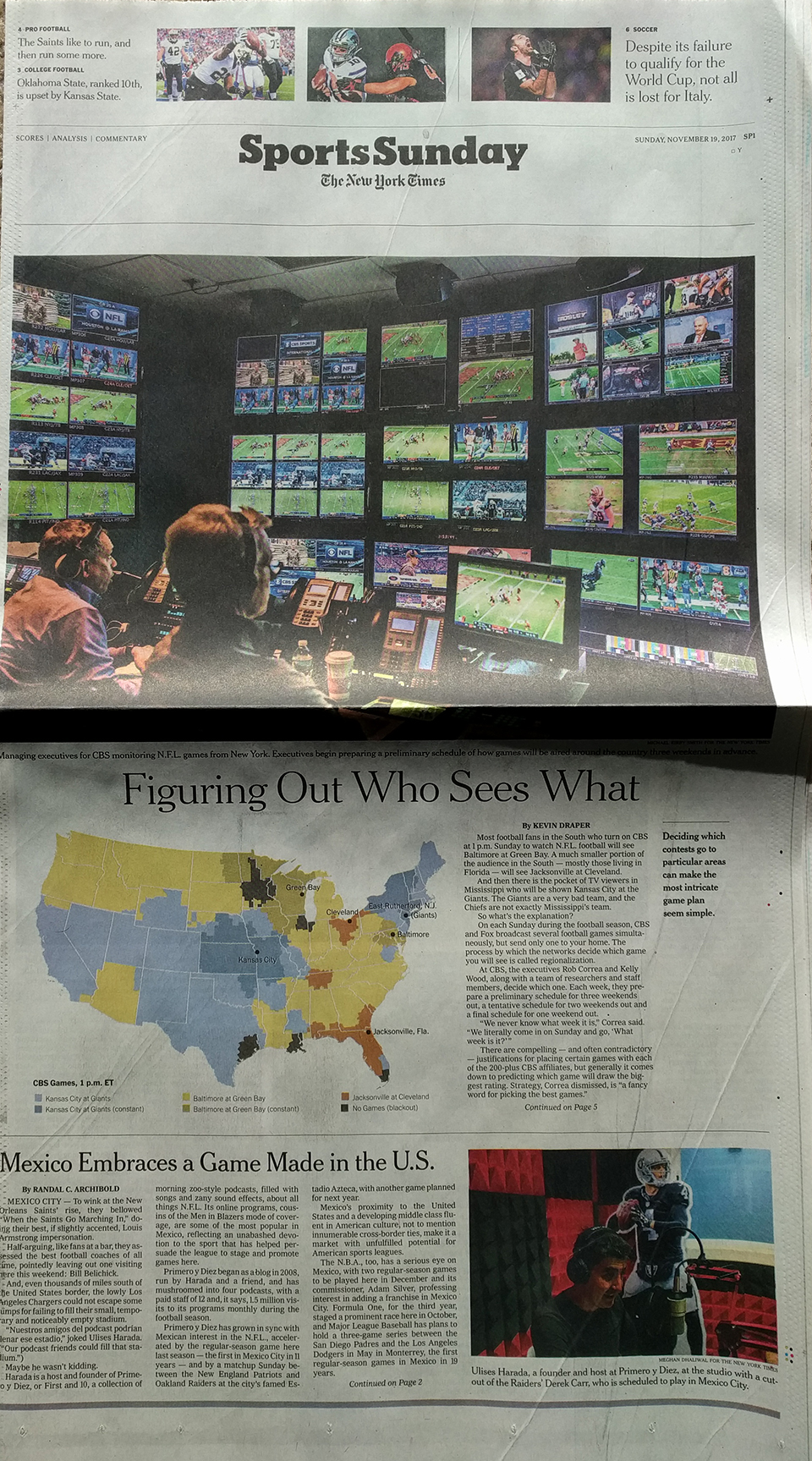
I was reading the Sunday paper yesterday and whilst I normally skip the sports section, especially during baseball’s offseason, this time a brightly coloured map caught my attention. Of course then I had to read the article, but I am glad that I did.
On Sunday the New York Times ran a print piece—I mean I assume I can find it online (I did.)—about CBS chooses which American football matches to air in the country’s markets. It is a wee bit complicated. And if you can find it, you should read it. The process is fascinating.
But I want to quickly talk about the design of the thing. Remember how I said a map caught my attention. That was pretty important, because the map was not the largest part of the article. Instead that went to a nice big photo. But the information designer I am, well, my eyes went straight to the map below that.

There is nothing too special about the map in particular. It is a choropleth where media markets are coloured by the game being aired yesterday. (The piece explains the blackout rules that changed a few years ago from what I remember growing up.)
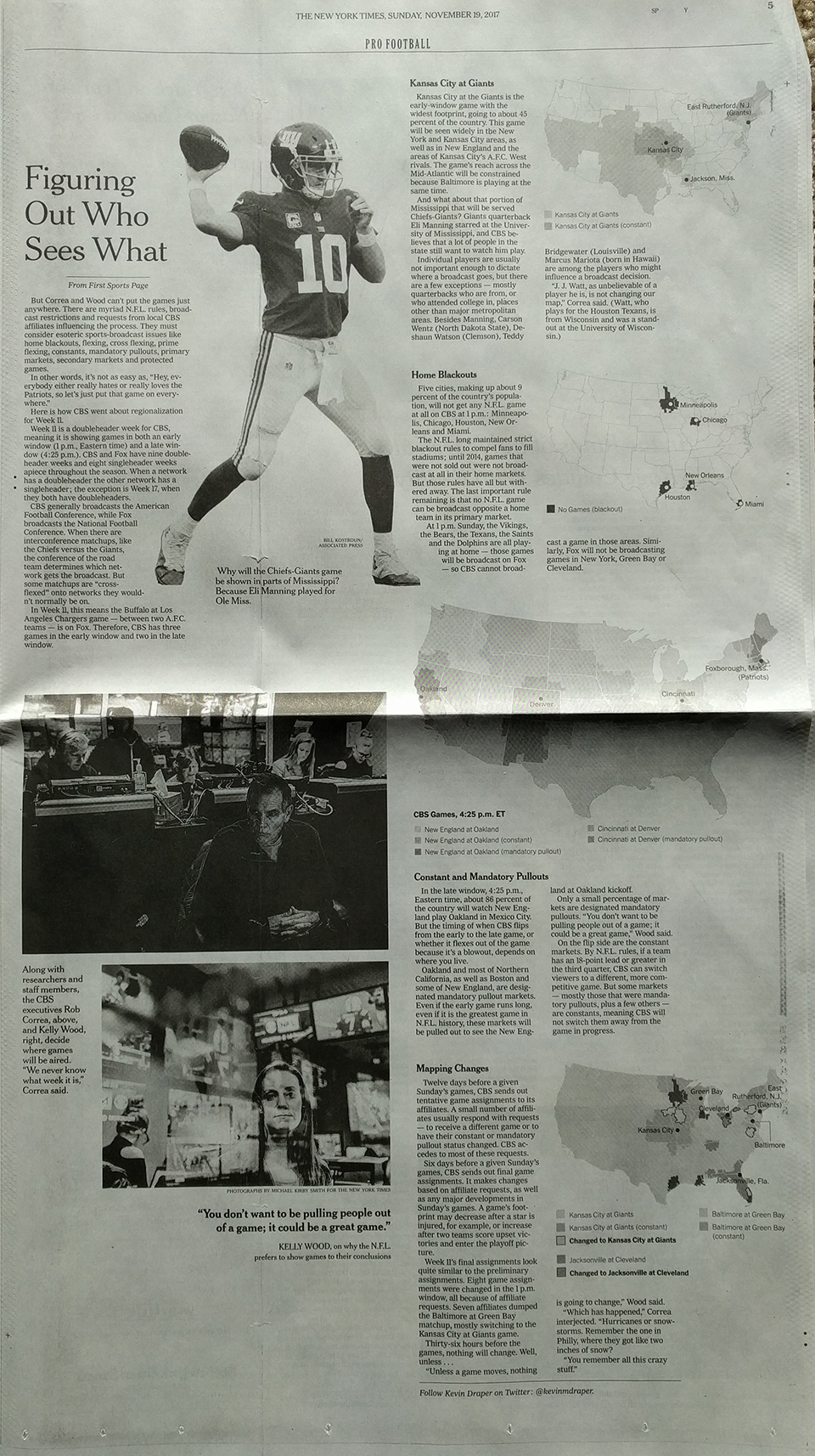
But then on the inside, the article takes up another page, this time fully. It runs maps down the side to highlight the matches and scenarios the author discusses, reusing the same map as above, but because this is an interior page, in black and white. It probably looks even better online as they likely kept the colour. (They did. But the maps are smaller.)

Overall, I really enjoyed the piece and the maps and visuals not only drew me into the piece, but helped contextualise the story.
Credit for the piece goes to Kevin Draper.
Leave a Reply
You must be logged in to post a comment.