As most of you know, I am a huge baseball fan. I am not so much a huge fan of American football. But I will watch it from time to time. And as a Red Sox fan, that means I will root for the Patriots. So I guess you know how my Sunday night went.
But this past week, I started my subscription to the printed New York Times. And on Sunday I opened the sports section to this full-page graphic.
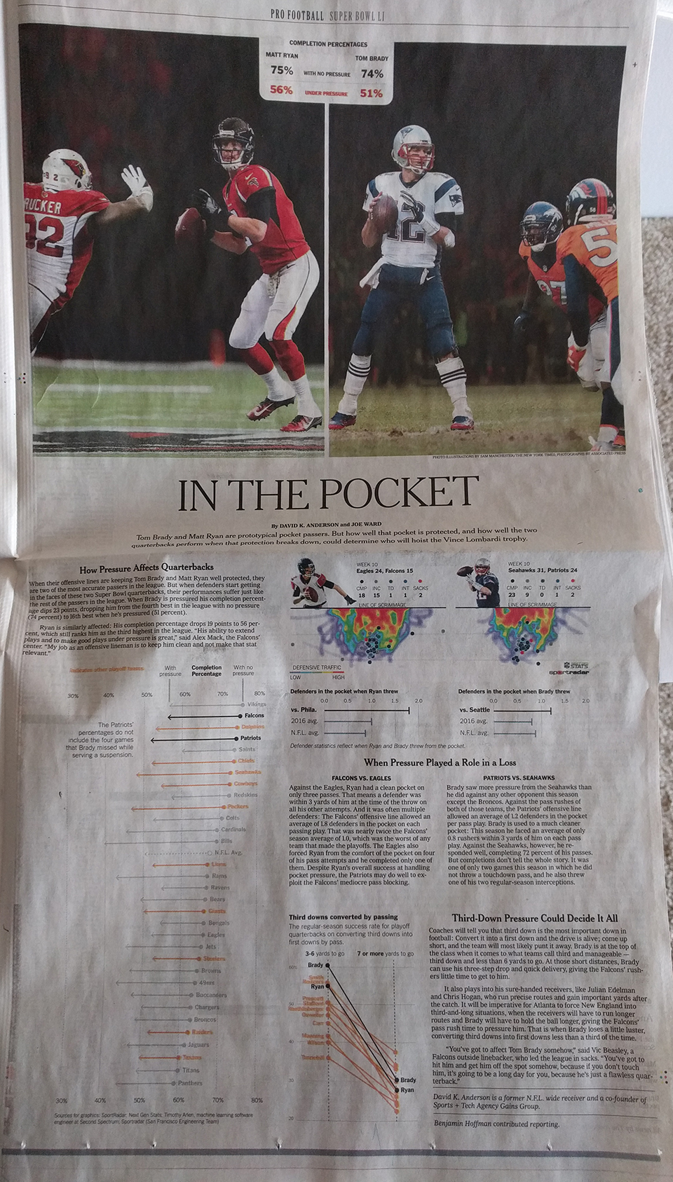
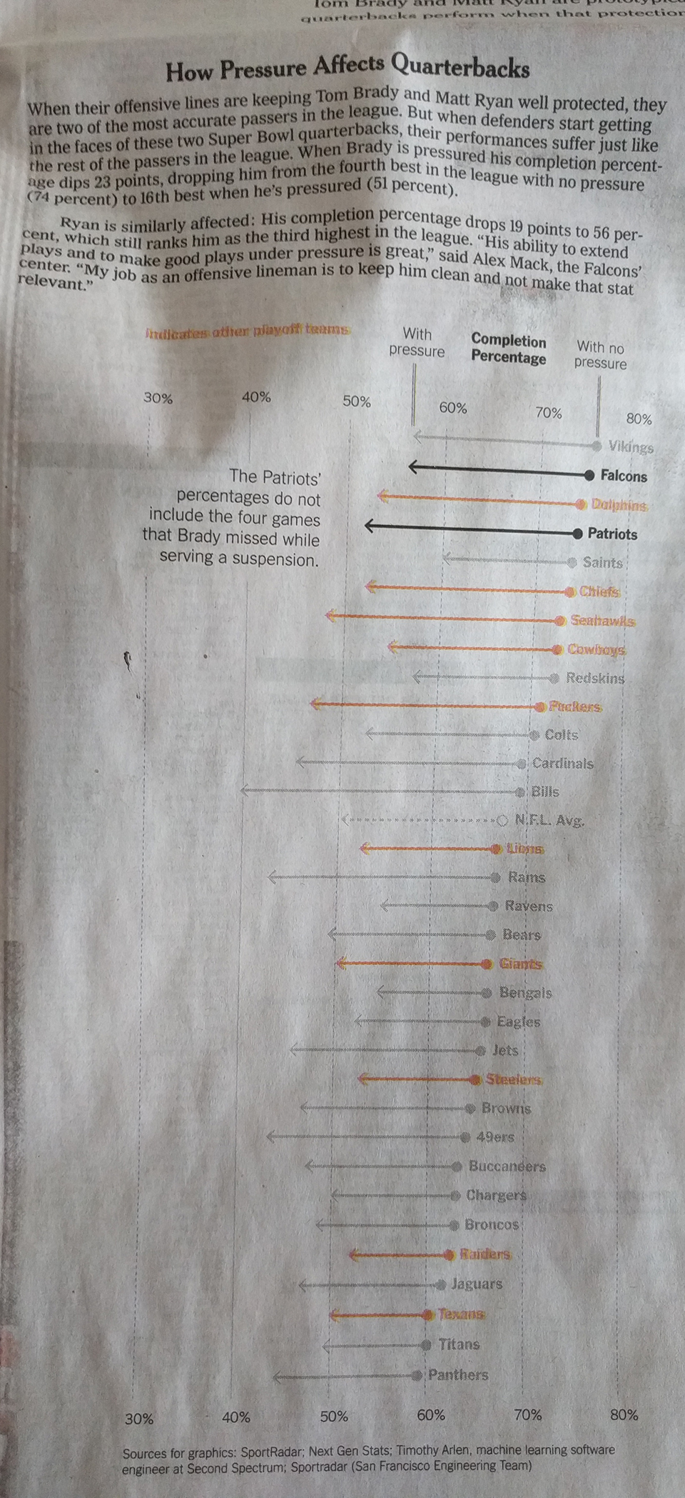
It comprises three graphics: The big one on the left looks at completions under pressure. Despite being a full-colour page, the designers only needed two colours to convey the message—black and orange.
Similarly, on the right, the third-down graphic also uses a more limited palette. But, for the heat map it does make some sense to use a full colour palette.
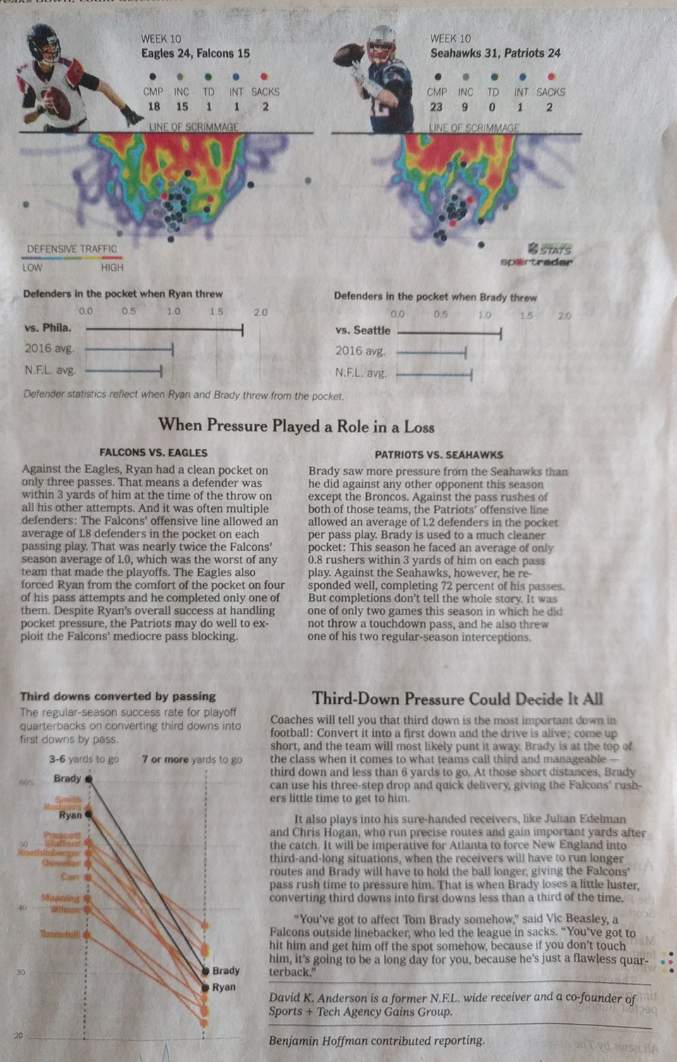
Overall, the page shows that colour, when thoughtfully restrained, makes not just the graphic clearer, but also good sense.
Credit fort he piece goes to David K. Anderson and Joe Ward.
Leave a Reply
You must be logged in to post a comment.