Tag: baseball
-

2025 Red Sox Draft Breakdown
Monday and Tuesday, Major League Baseball conducted its amateur player draft, wherein teams select American university and high school players. They have two weeks to sign them and assign them. (Though many will not actually play this year.) Two years ago the Red Sox installed Craig Breslow as their new chief baseball organisation. He has…
-

When Is a Torpedo Is Not a Torpedo?
When it’s a torpedo bat. Last week I looked at baseball’s new torpedo bats in a humourous light. But I did want to take a more serious look, because bat evolution has been part of the tale of baseball since its beginning. Back in the day bats featured long lengths and heavier weights. These days,…
-

Damn the Torpedoes!
Baseball is back and so bring forth the controversies. One of the ones from last week? The torpedo bat. To be clear, the torpedo bat has been around for a few years—it’s not new. However, on Opening Weekend, the Yankees beat up on Milwaukee Brewers’ pitching. But a Yankees announcer specifically pointed out the design…
-
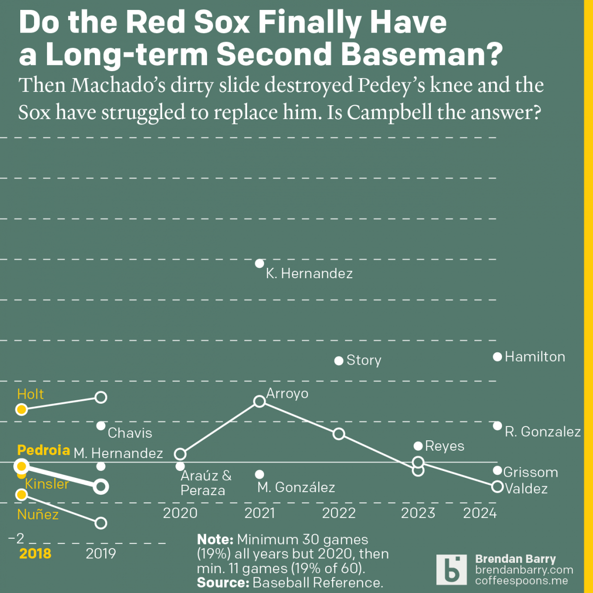
The Red Sox May Finally Have a Second Baseman
Last week was baseball’s opening day. And so on the socials I released my predictions for the season and then a look at the revolving door that has been the Red Sox and second base since 2017. Back in 2017 we were in the 11th year of Dustin Pedroia being the Sox’ star second baseman.…
-
Predicting…the Known Stats?
I have been trying to post more regularly here on Coffeespoons, but now that baseball’s postseason is in full swing—pun fully intended—my free time is spent watching balls and strikes at all hours of the day. (Though, with the Wild Card round over and the move from four to two games per day, my time…
-
Tired of These Motherf*cking Sox on This Motherf*cking Plane
At least, that’s what I imagine South Siders saying in Chicago as they watch the White Sox team charter plane land at Midway. For those not following America’s Major League Baseball season, the Chicago White Sox are one of two clubs claiming Chicago as their home. (The other being the Cubs.) And the White Sox—not…
-
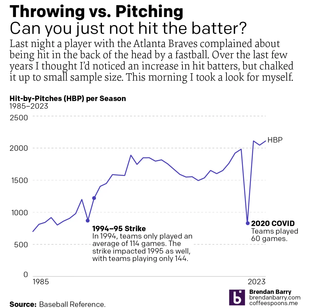
I Want a Pitcher Not a Back o’ Head Hitter
We’re about to go into the sportsball realm, readers. Baseball, specifically. Tuesday night, Atlanta Braves batter Whit Merrifield was hit in the back of the head by a 95 mph fastball. Luckily, modern ballplayers wear helmets. But at that velocity, one does not have the most reaction time in the world a number of other…
-
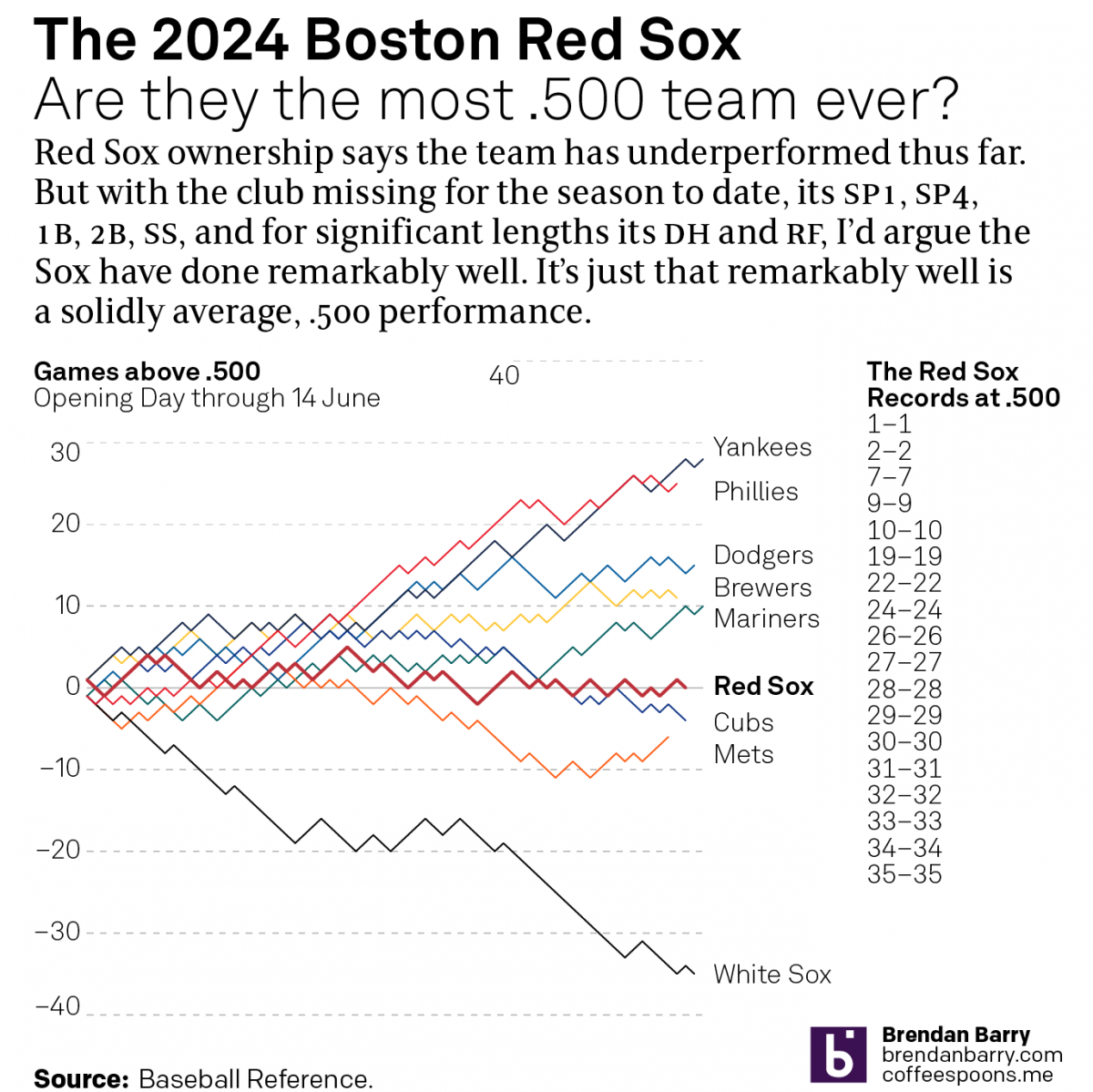
The .500 Red Sox
I initially made this datagraphic over the weekend, after watching the last few weeks of Boston Red Sox baseball wherein they continued to win a game, lose a game, resulting in an even .500 record. When I started, the graphic I sketched looked very different as I had included timelines and highlighted key moments where…
-
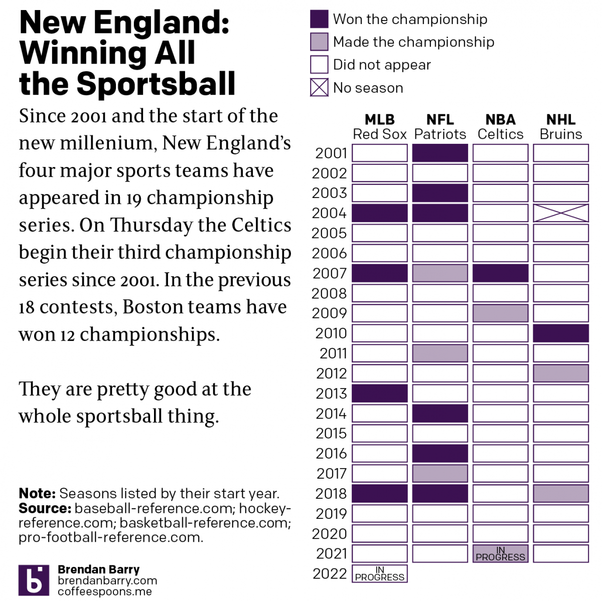
Boston: Sportstown of the 21st Century
Tonight the Boston Celtics play in Game 1 of the NBA Finals against the Golden State Warriors, one of the most dominant NBA teams over the last several years. But since the start of the new century and the new millennium, more broadly Boston’s four major sports teams have dominated the championship series of those…
-
How the Globe’s Writers Voted
Yesterday we looked at a piece by the Boston Globe that mapped out all of David Ortiz’s home runs. We did that because he has just been voted into baseball’s Hall of Fame. But to be voted in means there must be votes and a few weeks after the deadline, the Globe posted an article…