Tag: genealogy
-
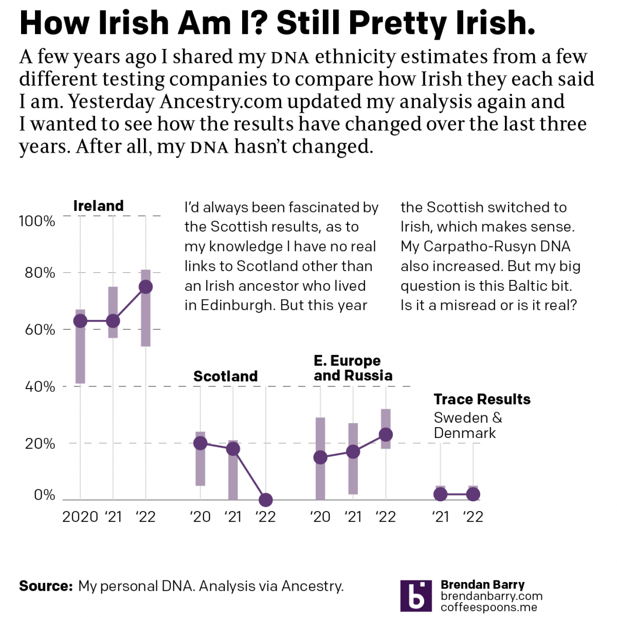
Still Irish
Last October Ancestry.com updated their ethnic origins breakdowns. Longtime readers will know these are not the most useful tools for helping one in their genealogical research. But, if they garner interest in one’s family history and motivate people to explore their own pasts, more power to them. I only encourage those people to dig a…
-

The Women in My Ancestry
International Women’s Day was Sunday and last weekend I attempted to research the occupations and careers of my direct line female ancestors. Including the scope to aunts and cousins broadened things too much in my mind. Unfortunately, there were too few who had recorded careers outside of “keeping house” or similar descriptions in census records.…
-
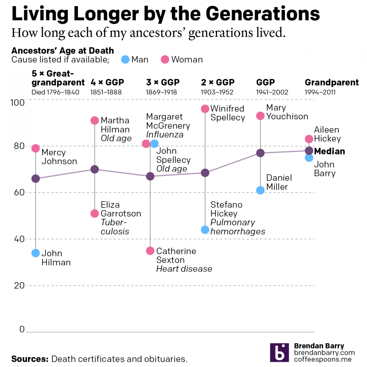
Living Longer by the Generations
Last weekend was Easter—for both the Catholics and the Orthodox—and I visited the Appalachian ancestral home of the Carpatho–Rusyn side of my family. Before leaving town I drove up to the old cemetery on a hill overlooking the old church and the Juniata River to pay my respects to those who came before me and…
-
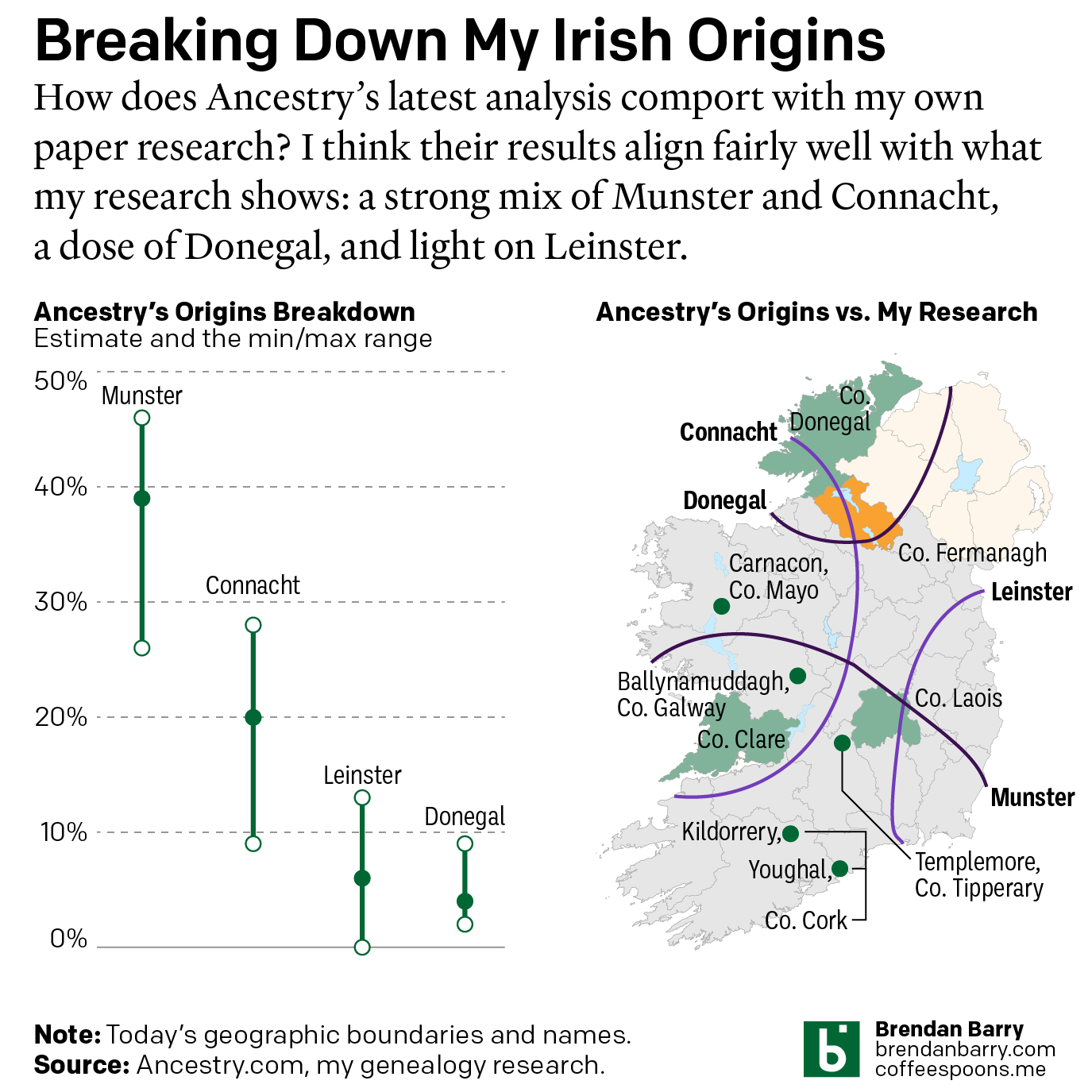
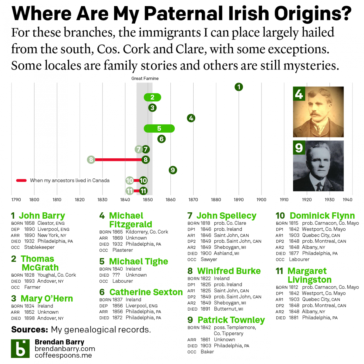
My Irish Heritage
This week began with Saint Patrick’s Day, a day that here in the States celebrates Ireland and Irish heritage. And I have an abundance of that. As we saw in a post earlier this year about some new genetic ancestry results, Ireland accounts for approximately 2/3 of my ancestry. But as many of my readers…
-
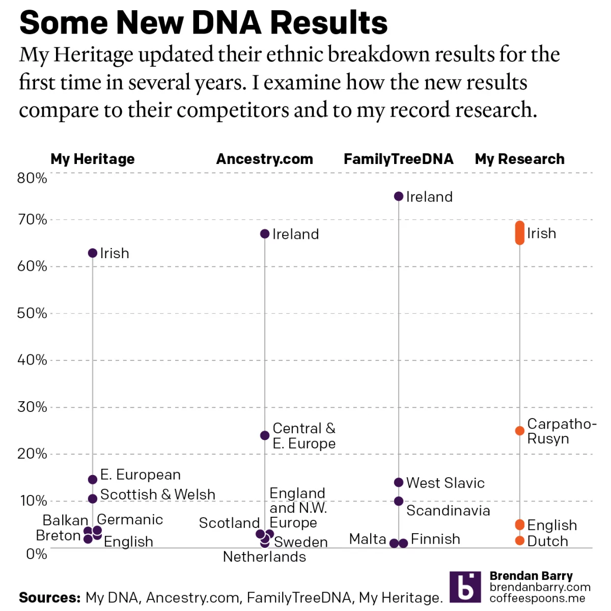
A Refreshed Look at My Ethnic Heritage
Late last week I received an update on my ethnic breakdown from My Heritage, a competitor of Ancestry.com and other genealogy/family history/genetic ancestry companies. For many years, the genealogical community had been waiting for this long-promised update. And it has finally arrived. For my money, My Heritage’s older analysis, v0.95, did not align with my…
-
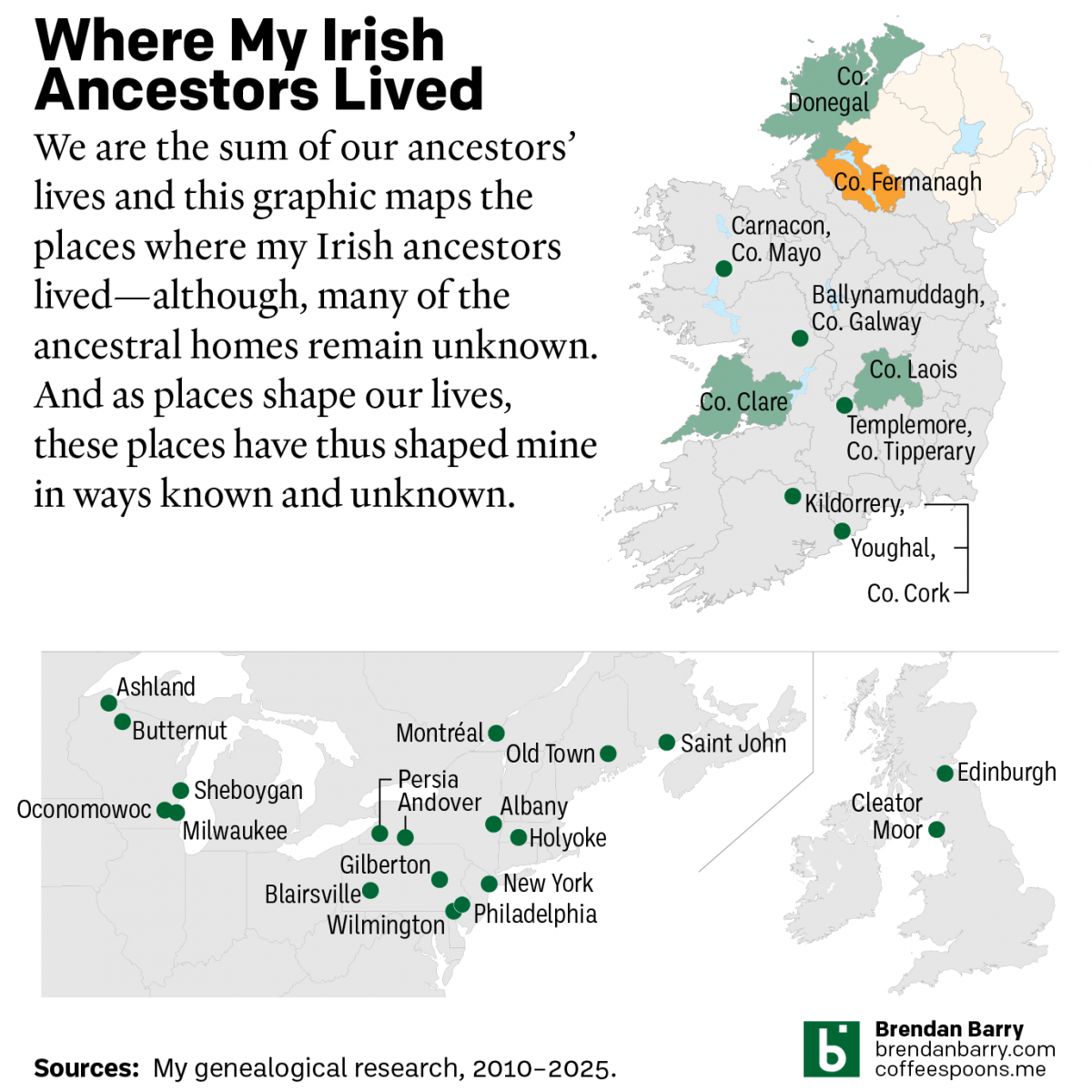
My Irishness
Yesterday was Saint Patrick’s Day and those who have followed me at Coffeespoons—or more generally know me—are well aware that my background is predominantly Irish. Those same people probably also know of my keen interest in genealogy. And that’s what today’s post is all about. Irish genealogy is difficult because of the lack of records…
-
No Matter What You Say, I’m Still Me
As many long-time readers know, I was long ago bitten by the genealogy bug and that included me taking several DNA tests. The real value remains in the genetic matches, less so the ethnicity estimates. But the estimates are fun, I’ll give you that. Every so often the companies update their analysis of the DNA…
-
Hey, Cousin!
As many of my long-time readers know, I count genealogy as one of my hobbies. A few weeks ago for Orthodox Easter I travelled up to the hometown of my late grandfather. There I get to see people to whom I’m related as many of us can point to ancestors from the same few villages…
-
Old Family Trees
Another quick little post from a little while back, around Christmas news broke about the oldest family tree yet discovered. Researchers used DNA recovered from a 5700-year old tomb in the UK to piece together the relationships between the people interred within the tomb. Graphic wise, we’re not talking about anything crazy or inventive here—it’s…
-
Updated DNA Ethnicity Estimates
Earlier this year I posted a short piece that compared my DNA ethnicity estimates provided by a few different companies to each other. Ethnicity estimates are great cocktail party conversations, but not terribly useful to people doing serious genealogy research. They are highly dependent upon the available data from reference populations. To put it another…