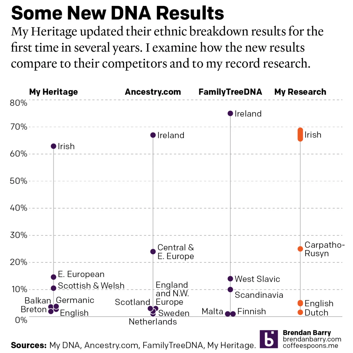
Updated DNA Ethnicity Estimates

Earlier this year I posted a short piece that compared my DNA ethnicity estimates provided by a few different companies to each other. Ethnicity estimates are great cocktail party conversations, but not terribly useful to people doing serious genealogy research. They are highly dependent upon the available data from reference populations.

To put it another way, if nobody in a certain ethnic group has tested with a company, there’s no real way for that company to place your results within that group. In the United States, Native Americans are known for their reluctance to participate and, last I heard, they are under-represented in ethnicity estimates. Fortunately for me, Western European population groups are fairly well tested.

But these reference populations are constantly being updated and new analysis being performed to try and sort people into ever more distinct genetic communities. (Although generally speaking the utility of these tests only goes back a handful of generations.)

Last night, when working on a different post, I received an email saying Ancestry.com had updated their analysis of my DNA. So naturally I wanted to compare this most recent update to last September’s.

Still mostly Irish

Sometimes when you look at data and create data visualisation pieces, the story is that there is very little change. And that’s my story. The actual number for my Irish estimate remained the same: 63%. I saw a slight change to my Scottish and Slavic numbers, but nothing drastic. My trace results changed, switching from 2% from the Balkans to 2% from Sweden and Denmark. But you need to take trace results with a pretty big grain of salt, unless they are of a different continent. Broadly speaking, we can be fairly certain about results at a continental level, but differences between, say, French and Germans are much harder to distinguish.

The Scottish part still fascinates me, because as far back as I’ve gone, I have not found an identifiable Scottish ancestor. A great-great-grandfather lived for several years in Edinburgh, but he was the son of two Ireland-born Irish parents. I also know that this Scottish part of me must come from my paternal lines as my mother has almost no Scottish DNA and she would need to have some if I were to have had inherited it from her.

Now for about half of my paternal Irish ancestors, I know at least the counties from which they came. My initial thought, and still best guess, is that the Scottish is actually Scotch–Irish from what is today Northern Ireland. But I am unaware of any ancestor, except perhaps one, who came from or has origins in Northern Ireland.

The other thing that fascinated me is that despite the additional data and analysis the ranges, or degree of uncertainty in another way of looking at it, increased in most of the ethnicities. You can see the light purple rectangles are actually almost all larger this year compared to last. I can only wonder if this time next year I’ll see any narrowing of those ranges.

Credit for the piece is mine.

Viral Mutations

With Covid-19, one of the big challenges we face is the rapid mutations in the viral genetic code that have produced several beneficial—from the virus’ standpoint—adaptations. Several days ago the New York Times published a nice, illustrated piece that showed just what these mutations look like.

Of course, these were not just nice illustrations of protein molecules, but the screenshot below is of the code itself and you can see how just a few alterations can produce subtle, but impactful, effects.

In a biological sense, these mutations are nothing new. In fact, humanity wouldn’t be humanity but for mutations. Rather we are seeing evolution play out in front of our eyes—albeit eyes locked in the same household for nearly a year now—as the virus evolves adaptations better suited to spreading and surviving in a host population.

The piece includes several illustrations, but begins with an overall, simplified diagram of the virus and where its genetic code lies. And then breaks that code down similar to a stacked bar chart.

Designers identify where in the code the different mutations occur and the type of mutation. Later on in the piece we see a map of where this particular variant can be found.

I might come back to that map later, so I won’t comment too much on it here.

But I think this piece does a great job of showcasing just what we mean when we talk about virus mutations. It’s really just a beneficial slip up in the genetic alphabet.

Credit for the piece goes to Jonathan Corum and Carl Zimmer.

African Descent in African Americans

A study published last week explores the long-lasting impact of the Atlantic triangle trade of slaves on the genetic makeup of present day African Americans. Genetic genealogy can break down many of what we genealogists call brick walls, where paper records and official documentation prevent researchers from moving any further back in time. In American research, slavery and its lack of records identifying specific individuals by name, birth, and place of origin prevents many descendants from tracing their ancestry beyond the 1860s or 50s.

But DNA doesn’t lie. And by comparing the source populations of present day African countries to the DNA of present day Americans (and others living in the Western hemisphere), we can glean a bit more insight into at least the rough places of origin for individual’s ancestors. And so the BBC, which wrote an article about the survey, created this map to show the average amount of African ancestry in people today.

Average amount of African genetic ancestry in present day populations of African descent

There is a lot to unpack from the study, and for those interested, you should read the full article. But what this graphic shows is that there is significant variation in the amount of African descent in African-[insert country here] ethnic groups. African-Brazilians, on average, have somewhere between 10–35% African DNA, whereas in Mexico that figures falls to 0–10%, but in parts of the United States it climbs upwards of 70–95%.

In a critique of the graphic itself, when I look at some of the data tables, I’m not sure the map’s borders are the best fit. For example, the data says “northern states” for the United States, but the map clearly shows outlines for individual states like New York, Pennsylvania, and New Jersey. In this case, a more accurate approach would be to lump those states into a single shape that doesn’t break down into the constituent polities. Otherwise, as in this case, it implies the value for that particular state falls within the range, when the data itself does not—and cannot because of the way the study was designed—support that conclusion.

Credit for the piece goes to the BBC graphics department.

Pulling Gene-ies Out of Bottles

I don’t always get to share more illustrative diagrams that explain things, but that’s what we have today from the Economist. It illustrated the concept of a gene drive by which a gene modified in one chromosome then modifies the remaining chromosome to insert itself there. Consequently it stands an almost 100% chance of being passed onto the subsequent generation.

Naturally this means great things for removing, say, mosquito-born diseases from populations as the gene drives can be used to ultimately eliminate the population. But of course, should we be doing this? Regardless, we have a graphic from the Economist.

I still find them a pest…

It makes nice use of a small mosquito icon to show how engineered mosquitos can take over the population from wild-type. The graphic does a nice job showing the generational effect with the light blue wild-type disappearing. But I wonder if more could not be said about the actual gene drive itself. Of course, it could be that they simplified the process substantially to make it accessible to the audience.

Credit for the piece goes the Economist graphics department.

The UK’s Genetic Clusters

I always enjoy the combination of two of my interests: data visualisation and genealogy. So this BBC article that references a Nature article piqued my interest. It looks at the distribution of DNA across the United Kingdom and identifies different cluster areas. The most important finding is that the Celts, i.e. the people of Scotland, Northern Ireland, Wales, and Cornwall are not a single genetic group. Another finding of interest to me is that the people of Devon are distinct from both Cornwall and Dorset, Devon’s bordering regions. That interest is because my New England ancestors largely hailed from Devon and Dorset.

The colours don't imply relationships, for what it's worth
The colours don’t imply relationships, for what it’s worth

Credit for the piece goes to the Nature article authors.