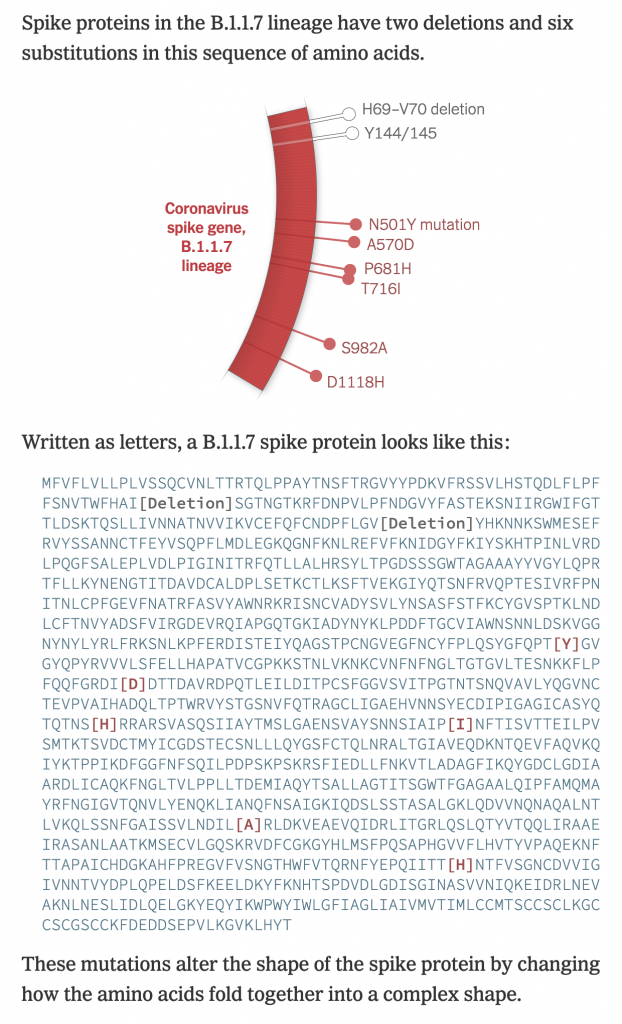
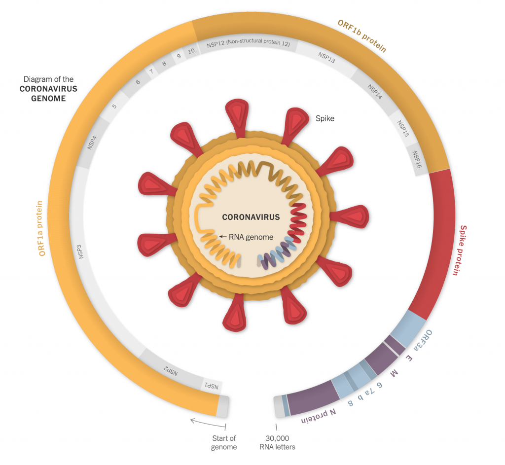
With Covid-19, one of the big challenges we face is the rapid mutations in the viral genetic code that have produced several beneficial—from the virus’ standpoint—adaptations. Several days ago the New York Times published a nice, illustrated piece that showed just what these mutations look like.
Of course, these were not just nice illustrations of protein molecules, but the screenshot below is of the code itself and you can see how just a few alterations can produce subtle, but impactful, effects.

In a biological sense, these mutations are nothing new. In fact, humanity wouldn’t be humanity but for mutations. Rather we are seeing evolution play out in front of our eyes—albeit eyes locked in the same household for nearly a year now—as the virus evolves adaptations better suited to spreading and surviving in a host population.
The piece includes several illustrations, but begins with an overall, simplified diagram of the virus and where its genetic code lies. And then breaks that code down similar to a stacked bar chart.

Designers identify where in the code the different mutations occur and the type of mutation. Later on in the piece we see a map of where this particular variant can be found.
I might come back to that map later, so I won’t comment too much on it here.
But I think this piece does a great job of showcasing just what we mean when we talk about virus mutations. It’s really just a beneficial slip up in the genetic alphabet.
Credit for the piece goes to Jonathan Corum and Carl Zimmer.
Leave a Reply
You must be logged in to post a comment.