A study published last week explores the long-lasting impact of the Atlantic triangle trade of slaves on the genetic makeup of present day African Americans. Genetic genealogy can break down many of what we genealogists call brick walls, where paper records and official documentation prevent researchers from moving any further back in time. In American research, slavery and its lack of records identifying specific individuals by name, birth, and place of origin prevents many descendants from tracing their ancestry beyond the 1860s or 50s.
But DNA doesn’t lie. And by comparing the source populations of present day African countries to the DNA of present day Americans (and others living in the Western hemisphere), we can glean a bit more insight into at least the rough places of origin for individual’s ancestors. And so the BBC, which wrote an article about the survey, created this map to show the average amount of African ancestry in people today.
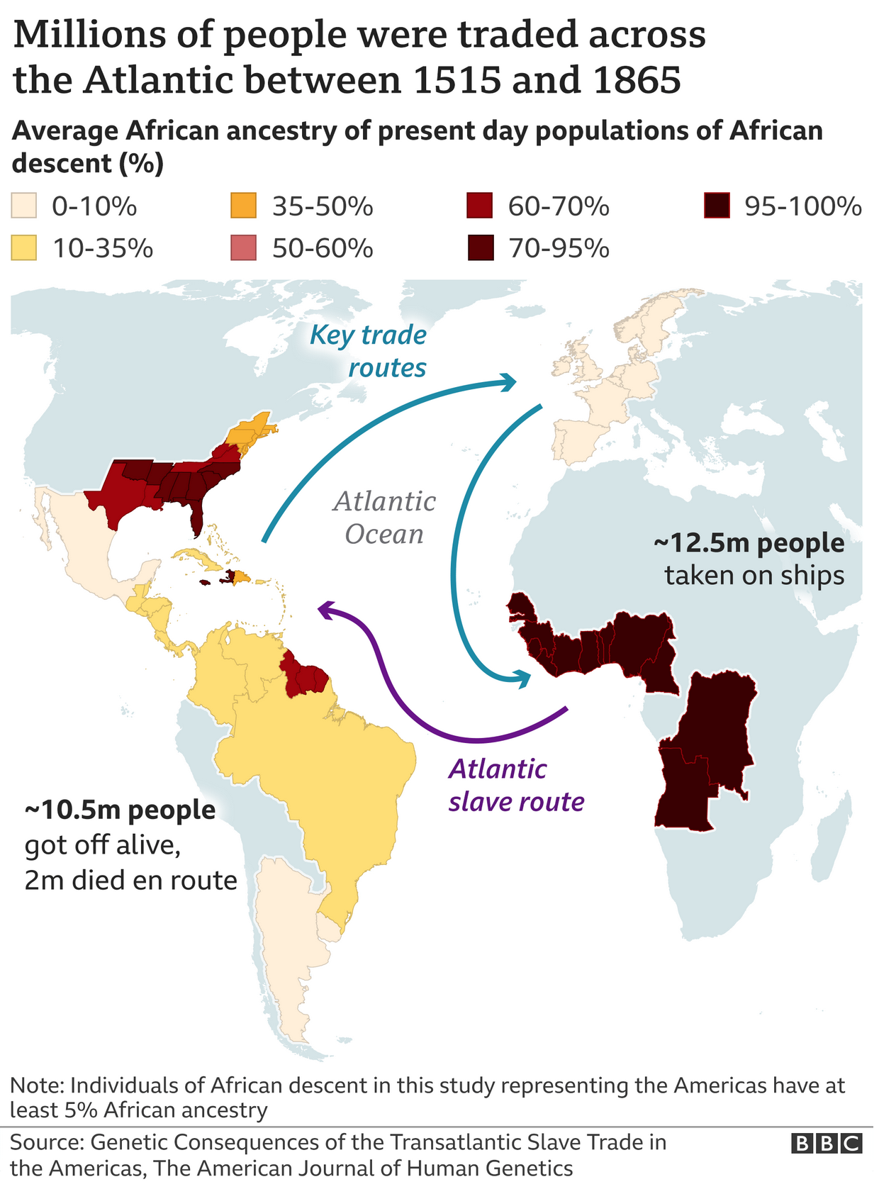
There is a lot to unpack from the study, and for those interested, you should read the full article. But what this graphic shows is that there is significant variation in the amount of African descent in African-[insert country here] ethnic groups. African-Brazilians, on average, have somewhere between 10–35% African DNA, whereas in Mexico that figures falls to 0–10%, but in parts of the United States it climbs upwards of 70–95%.
In a critique of the graphic itself, when I look at some of the data tables, I’m not sure the map’s borders are the best fit. For example, the data says “northern states” for the United States, but the map clearly shows outlines for individual states like New York, Pennsylvania, and New Jersey. In this case, a more accurate approach would be to lump those states into a single shape that doesn’t break down into the constituent polities. Otherwise, as in this case, it implies the value for that particular state falls within the range, when the data itself does not—and cannot because of the way the study was designed—support that conclusion.
Credit for the piece goes to the BBC graphics department.
Leave a Reply
You must be logged in to post a comment.