Tag: heat map
-
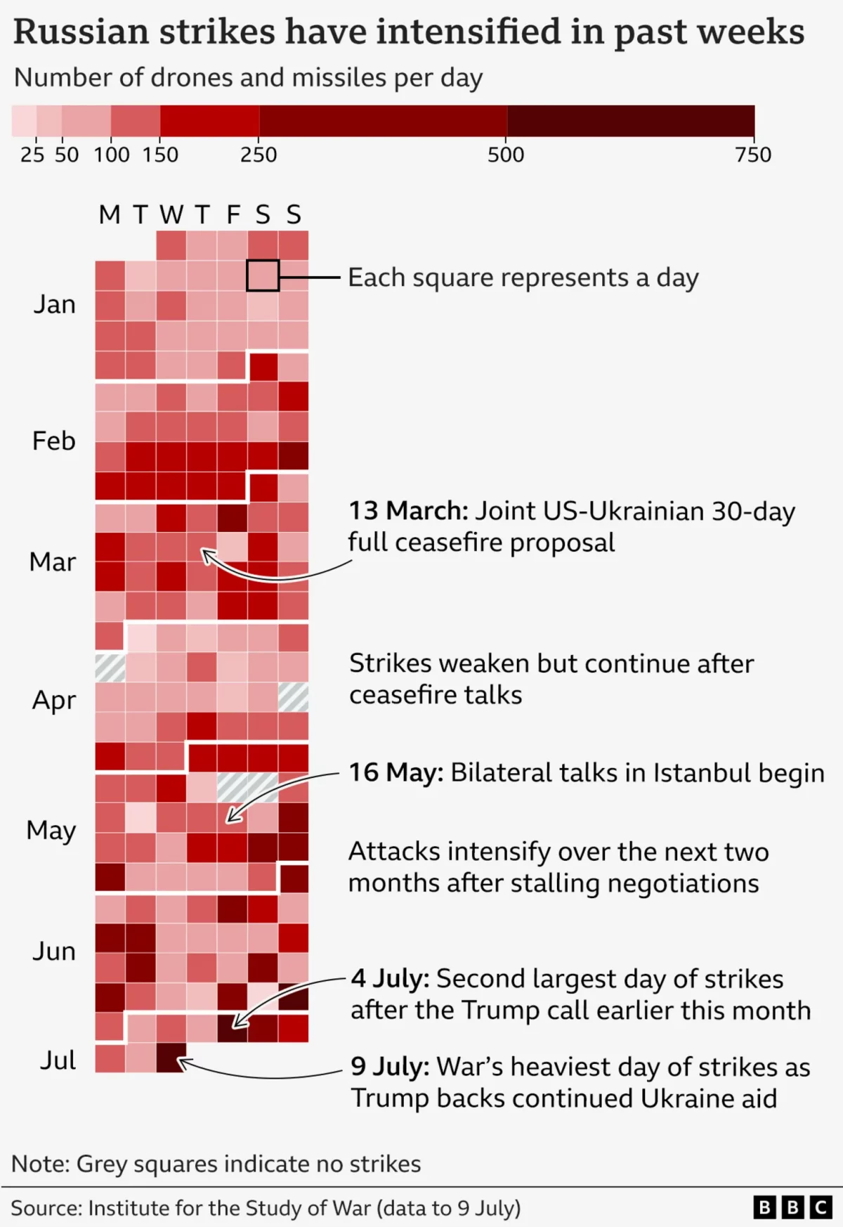
It’s Raining Drones
Last Friday the BBC published an article about the US’ resumption of supplying military assistance to Ukraine in its defence of Russia’s invasion. But in that article, the author referenced the increased intensity of Russian drone and missile strikes on Ukraine over that week. To show the intensity, the BBC included this graphic, which incorporates…
-
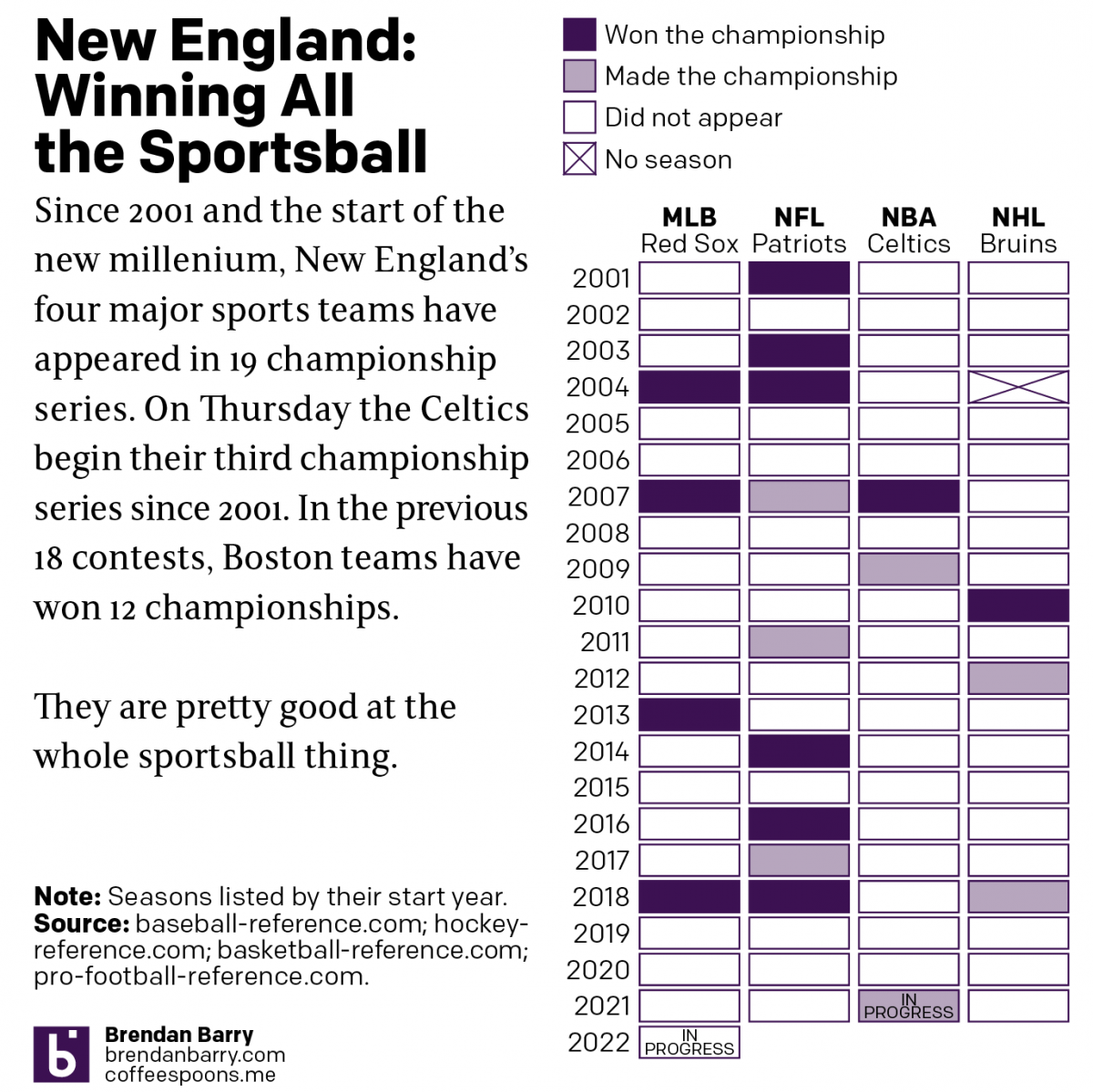
Boston: Sportstown of the 21st Century
Tonight the Boston Celtics play in Game 1 of the NBA Finals against the Golden State Warriors, one of the most dominant NBA teams over the last several years. But since the start of the new century and the new millennium, more broadly Boston’s four major sports teams have dominated the championship series of those…
-
Golden Buttered Popcorn
We are in the midst of basketball playoffs right now. And one of the teams participating is the Golden State Warriors. They are pretty good at this whole basketball thing. One of the reasons is their star player Steph Curry. And it turns out that he is an enormous fan of popcorn. So much so…
-
World Cup Match Probabilities
The World Cup has had some impressive matches and some stunners. (And the two are not mutually exclusive.) But if you are like me and have to work during most of the broadcasts, how can you follow along? Well thankfully FiveThirtyEight put together a nice statistical model that provides the probability of a team winning—or…
-
When the Whole Is Less Than the Sum of its Parts
Last week we talked a lot about trade—and we will get back to it. But the World Cup is now in full swing and I want to take a look at a couple of things this week. But to begin, the Economist published an article about the difficulty of predicting the outcome of World Cups.…
-
Traffic Accidents in Philadelphia
I’m working on a set of stories and in the course of that research I came across this article from Philly.com exploring traffic accident in Philadelphia. The big draw for the piece is the heat map for Philadelphia. Of course at this scale the map is pretty much meaningless. Consequently you need to zoom in…
-
Sugary Sweet Donut Charts
I know, I know. You probably expect some sort of climate post given the whole Paris thing. But instead, this morning I came across an article where the supporting chart failed to tell the story. So today we redesign it. The BBC has an article about MPs backing a tax on sugary drinks. Within the…