I’m working on a set of stories and in the course of that research I came across this article from Philly.com exploring traffic accident in Philadelphia.

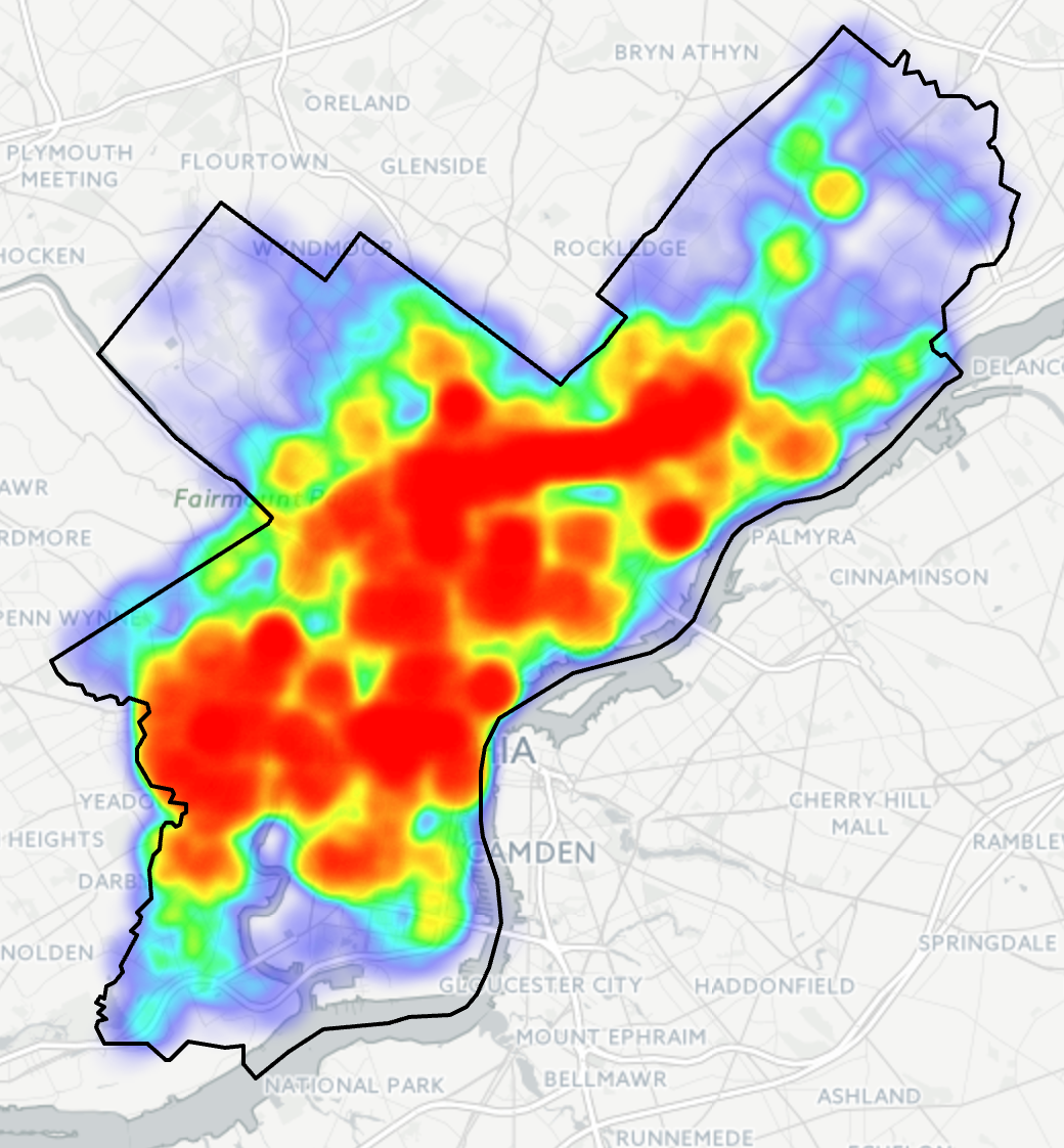
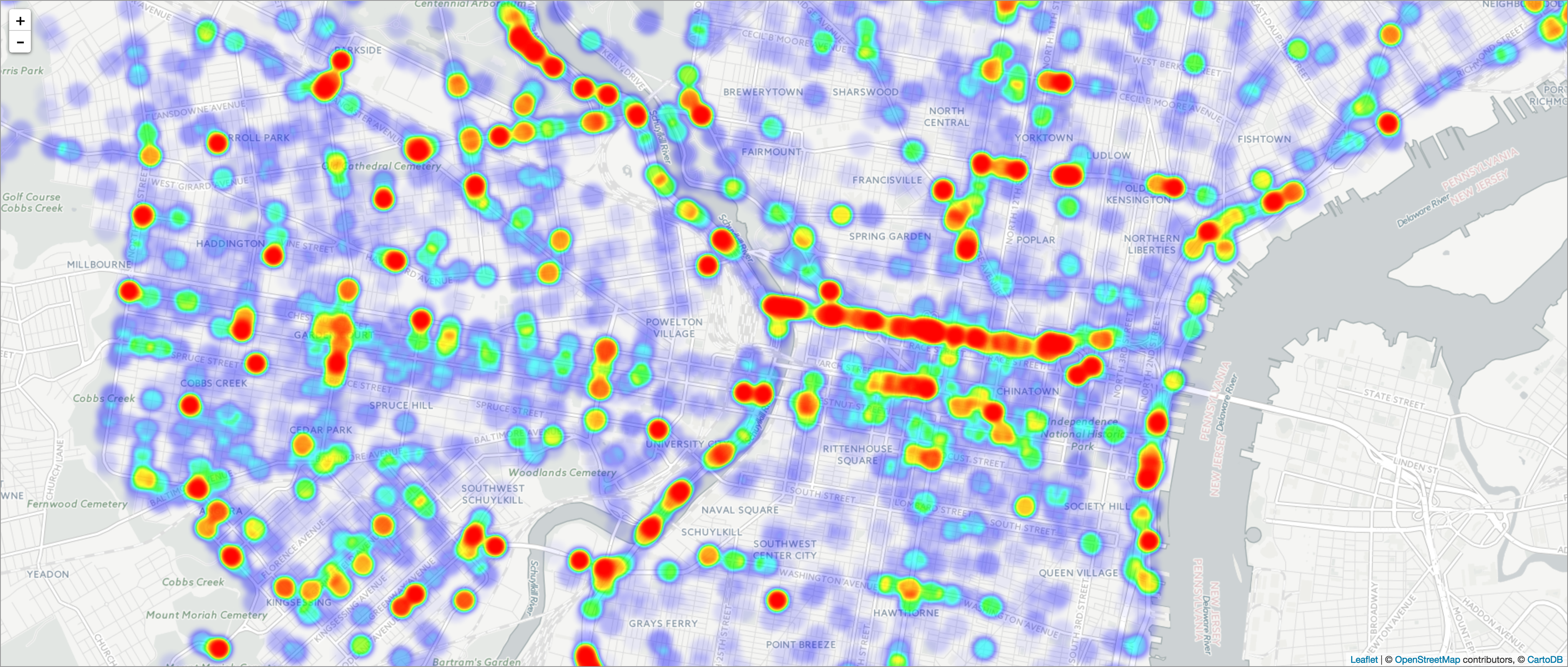
The big draw for the piece is the heat map for Philadelphia. Of course at this scale the map is pretty much meaningless. Consequently you need to zoom in for any significant insights. This view is of the downtown part of the city and the western neighbourhoods.

As you can see there are obvious stretches of red. As a new resident of the city, I can tell you that you can connect the dots along a few key routes: I-76, I-676, and I-95. That and a few arterial streets.
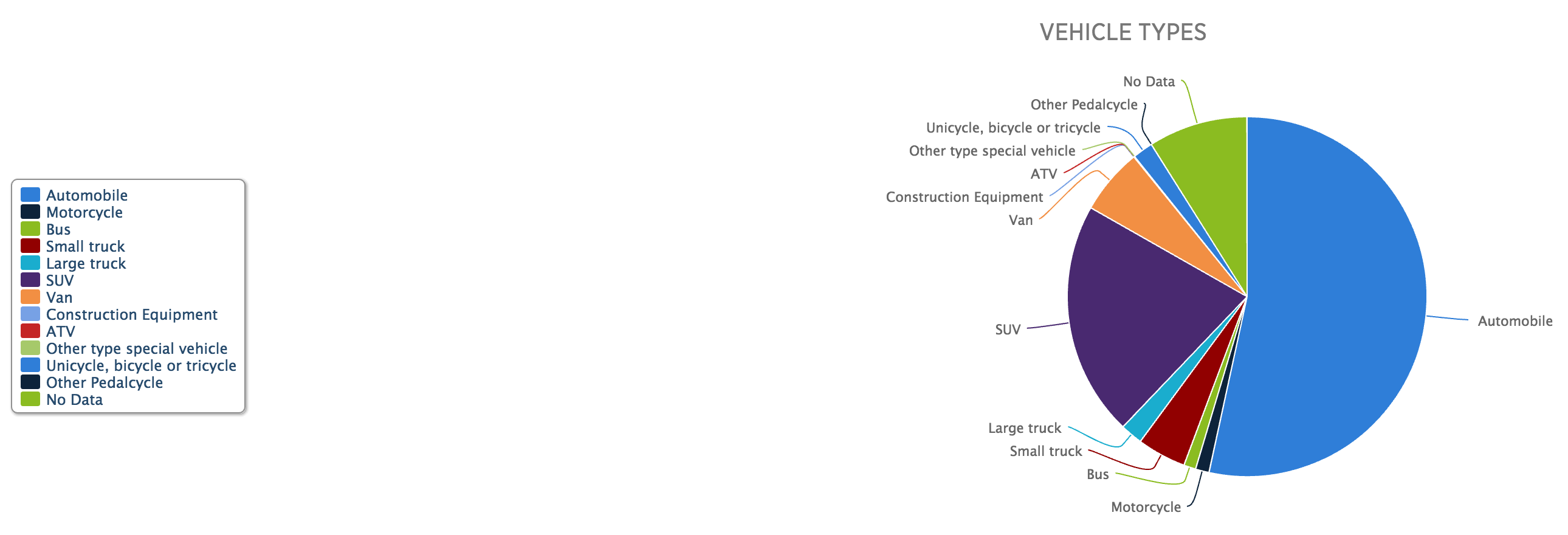
Now while I do not love the colour palette, the form of the visualisation works. The same cannot be said for other parts of the piece. Yes, there are too many factettes. But…pie charts.

From a design standpoint, first is the layout. The legend needs to be closer to the actual chart. Two, well, we all know my dislike of pie charts, in particular those with lots of data points, which this piece has. But that gets me to point three. Note that there are so many pieces the pie chart loops round its palette and begins recycling colours. Automotives and unicycles are the same blue. Yep, unicycles. (Also bi- and tricycles, but c’mon, I just want to picture some an accident with a unicycle.)
If you are going to have so many data points in the pie chart, they should be encoded in different colours. Of course, with so many data points, it would be difficult to find so many distinguishable but also not garish colours. But when you get to that point, you might also be at the point where a pie chart is a bad form for the visualisation. If I had the time this morning I would create a quick bar chart to show how it would perform better, but I do not. Trust me, though, it would.
Credit for the piece goes to Michele Tranquilli.
Leave a Reply
You must be logged in to post a comment.