Tag: information design
-
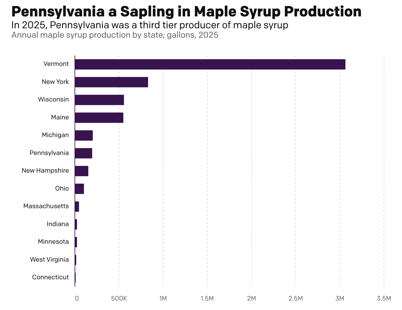
Maple Syrup Monday
This morning over breakfast I was reading an article in the Philadelphia Inquirer about Pennsylvania maple syrup production. My breakfast was oatmeal with maple syrup, cinnamon, and all space along with orange juice and a cup of tea. They talked about Pennsylvania’s production and compared it to Vermont’s, which made me want nothing more than…
-
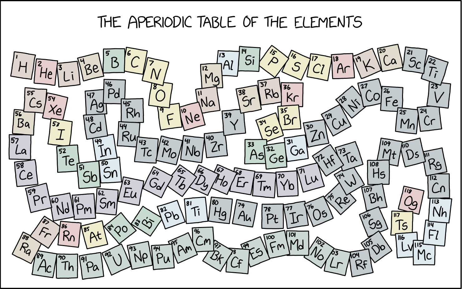
The Long, Winding Road
At the beginning of the week I wrote about a table as a chart, for which I designed a light-duty interactive bar chart. Tables can be great, when used well, but they are not ideal for showing trends in data—hence the term data visualisation. But today is now Friday and we made it to the…
-
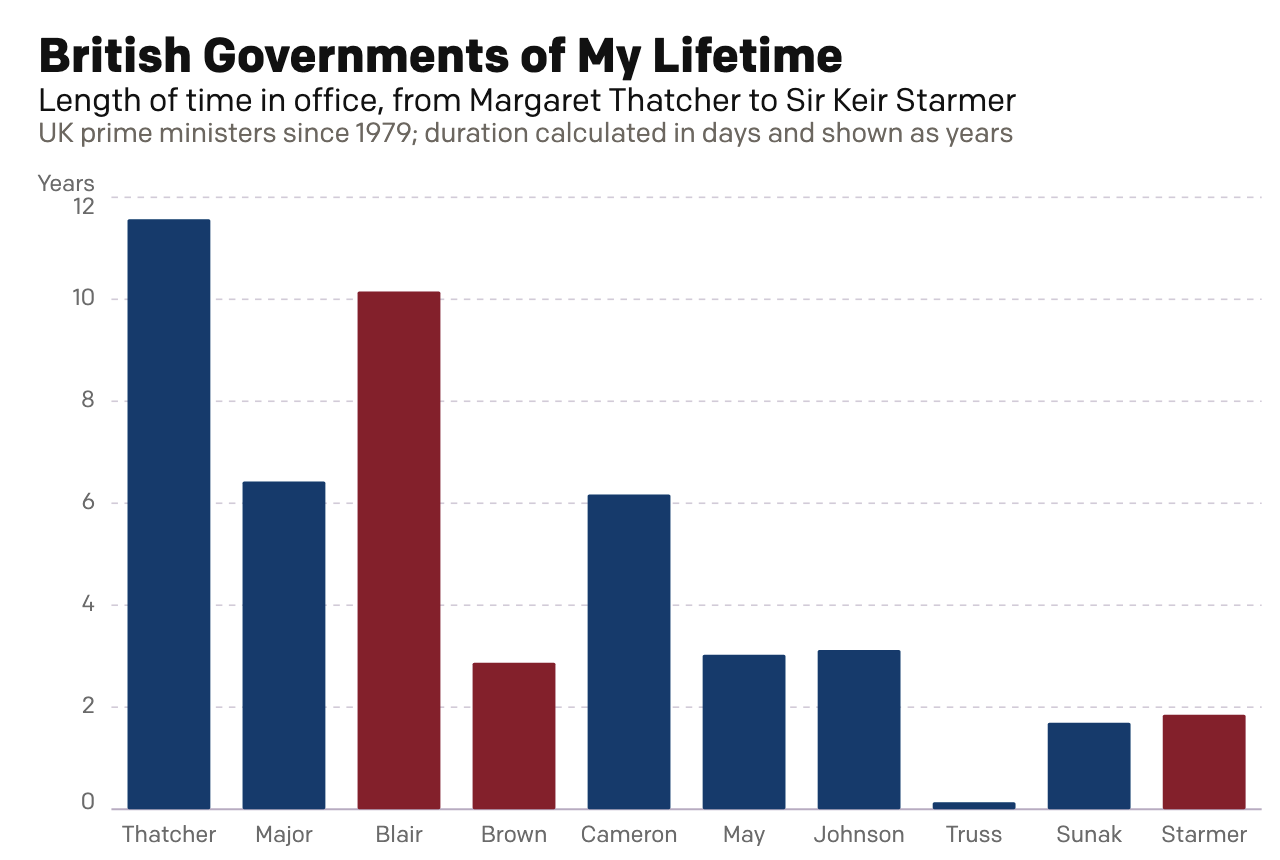
Rise of the Nutters
For most of my life I have been interested in British politics. I can recall talking with my mates about Tony Blair’s Prime Minister’s Questions (PMQs) in high school and at university. During the Brexit debate, my American friends would frequently ask me just what was going on across the pond. Through that point in…
-
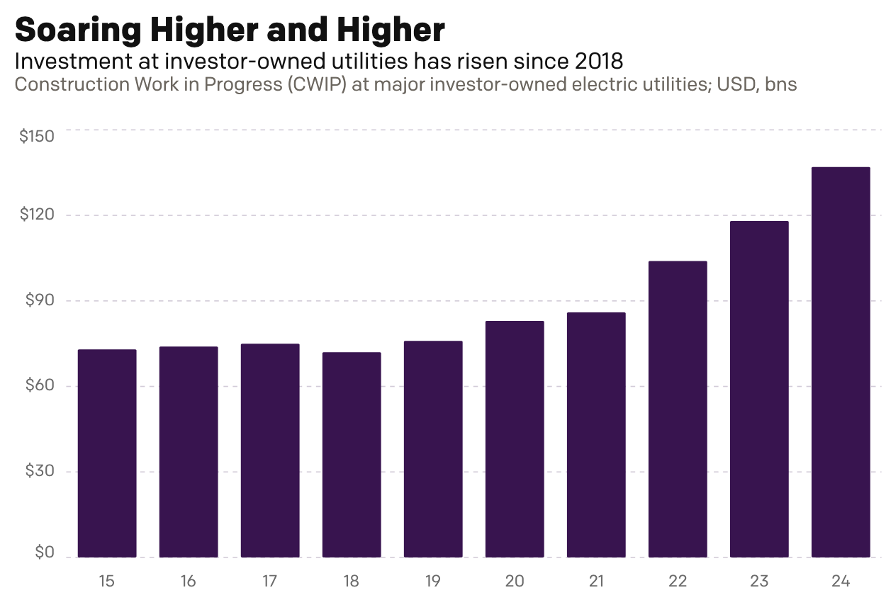
Go Fly a Kite
This past weekend I read an article over on Reuters about the cost of electricity for Americans, especially as it pertains to unfinished electrical generation projects. To be fair, I did not read it thinking I would be getting an opportunity to talk about something here on Coffeespoons. Rather, I just received a letter from…
-
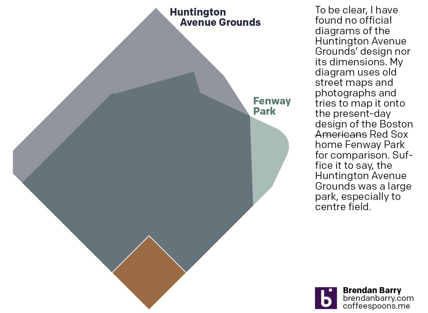
Back to Boston’s Beginning
And I don’t mean the city’s. No, 125 years ago today, the Boston Americans, later to be renamed the Boston Red Sox, played their first home game. Not at Fenway Park, mind you, but their original home—the Huntington Avenue Grounds. I decided to make a graphic comparing Huntington Avenue to Fenway, but could not find…
-
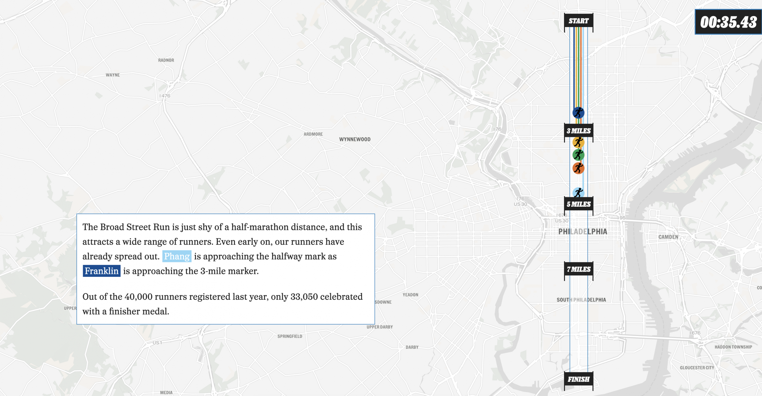
The Broad Street Run
This past weekend, Philadelphia hosted the Broad Street Run, a 10-mile run from the “top” of the city’s Broad Street in the north to the end at the bottom in the Navy Yard, a length of—you guessed it—10 miles. And congratulations to my sister for not just running it for the first time, but completing…
-
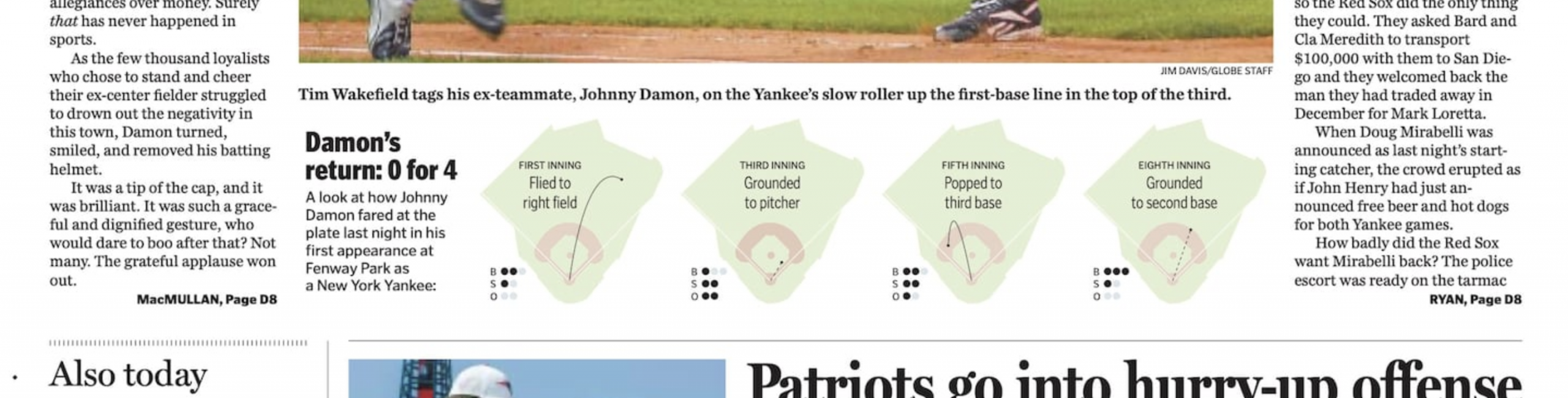
Damon the Bad
I guess we’re going to stick with the baseball this week. I forgot this year is the 20th anniversary of the Doug Mirabelli game. For those unfamiliar with the story, the Red Sox long employed knuckleballer Tim Wakefield, one of my all-time favourite pitchers. The knuckleball, however, is very difficult to catch because its lack…
-

AC to Philly Expressway?
And I am not talking about Atlantic City. No, on Saturday, the Red Sox fired their manager Alex Cora and his entire staff. Or, rather, the staff loyal to him. I wrote about that on Monday. Little did we know that Saturday night, Alex Cora and the chief of baseball operations for the Philadelphia Phillies,…
-
Revenge of the Nerds
This past weekend I thought I would be writing about something else, and perhaps I still will later this week, but for now we turn to the Boston Red Sox firing Alex Cora, their manager; Jason Varitek, beloved Sox icon and in the dugout as game planning and run prevention coach; Ramon Vazquez, bench coach;…
-
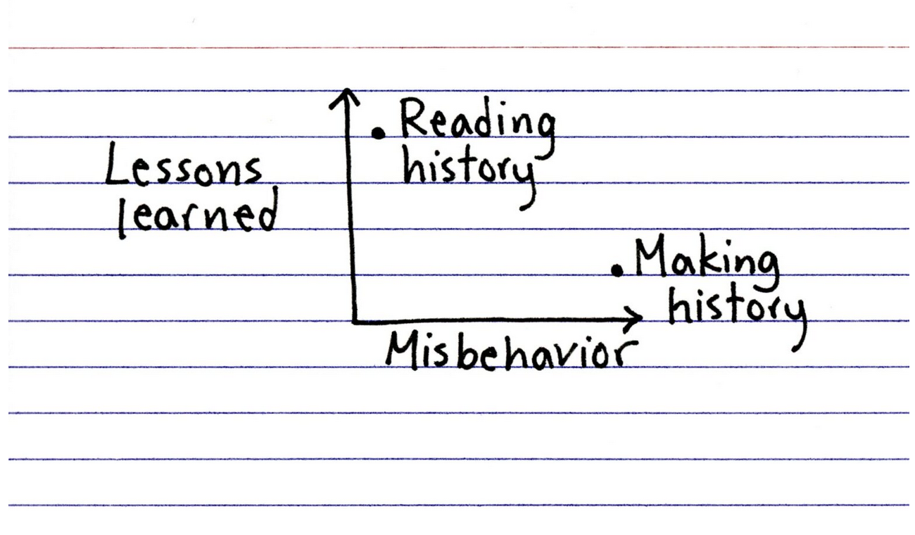
Words. Words. Words.
This year—and last—I have been making a more concerted effort to read more and use social media less. I just finished reading an Isaac Asimov novella, Lucky Starr the Moons of Jupiter, but that interrupted my reading of The Carpathians, a non-fiction book about the history of the northern slopes of the Carpathian Mountains—the Polish…