Tag: information design
-
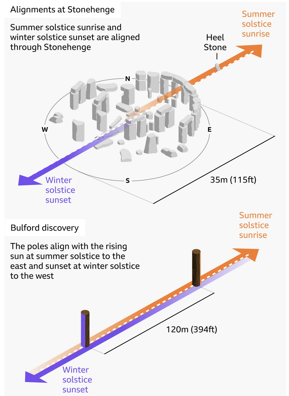
Stone Hard(ing)ly Beats Wood
At least in chronological dating. I debated posting this today or Monday, given that this weekend is a three-day holiday in the States, and that the selected graphic—in this case an illustration—explains the alignment of Stonehenge and—the focus of the BBC article wherein this graphic appears—a prehistoric, pre-Stonehenge, well, henge of wood posts only a…
-
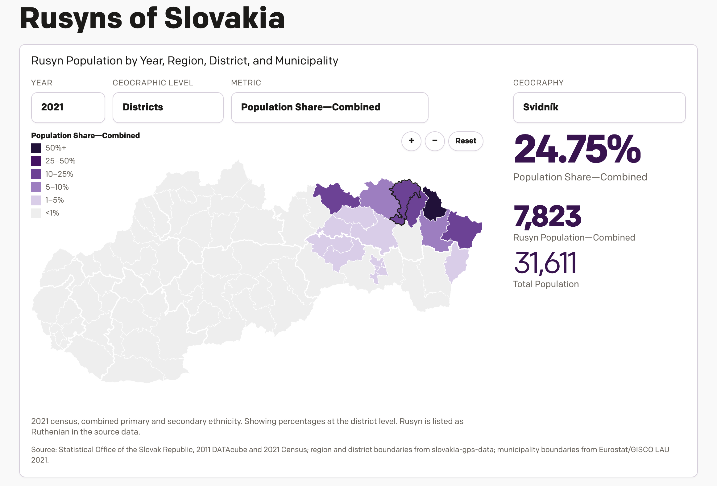
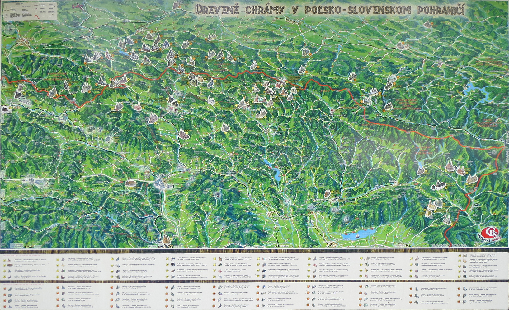
New(ish) Data for the Old Country
One of the most popular pieces of content on my website over the last several years has been a datagraphic I designed, which explores the Slovakian census data from 2011 on the Carpatho–Rusyns of Slovakia. I wrote about it for Coffeespoons back in 2012. The Carpatho–Rusyns, as they are known in the United States and…
-
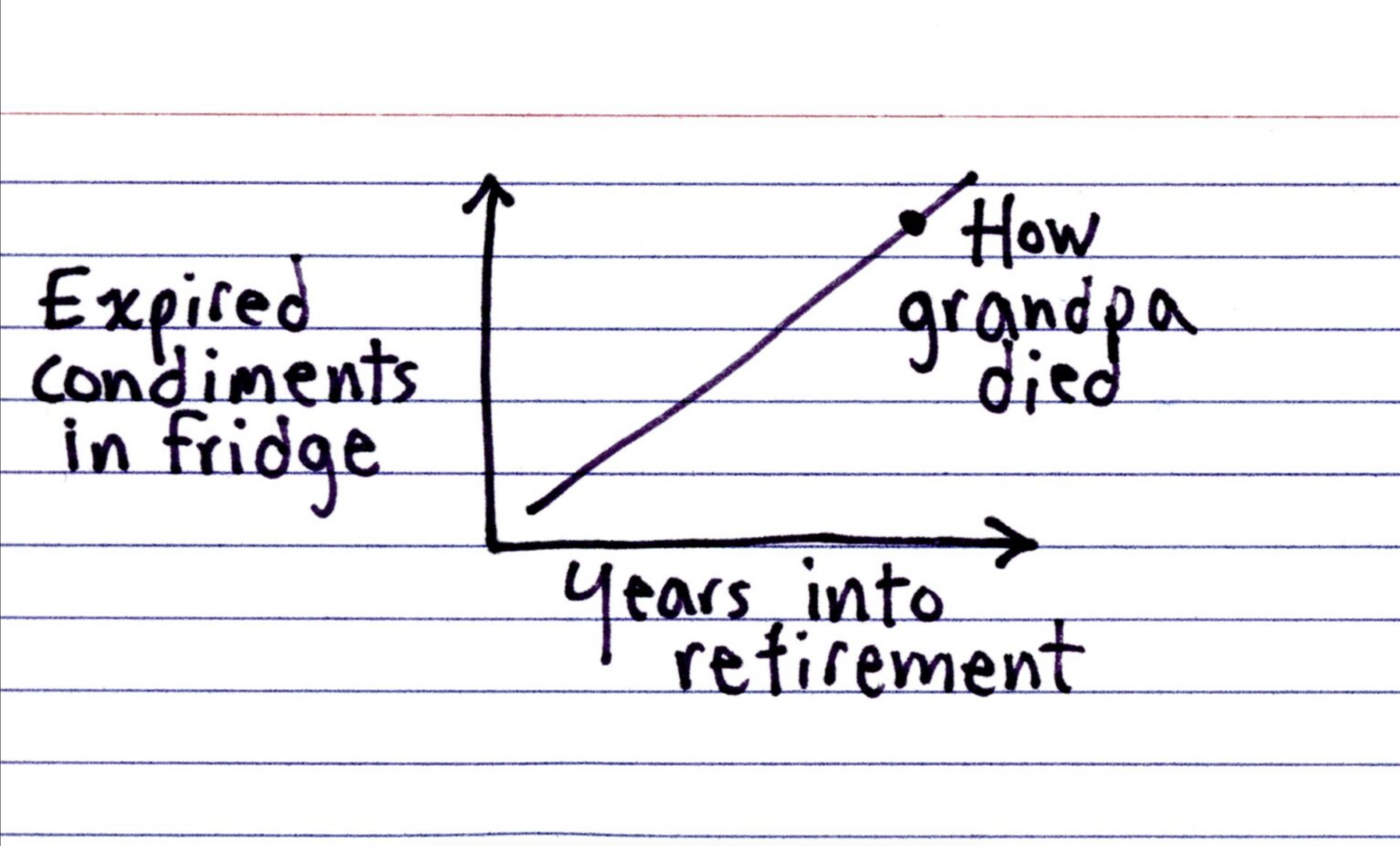
Colonel Mustard in the Refrigerator
Happy Friday, all. I have been eating a lot of leftovers and things scrounged up from fridges this past week, and being home today it shall likely be the same. But that does not mean you want to be looking into my refrigerator and seeing just what condiments I have available. Spoiler: (pun intended) it…
-
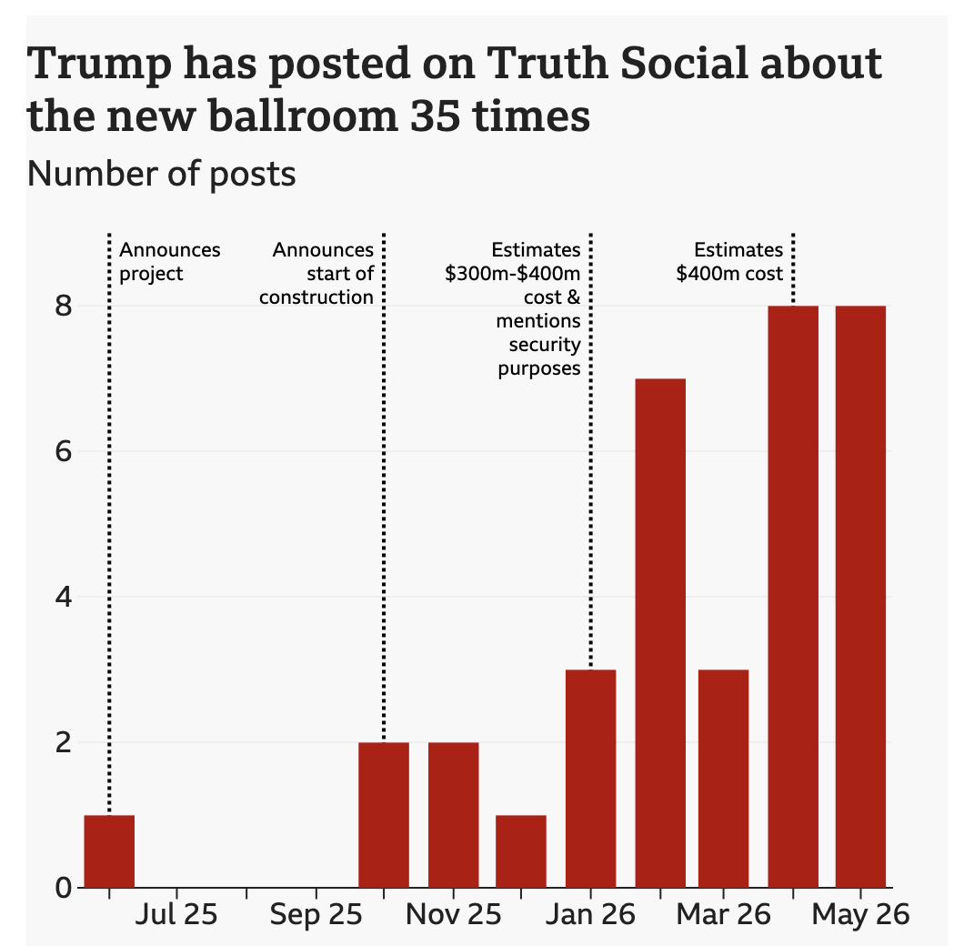
Big Beautiful Ballroom
Last week the BBC published a look at the new White House ballroom promised by President Trump. The ballroom required demolishing the existing East Room. Instead of focusing on the legality of the move, I want to focus on the ever increasing cost of the project. The article does include a great before/after photograph of…
-
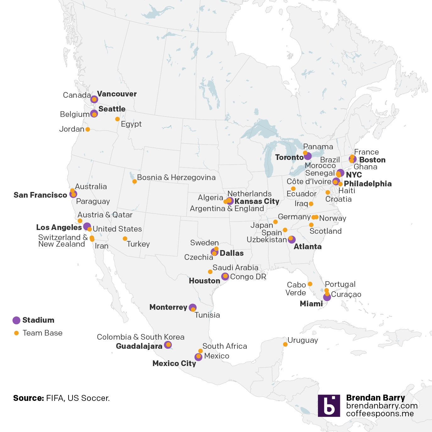
USAI! My Eyes!
Of all things, this came to me through social media I follow for news about the Red Sox. But it’s Friday and after seeing this I definitely need a drink. The AI-made map purports to show the locations of World Cup home bases for the various competing teams. It certainly shows…uh…something. It does not take…
-
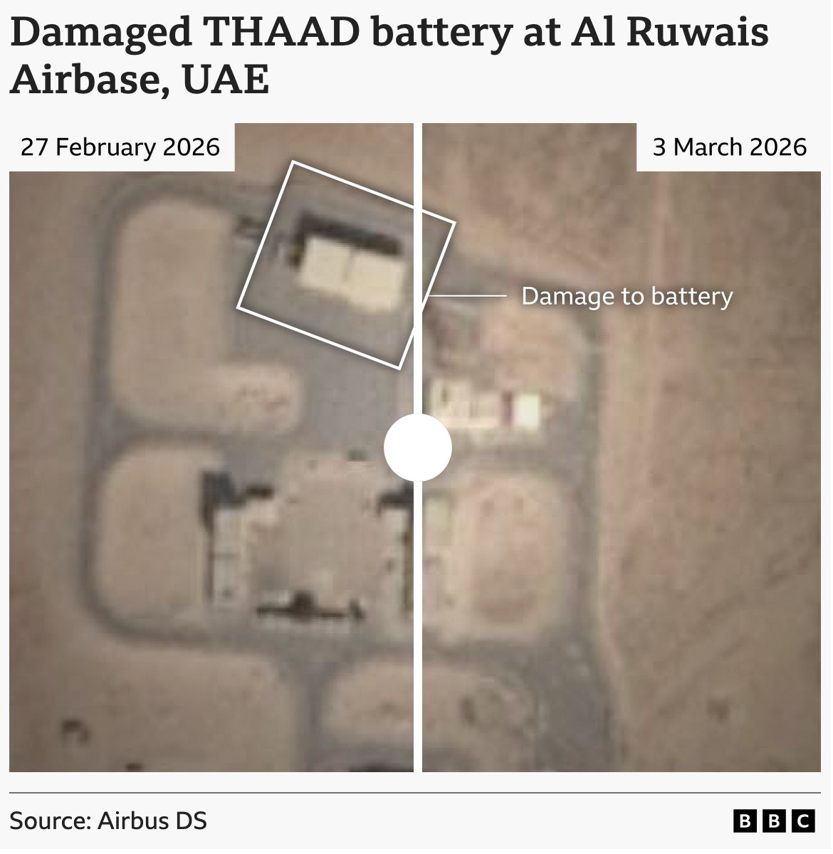
Keyholes to the Memory Holes
For those who have yet to read 1984, my favourite book by my favourite author, memory holes are what the government dump data and documents into to incinerate them and remove all record of their existence. Where is your proof that chocolate production is down this year? The government then points to fabricated replacement data…
-
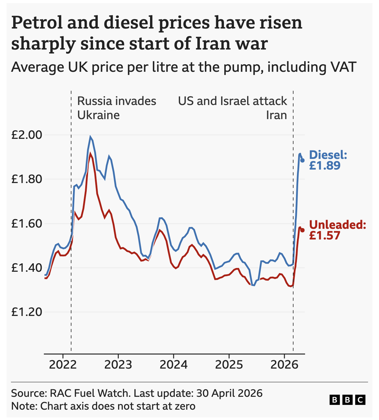
Pain at the Pump Across the Pond
Over the past week I did a bit more driving than usual. Every single day I watched the digital display at the local Wawa tick up by a penny or two. But I read the news and see reports of fuel shortages and restrictions, especially in Europe and Asia. This morning the BBC reported on…
-
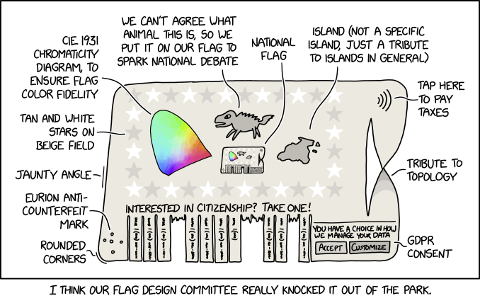
Vexing Vexillology
Happy Friday, all. As a young child, I always loved flags. I collected international ones from random places in the US. I no longer collect them, but I still love their design and was fortunate to live in a city that has a good one: Chicago. (Philadelphia and Pennsylvania, sadly, do not have good flags.)…
-
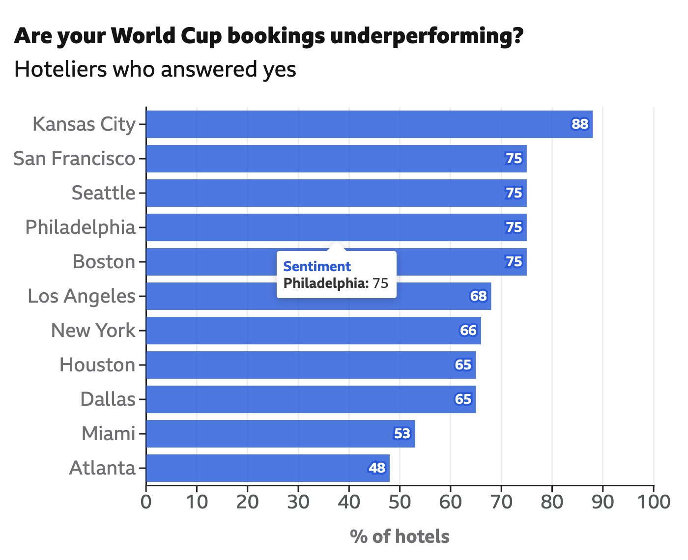
Unnecessary Extra Labelling
I frequently criticise labelling the data values on bar charts, a style seemingly everywhere on the internets. Labels provide precise values, but if you need to see the precise value in a graphic, you don’t really need the graphic—you need a table. Enter this interactive graphic in an article from the BBC exploring hotel bookings…
-
Board of Modern Religious Architecture
Yesterday evening I received an e-mail about some of my work over on my Ganister website, where I try to capture, record, and preserve the history of the small quarry town in western Pennsylvania whence my grandfather came. The e-mail’s contents led me back to some old photographs I took from my trip to the…