Tag: Sankey diagram
-
Mission Accomplished
Last weekend the United States and Israel preemptively struck Iran and kicked off a regional war. As I type this Monday morning, the US–Israeli strike forced assassinated the ayatollah and numerous other senior Iranian officials—but this seems to have been anticipated to a degree and the regime quickly retaliated and has delegated roles and responsibilities.…
-
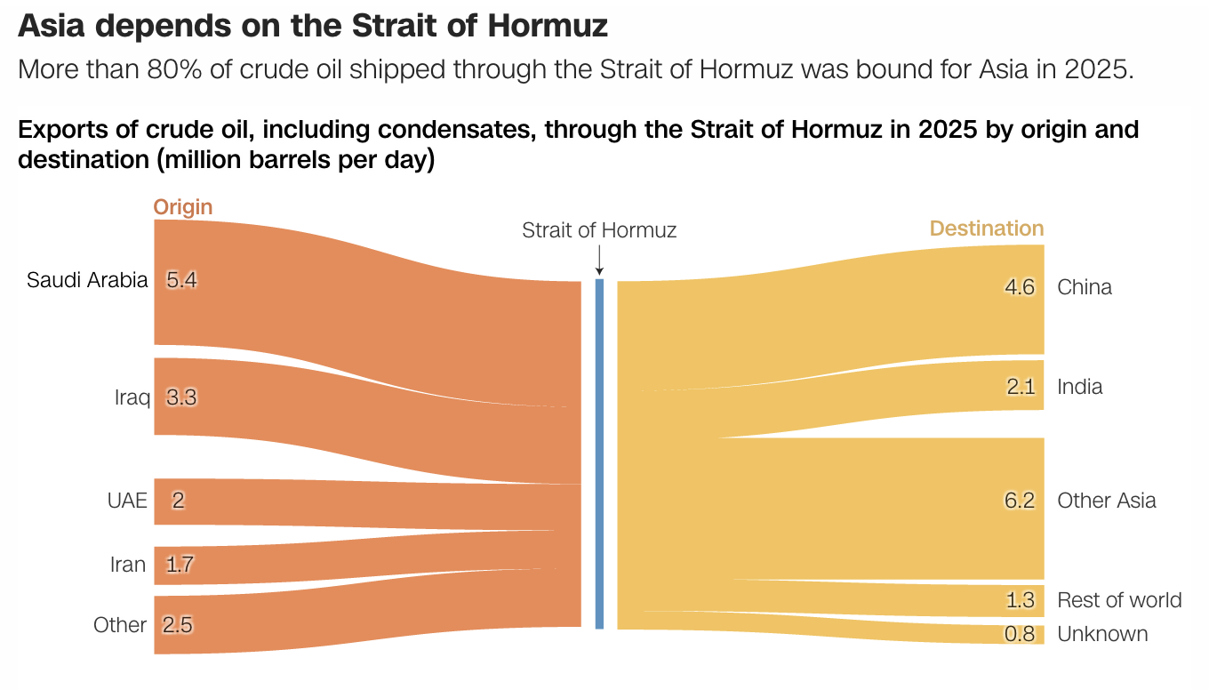
Sankey Shows Starters Sticking with Sticky Stuff
I spent way more time trying to craft that title than I’d like to admit. Headline writing is not easy. Quick little piece today about Sankey diagrams. I love them. You often see them described as flow diagrams—this piece is in the article we’ll get to shortly—but they are more of a subset within a…
-
Israeli Electoral History
One of the important stories of last week that was not black hole related was that of the re-election of the Likud Party in Israel, a party headed by Benjamin Netanyahu. This will be his fourth consecutive time as prime minister plus a fifth back in the late 1990s. Of course, he is facing an…
-
The London Job Exodus
Brexit is bad for Britain. Here is some proof from an article by Bloomberg that looks at where London-based banking jobs are headed post-Brexit. Spoiler alert, not elsewhere in Britain. The article purports to be more of a tracker in that they will add on data about jobs moving places when news breaks. But I…
-
Tracking the Women Running for Office
Yesterday we talked about a static graphic from the New York Times that ran front and centre on the, well, front page. Whilst writing the piece, I recalled a piece from Politico that I have been lazily following, as in I bookmarked to write about another time. And suddenly today seemed as good as any…
-
Brexit and the British General Election
On 8 June, Britons will go to the polls in a general election that Prime Minister Theresa May called to increase her parliamentary majority. The United Kingdom faces a number of issues—I am looking at you housing and the NHS for starters—but Brexit is on the minds of a lot of people. That makes sense,…
-
Could Marine Le Pen Have Won?
Well not likely—it was going to be tough regardless. Today’s piece is also from the Wall Street Journal and it was posted Saturday, the day before the election. It used a Sankey diagram to explore the support that Le Pen would have needed to draw from every candidate in the first round to get over…
-
Scottish Independence?
I was having a conversation with a mate the other night about what Brexit means for Scottish independence. This mate, however, is an American. Because when American politics are depressing and nonsensical, we turn to British pol—wait, never mind. Despite the overall UK vote to leave the European Union, Scotland (and London, and Northern Ireland) voted…
-
2016 Holyrood Elections
Last week Scotland voted for its parliament, Holyrood. The Scottish National Party did well enough, the Conservatives picked up quite a few seats, and Labour lost quite a few. The Guardian put together this piece looking at the results and the stories contained therein. But I want to focus on the graphics, the big piece of…