Well not likely—it was going to be tough regardless.
Today’s piece is also from the Wall Street Journal and it was posted Saturday, the day before the election. It used a Sankey diagram to explore the support that Le Pen would have needed to draw from every candidate in the first round to get over the 50% mark in the second round.
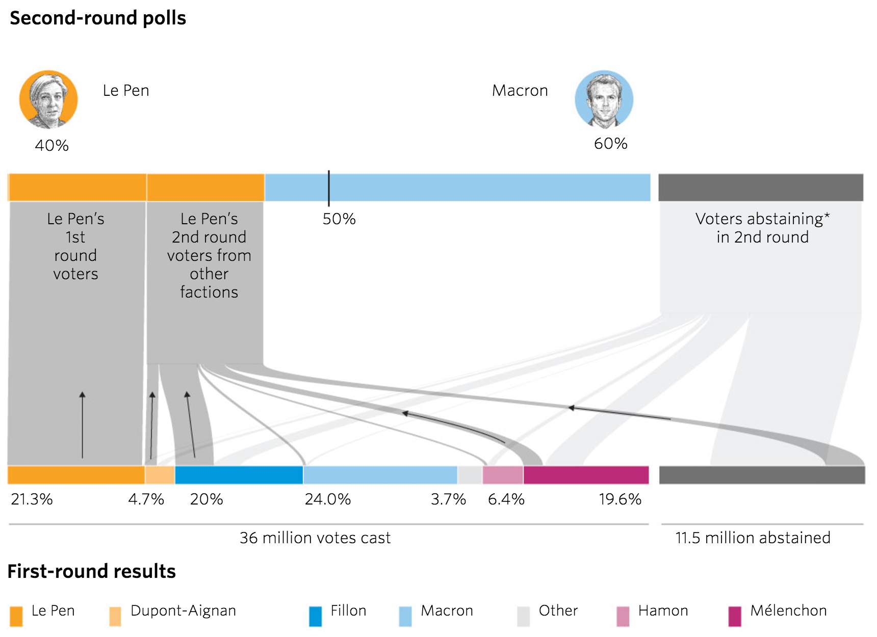
If anything this chart is not the story. The story is that the final count I saw put Macron not on 60%, but on just over 66%.
Turns out she couldn’t.
Credit for the piece goes to Stacy Meichtry and Jovi Juan.
Author: Brendan Barry
I am a graphic designer who focuses on information design. My day job? Well, they asked me not to say. But to be clear, this blog is my something I do on my own time and does not represent the views of…my employers. I think what I can say is that given my interest in information design—be it in the shape of clear charts, maps, diagrams, or wayfinding systems—I am fortunate that my day job focuses on data visualisation. Outside of work, I try to stay busy with personal design work. Away from the world of design, I have become an amateur genealogist and family historian. You will sometimes see that area of work bleed into my posts.
View all posts by Brendan Barry