Yesterday we talked about a static graphic from the New York Times that ran front and centre on the, well, front page. Whilst writing the piece, I recalled a piece from Politico that I have been lazily following, as in I bookmarked to write about another time. And suddenly today seemed as good as any other day.
After all, this piece also is about women running for Congress, and a bit more widely it also looks at gubernatorial races. It tracks the women candidates through the primary season. The reason I was holding off? Well, we are at the beginning of the primary season and as the Sankey diagram in the screenshot below shows, we just don’t have much data yet. And charts with “Wait, we promise we’ll have more” lack the visual impact and interest of those that are full of hundreds of data points.
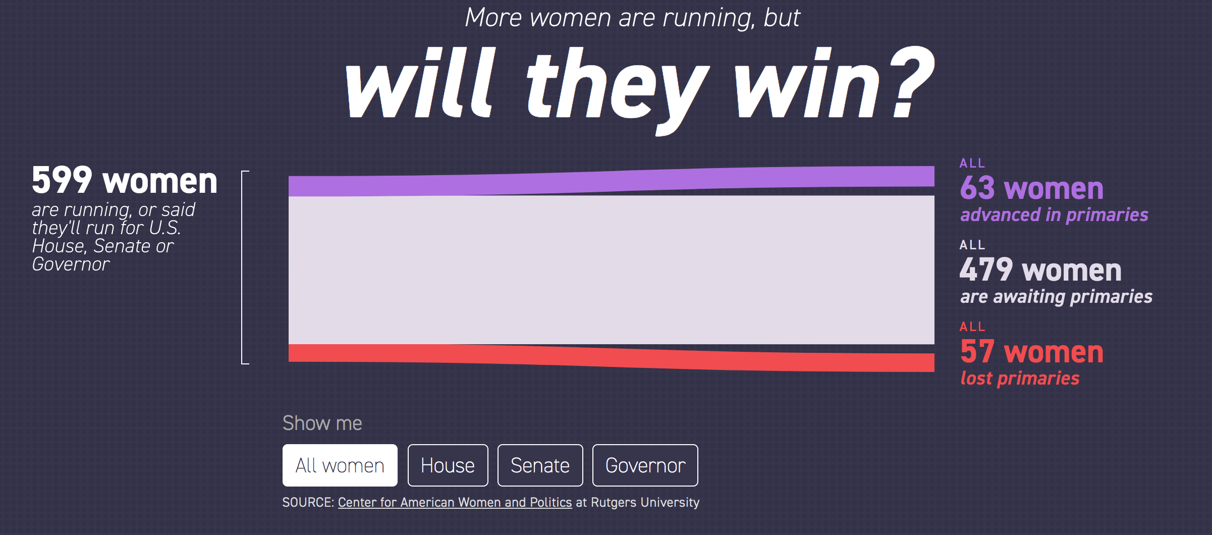
But we should still look at it—and who knows, maybe late this summer or early autumn I will circle back to it. After all, today is primary day in Pennsylvania. (Note: Pennsylvania is a closed primary state, which means you have to belong to the political party to vote for its candidates.) So this tool is super useful looking ahead, because it also shows the slate of women running for positions.

I really like the piece, but as I said above, I will want to circle back to it later this year to see it with more data collected.
Credit for the piece goes to Sarah Frostenson.
Leave a Reply
You must be logged in to post a comment.