Tag: sports
-

Opening Day
Happy Opening Day, everyone. Baseball is back. The Red Sox are back. Last year, I only posted my predictions on social media because they don’t include charts or graphs really. (But I did revisit them at year’s end.) These are mostly just tables. But, why not? Last year, shortly after Opening Day, I wrote about…
-

Philadelphia Blue Jays
Last weekend one of my good mates and I went out watch Game 7 of the World Series, wherein the Los Angeles Dodgers defeated the Toronto Blue Jays for Major League Baseball’s championship. Whilst we watched, I pointed out that the Jays’ pitcher at the moment hailed from a suburb of Philadelphia. He was well…
-
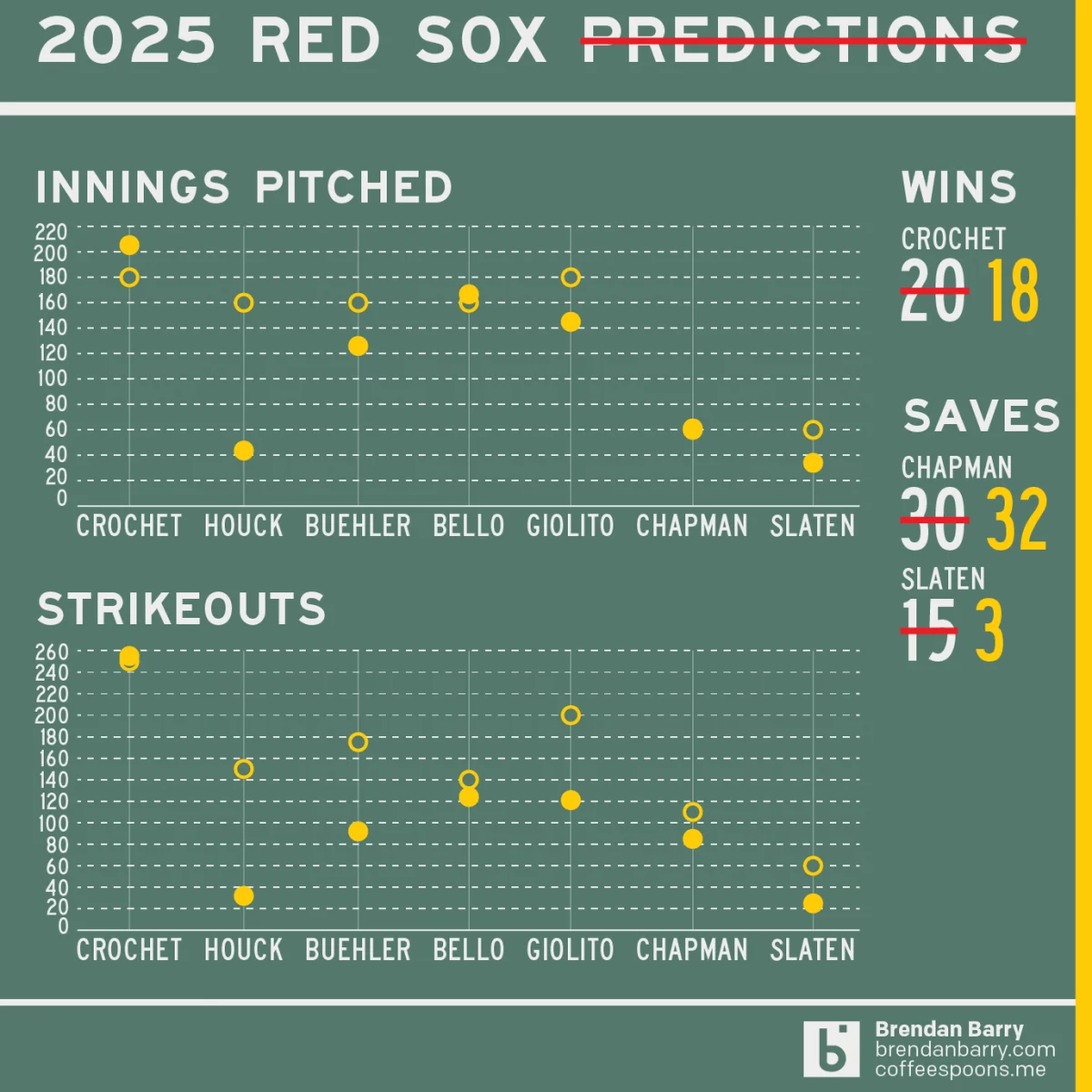
Revisiting My 2025 Red Sox Predictions
Back in March I posted my predictions for the 2025 Boston Red Sox on my social media feeds. I chose not to post it here, because the images had no real data visualisation and the only real information graphic was my prediction of the playoffs via a bracket. I did, however, write about how the…
-
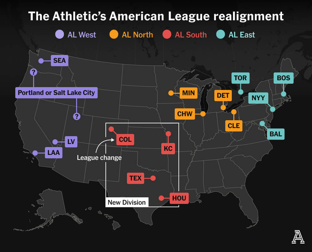
MLB’s Realignment
Last weekend, Major League Baseball Commissioner Rob Manfred created a mild furore when he discussed the sport’s looming expansion and how it would likely prompt a geographic realignment. I am old enough I still recall baseball’s two leagues—the American and National—organised into only two divisions—East and West. In the early 1990s, baseball expanded and created…
-
Bring on the Beantown Boys
For my longtime readers, you know that despite living in both Chicago and now Philadelphia, I am and have been since way back in 1999, a Boston Red Sox fan. And this week, the Carmine Hose make their biennial visit down I-95 to South Philadelphia. And I will be there in person to watch. This…
-
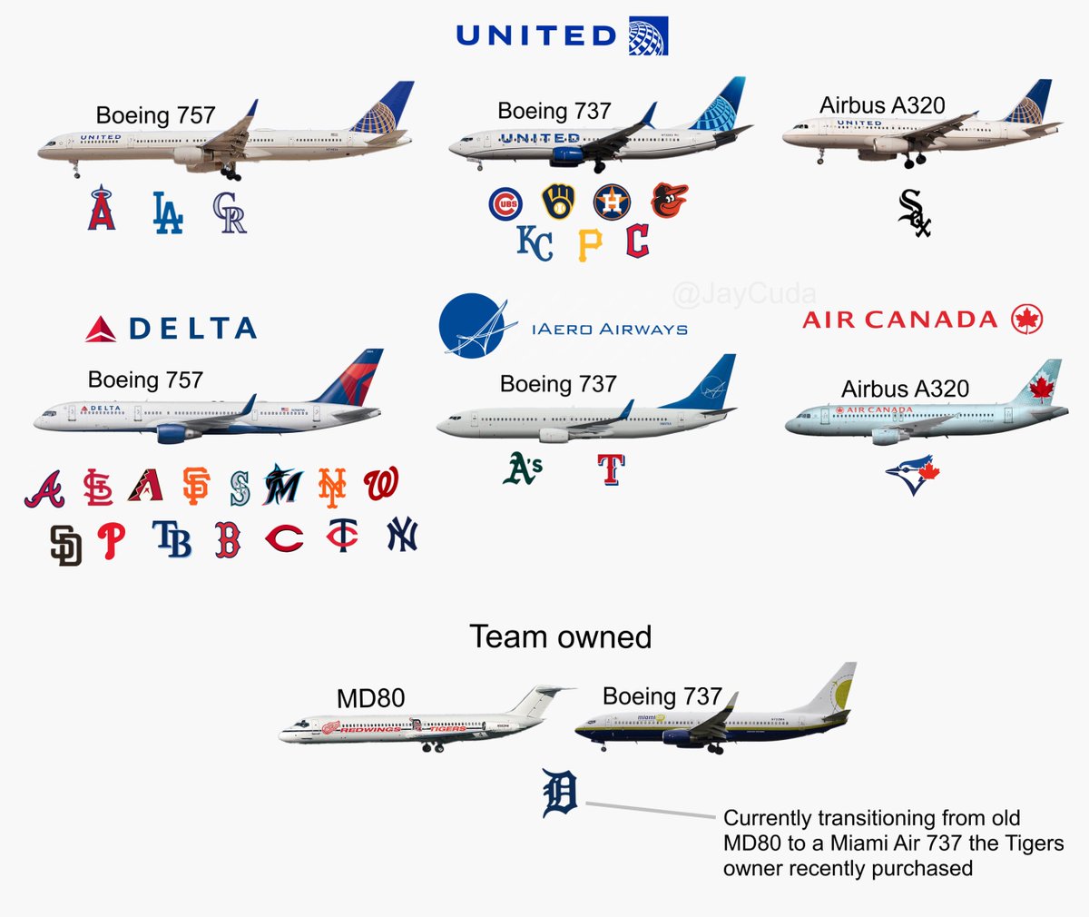
Tired of These Motherf*cking Sox on This Motherf*cking Plane
At least, that’s what I imagine South Siders saying in Chicago as they watch the White Sox team charter plane land at Midway. For those not following America’s Major League Baseball season, the Chicago White Sox are one of two clubs claiming Chicago as their home. (The other being the Cubs.) And the White Sox—not…
-
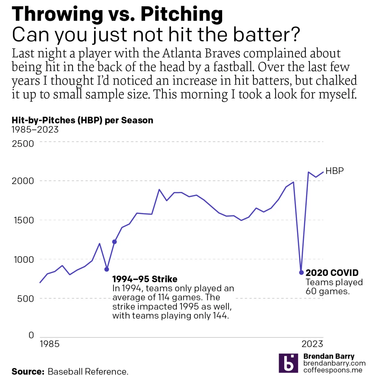
I Want a Pitcher Not a Back o’ Head Hitter
We’re about to go into the sportsball realm, readers. Baseball, specifically. Tuesday night, Atlanta Braves batter Whit Merrifield was hit in the back of the head by a 95 mph fastball. Luckily, modern ballplayers wear helmets. But at that velocity, one does not have the most reaction time in the world a number of other…
-
A New Downtown Arena for Philadelphia?
I woke up this morning and the breaking news was that the local basketball team, the 76ers, proposed a new downtown arena just four blocks from my office. The article included a graphic showing the precise location of the site. For our purposes this is just a little locator map in a larger article. But…
-
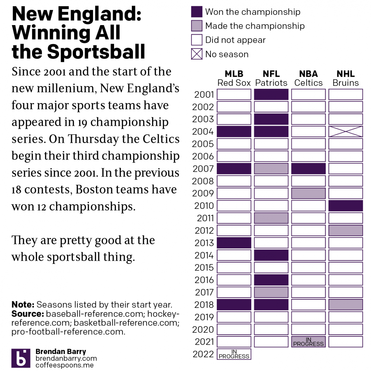
Boston: Sportstown of the 21st Century
Tonight the Boston Celtics play in Game 1 of the NBA Finals against the Golden State Warriors, one of the most dominant NBA teams over the last several years. But since the start of the new century and the new millennium, more broadly Boston’s four major sports teams have dominated the championship series of those…
-
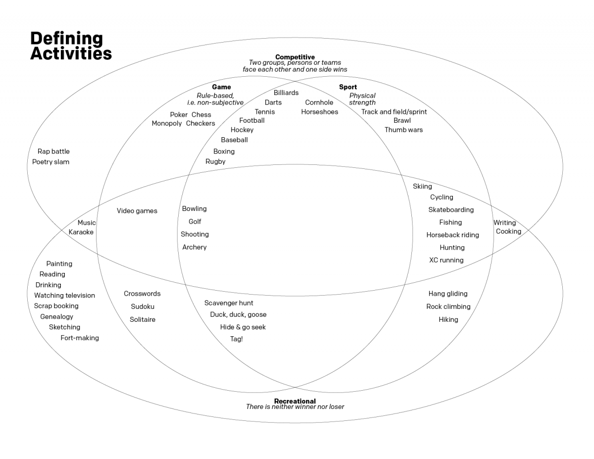
Sports and Games
Well that was a week. Let’s try to stay on the lighter side this Friday. Several weeks ago I was debating with several people about the difference between a game and a sport. I decided that the best way to try and capture our conversation was with a Venn diagram. So in the interest of…