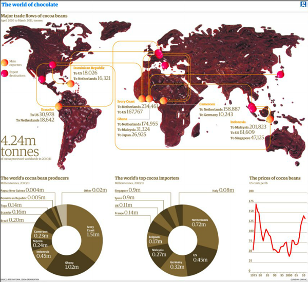
There are a few things in this world that I really dislike. Two of them are coffee and chocolate. So this map from the Guardian, a map made of real melted chocolate, is not quite to my liking.

While I can appreciate the concept behind it—regardless of the chocolate-ness—I am left to wonder if from a data visualisation point a world map might not have been the best choice. Only fourteen countries are shown, if I count melted chocolate correctly.
I am just thankful that at the bottom of the piece I am not looking at chocolate doughnuts.
Credit for the piece goes to Jenny Ridley.
Leave a Reply
You must be logged in to post a comment.