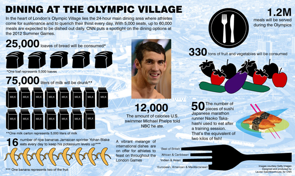
The Olympics bring out the best. Well, at least in athletics. In terms of infographics, not always so much. This piece from CNN is a fairly unorganised mess with lots of individual datapoints. It’s a shame to see this at CNN when so many other news outlets are doing quality graphic work for the Olympics.

Leave a Reply
You must be logged in to post a comment.