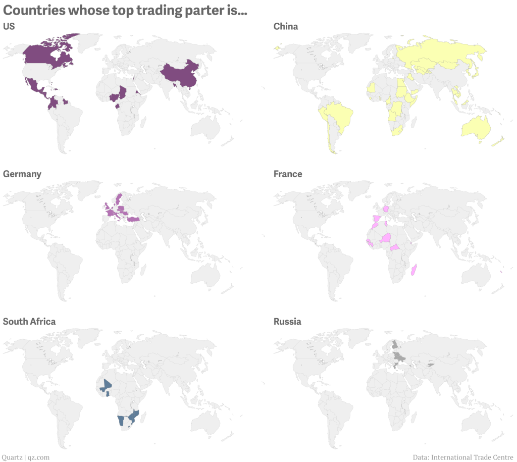
I often rail against the use of maps. I often hear “They’re pretty!” or “They’re colourful!” or “But I really do know where Guatemala is!” or “I can see my house!”. They’re often just a crutch, unless you can use them to show an actual geographic distribution. Thankfully from Quartz we get a series of small multiple maps that look at the geographic distribution of top trading partners for a select set of geographies.

For this set, I think the colours could be the same and perhaps the chosen country perhaps outlined or otherwise signalled on the map. (Only because my utter lack of faith in people being able to identify countries on a map.) Still, it’s a good piece overall that makes nice use of maps.
Credit for the piece goes to David Yanofsky.
Leave a Reply
You must be logged in to post a comment.