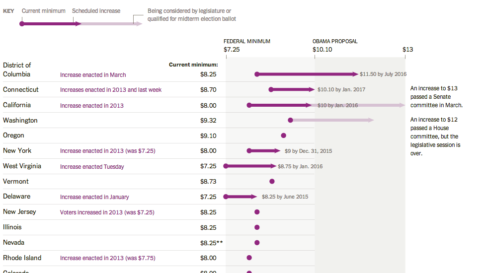
Here’s a piece from the New York Times where I have to quibble with some minor design decisions. The story behind the graphic is various state actions on the minimum wage compared to where President Obama wants the minimum wage raised. This is a good story and broadly I like the execution. But these arrows, these arrows pierce my design heart. (Too much of a metaphor?) Instead, I think a simple dot plot would have sufficed. But as I noted above, this is more of a quibble than a shame-on-you.
Credit for the piece goes to Alicia Parlapiano.
Leave a Reply
You must be logged in to post a comment.